Eagle Mobile by Khabib

Packaging, Branding, Graphic

Logo, corporate identity, communication graphics and tariff packaging for the new virtual mobile operator Eagle Mobile.

A characteristic feature of the operator’s pricing policy is that the more friends and relatives are connected to the tariff, the cheaper communication will be for each of the subscribers. This simple and honest message became the basis for the project graphics.

The operator’s symbol is a planing bracket that denotes not only an eagle, but also a union of people at a distance. A laconic black-and-white symbol can be used as a separate corporate element, or placed large under the bleed, forming a plate of the original shape.

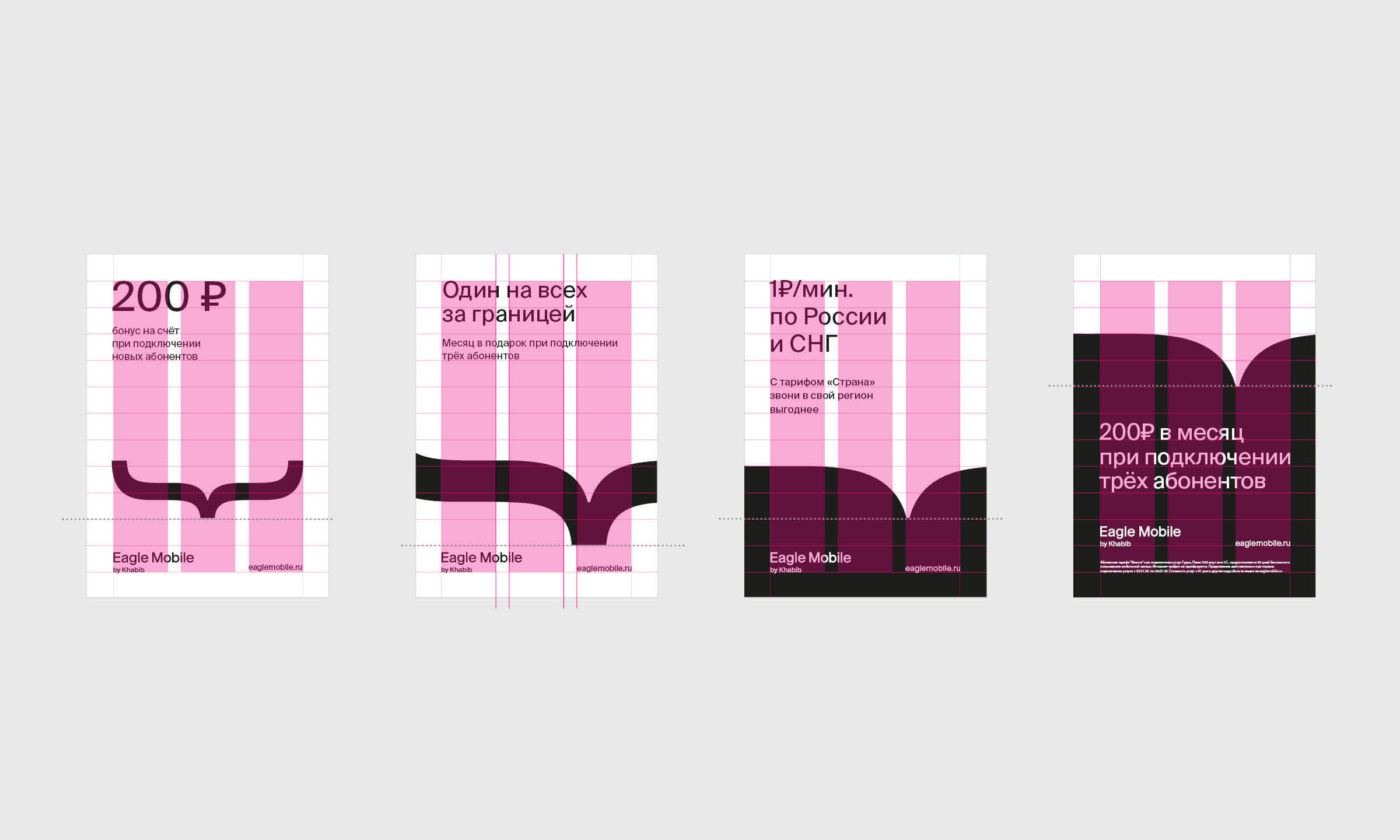
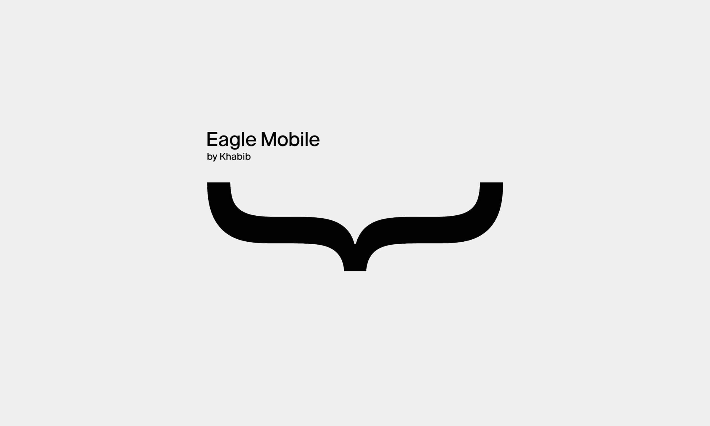
Символом оператора стала парящая скобка, обозначающая не только орла, но и объединение людей на расстоянии. Лаконичный черно-белый символ может использоваться как отдельный фирменный элемент, так и размещаться крупно под обрез, образуя плашку оригинальной формы.

Team

Владимир Лифанов, креативный директор
Алёна Шульга, дизайнер
Екатерина Куклина, аккаунт-директор