


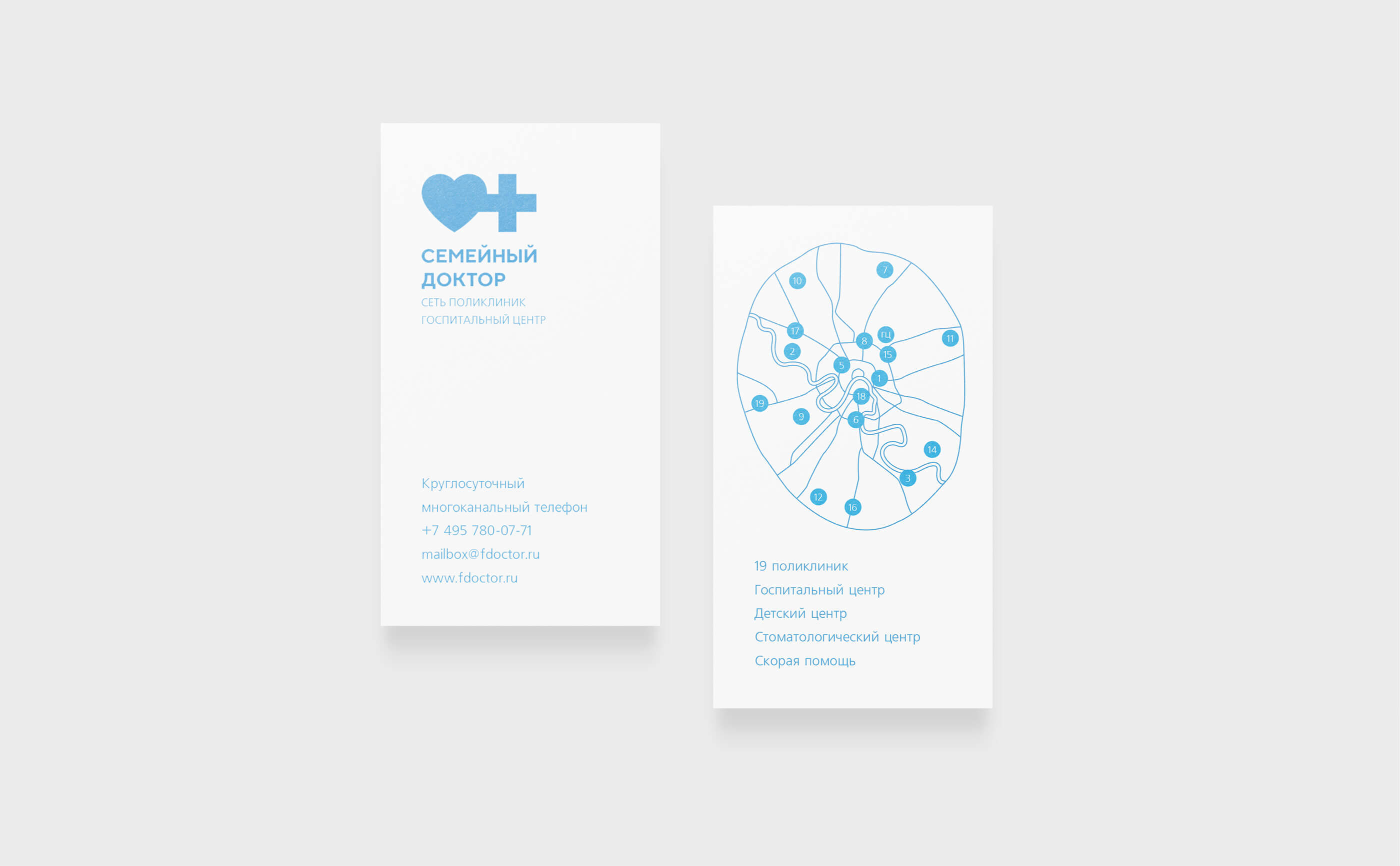
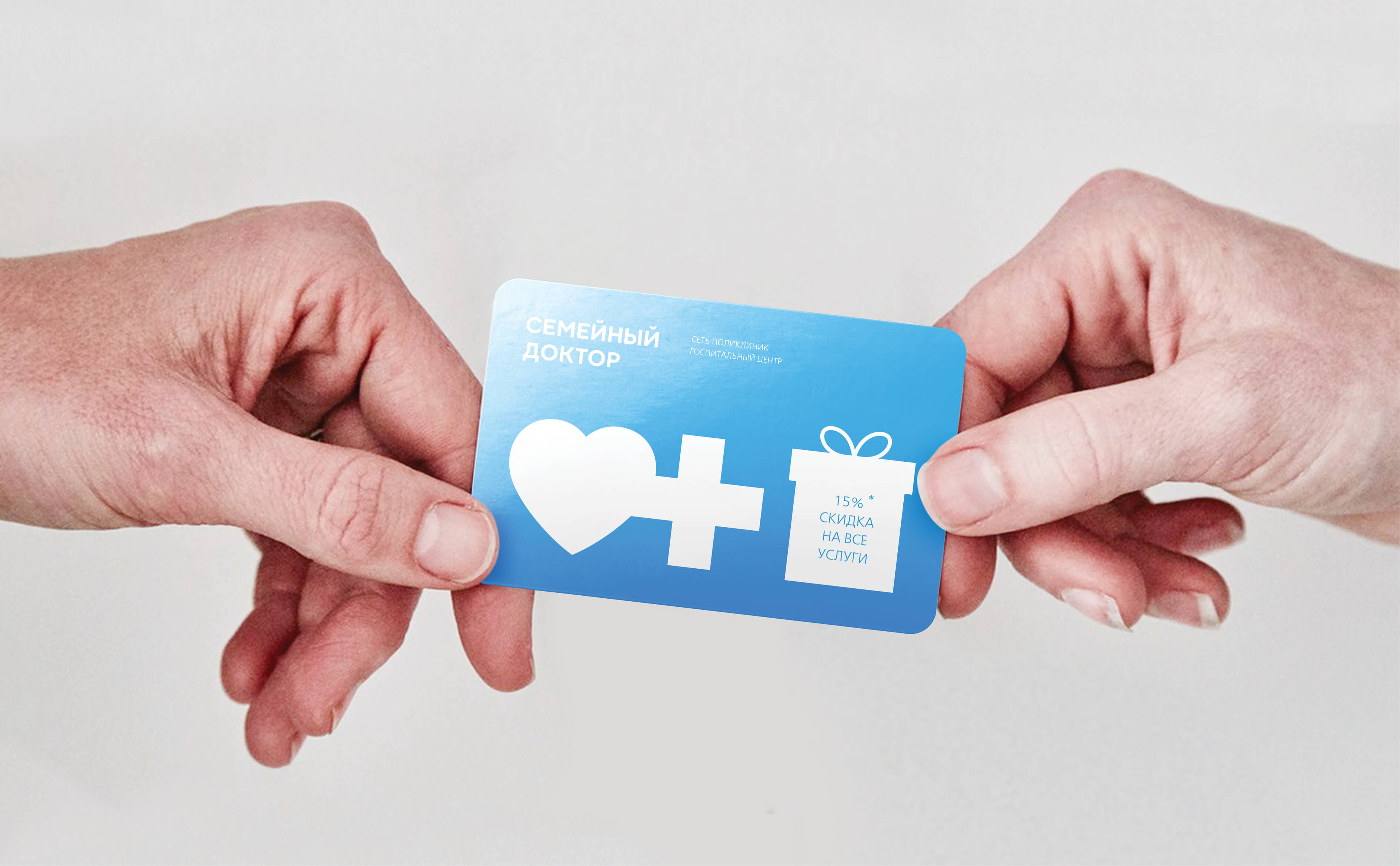


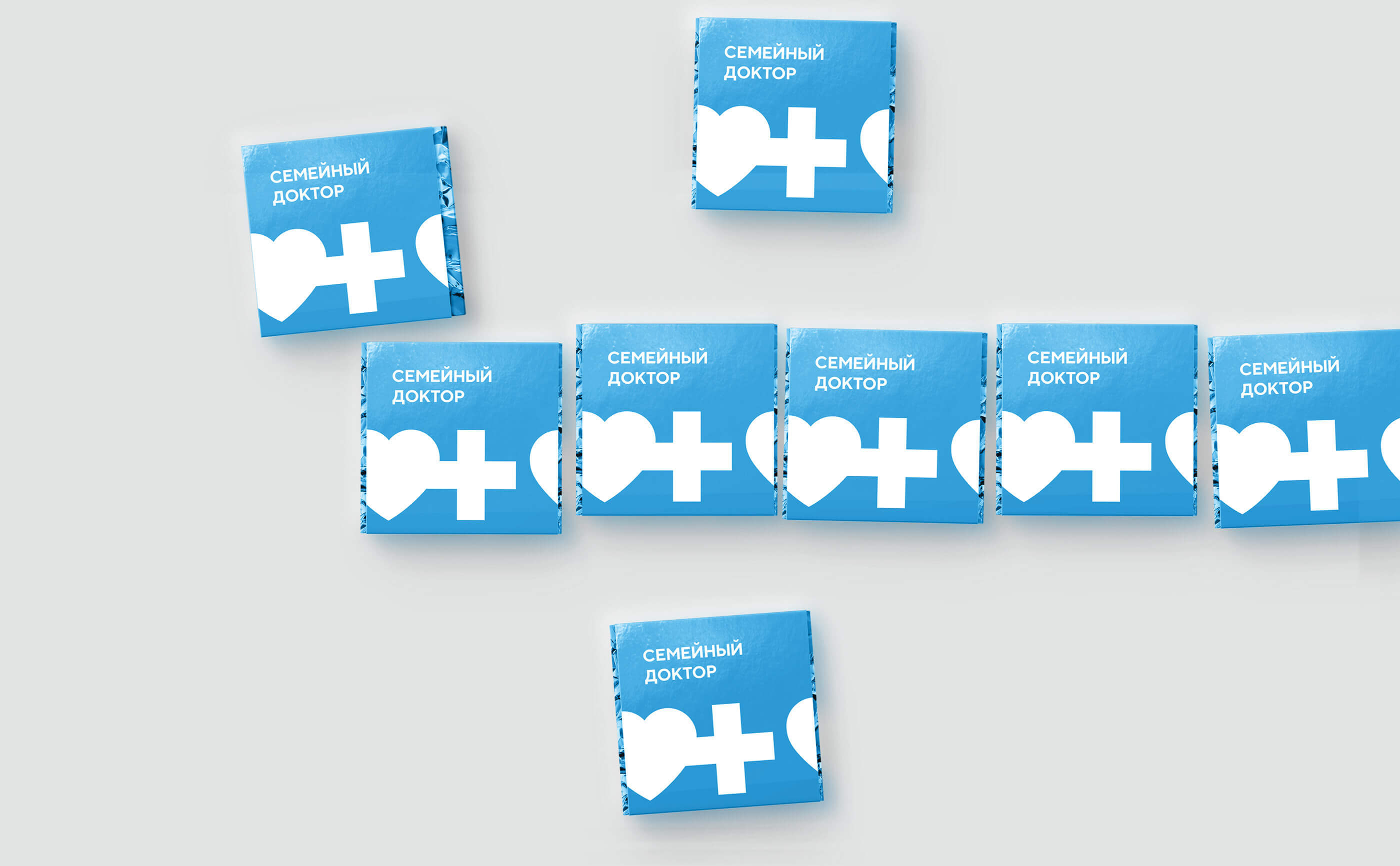


Family doctor
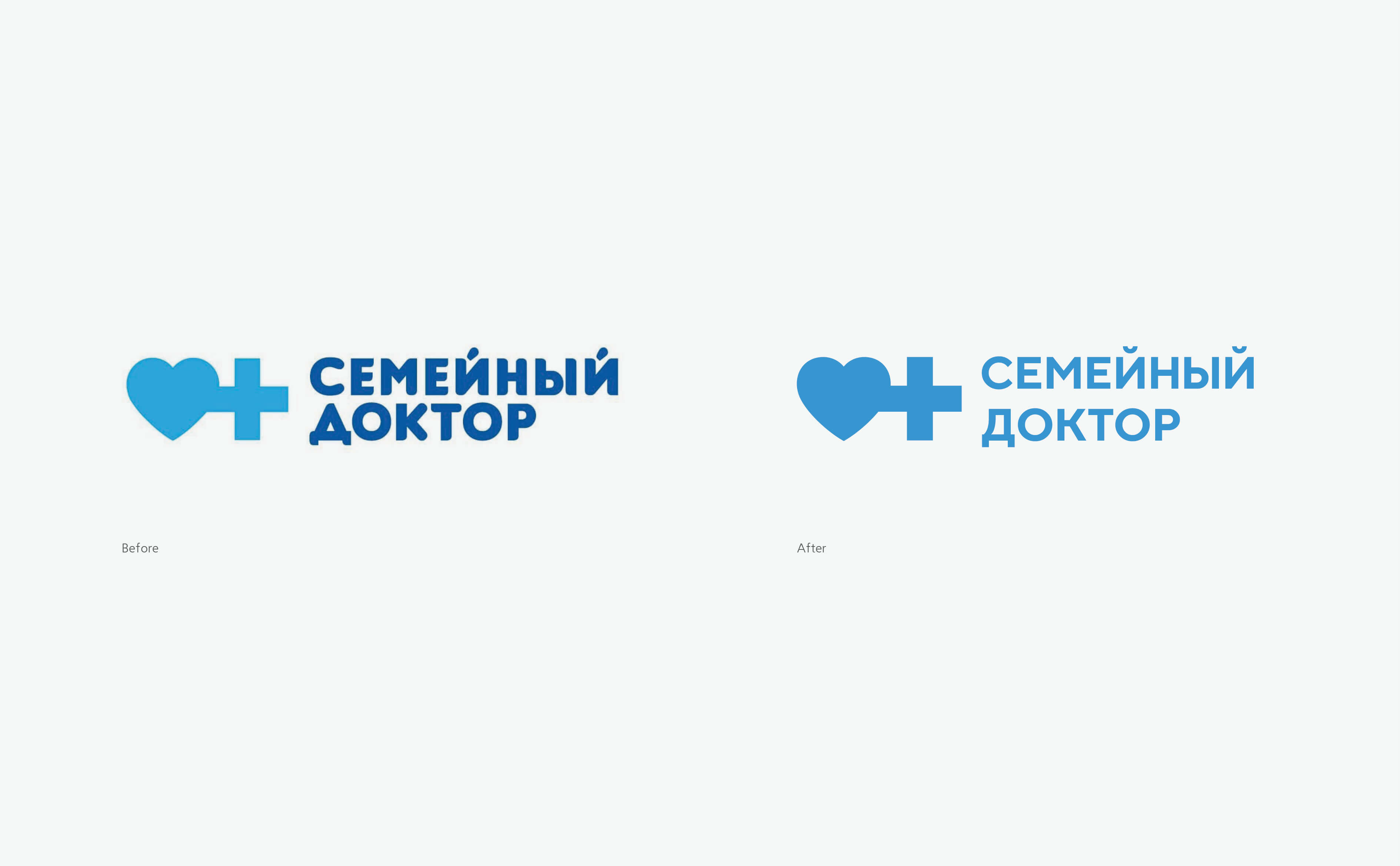
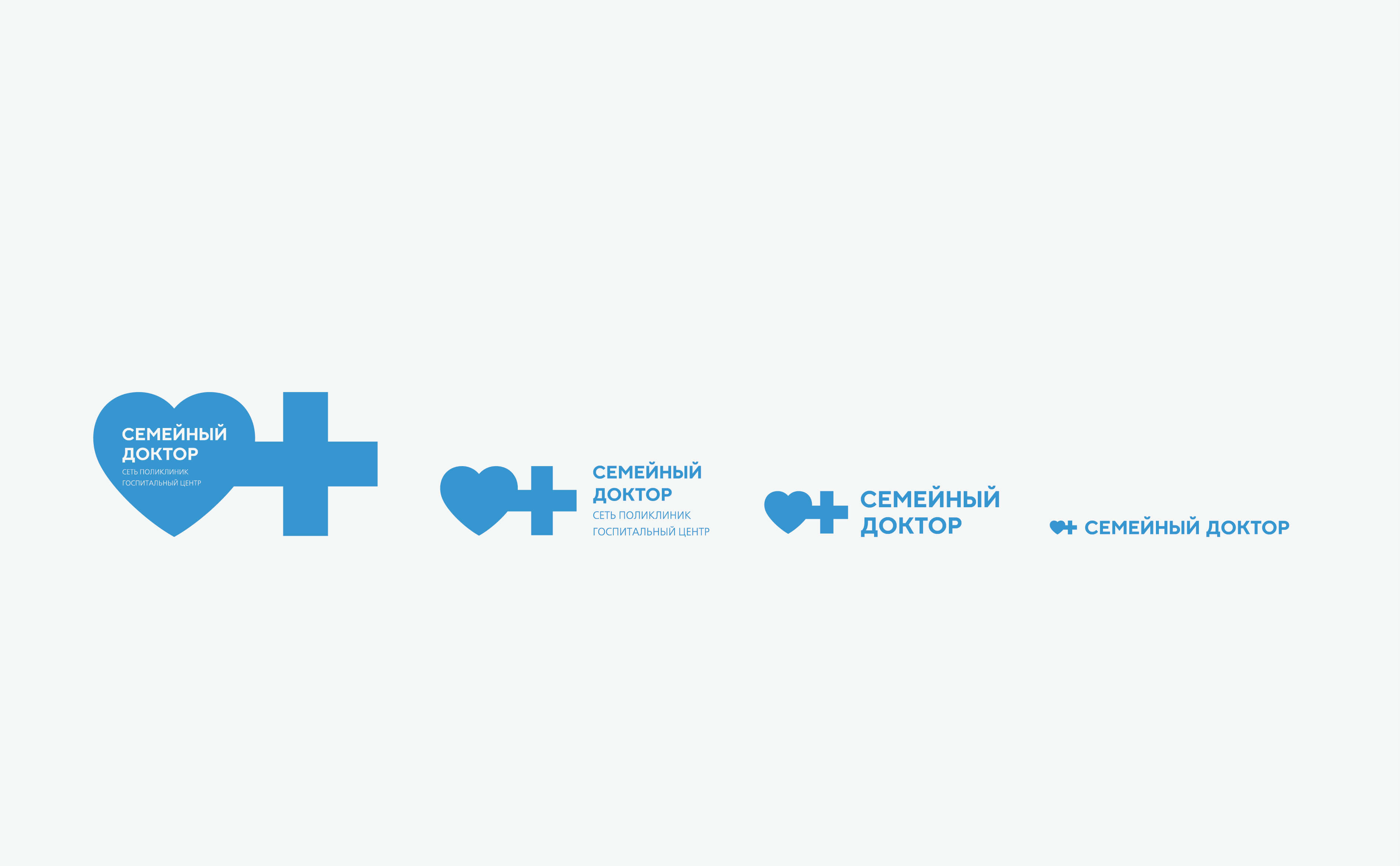
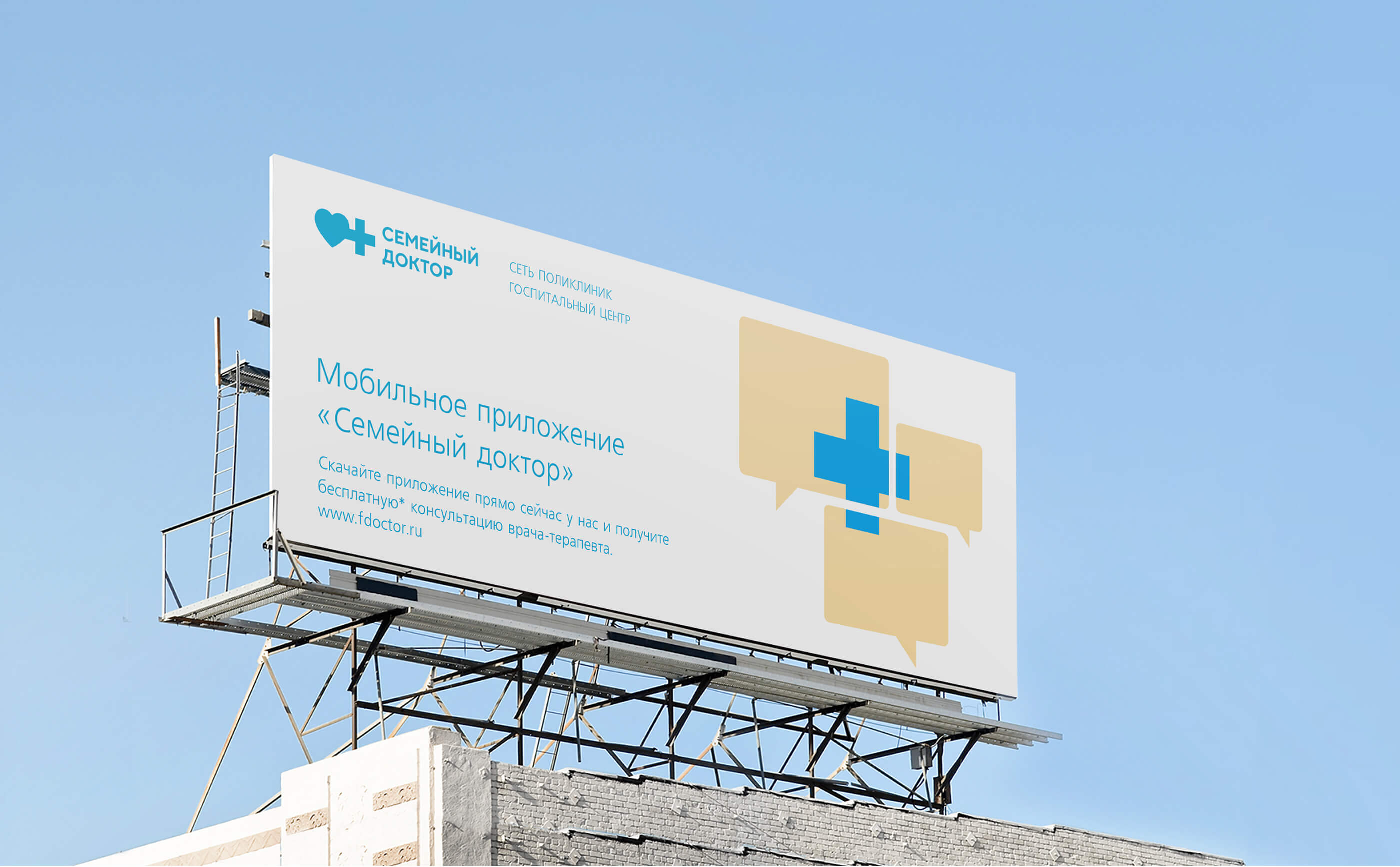
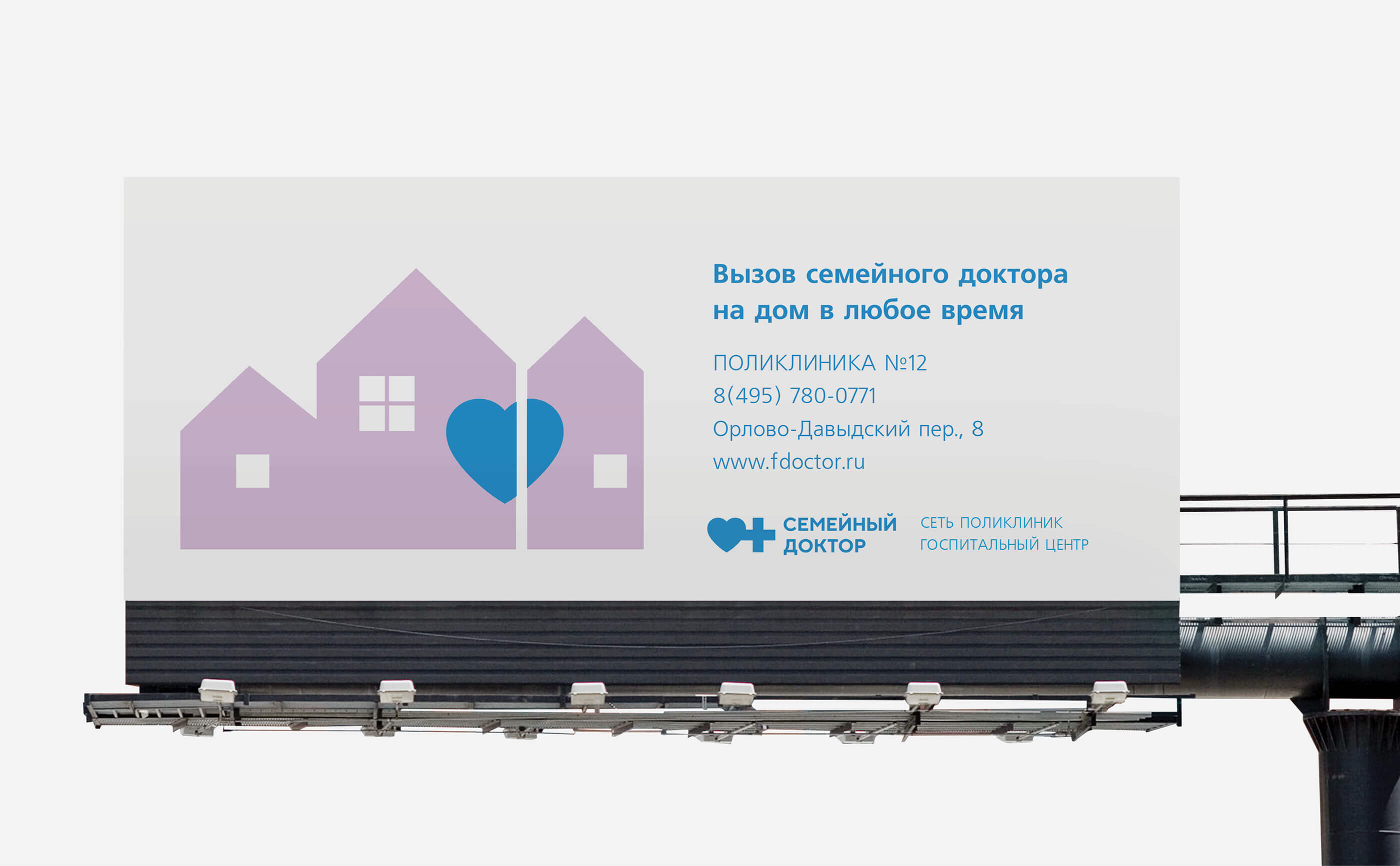
Family doctor company is one of the first private clinics in Russia. They manage 16 multiprofiled clinics and were included to the TOP-10 best private clinics of Russia according to Vadamecum magazine. Laconic logo – united heart and cross – exists more than 10 years. During this time logo has gained recognisability but former identity has lost its relevance for extended network. Business development required both internal and external changes. Company wished to keep recognisable logo within creating new graphic system to support it.
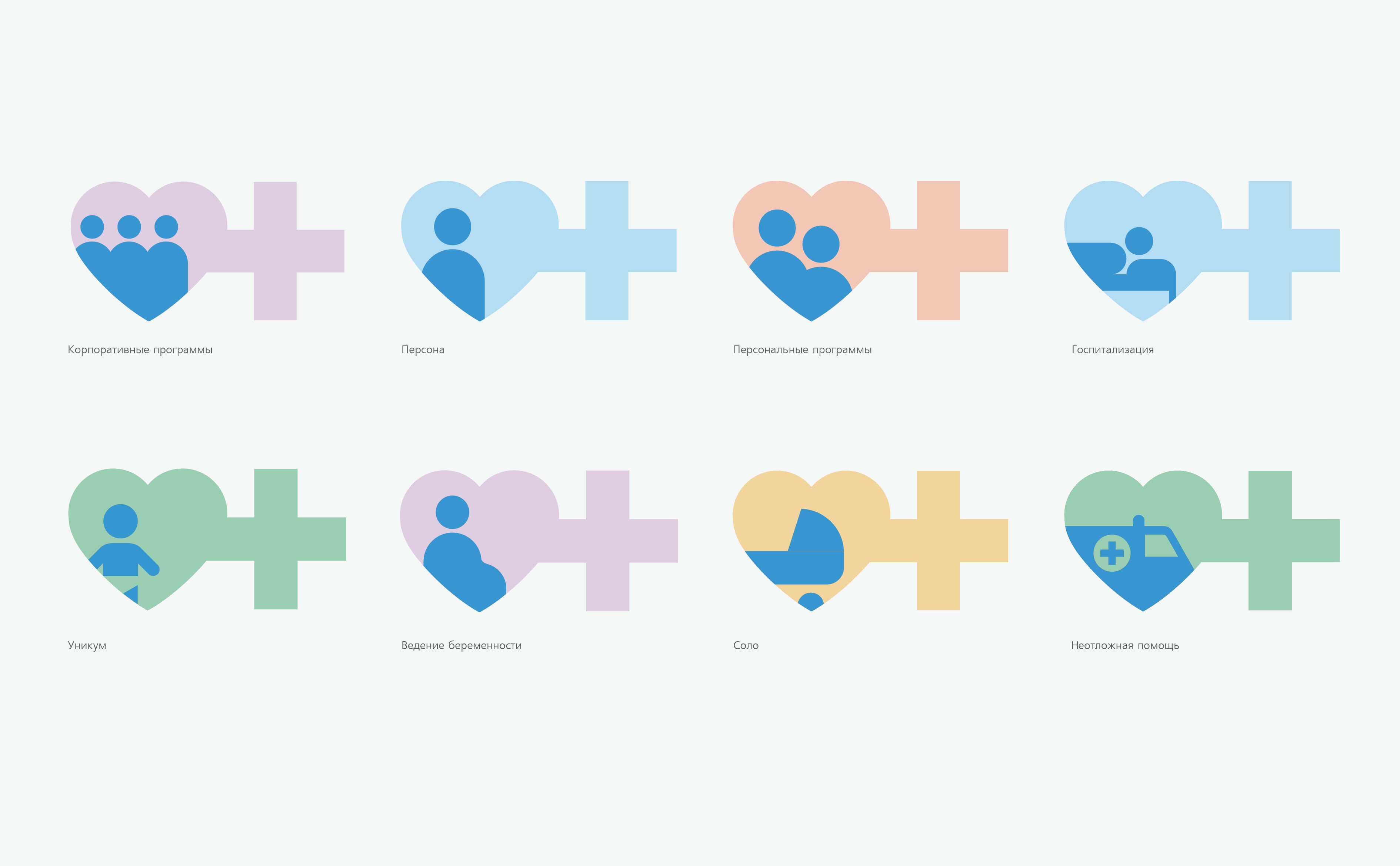
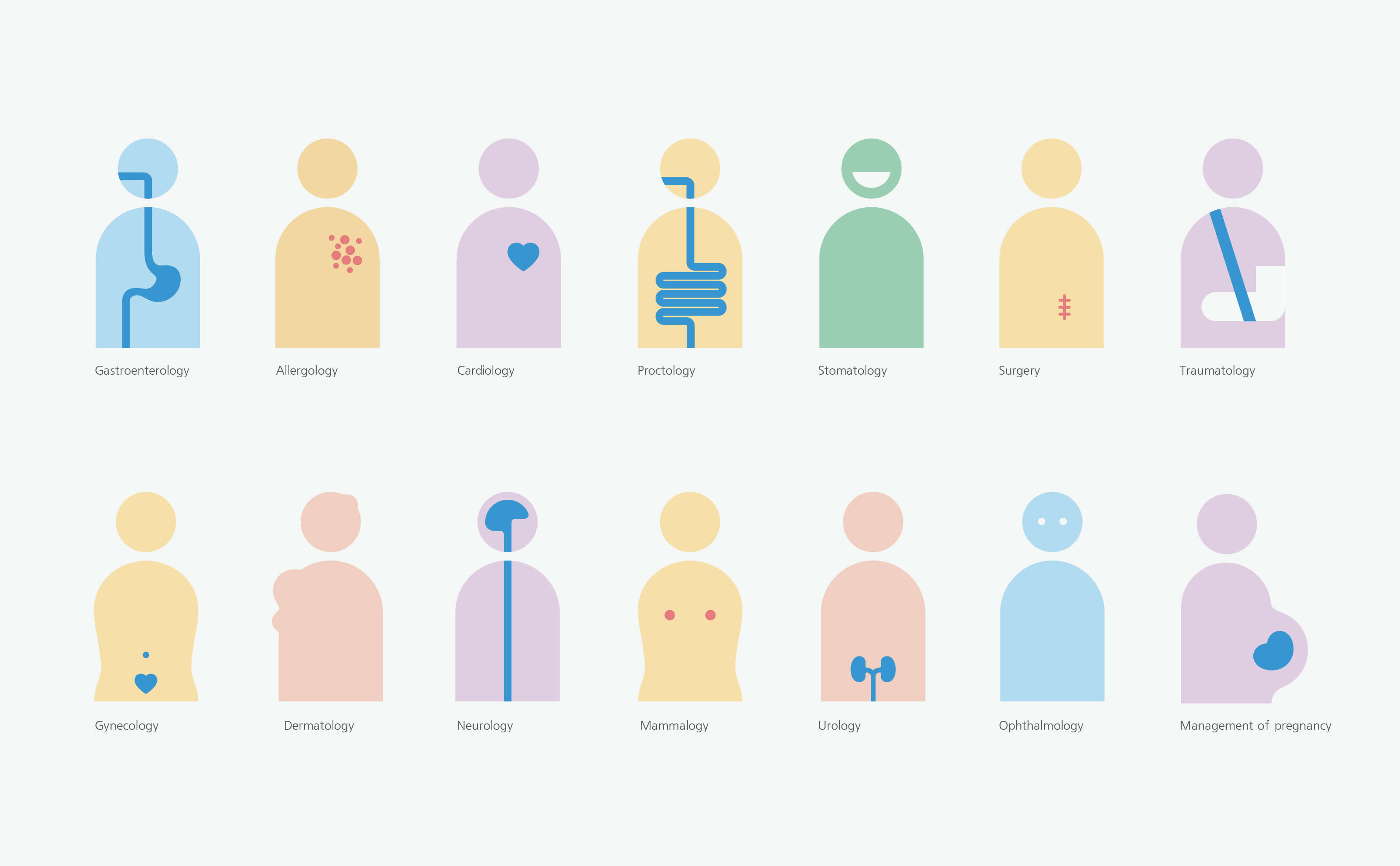
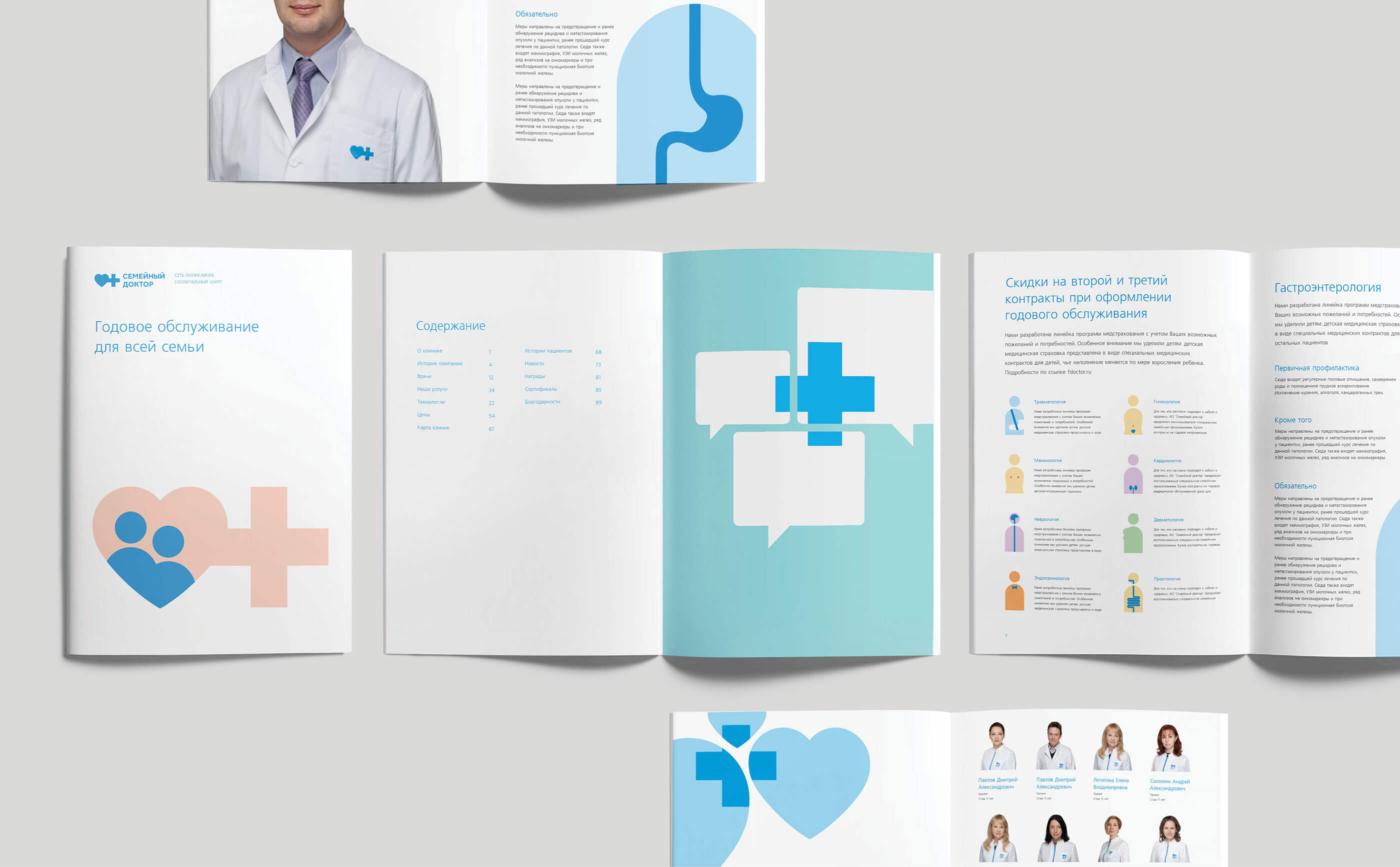
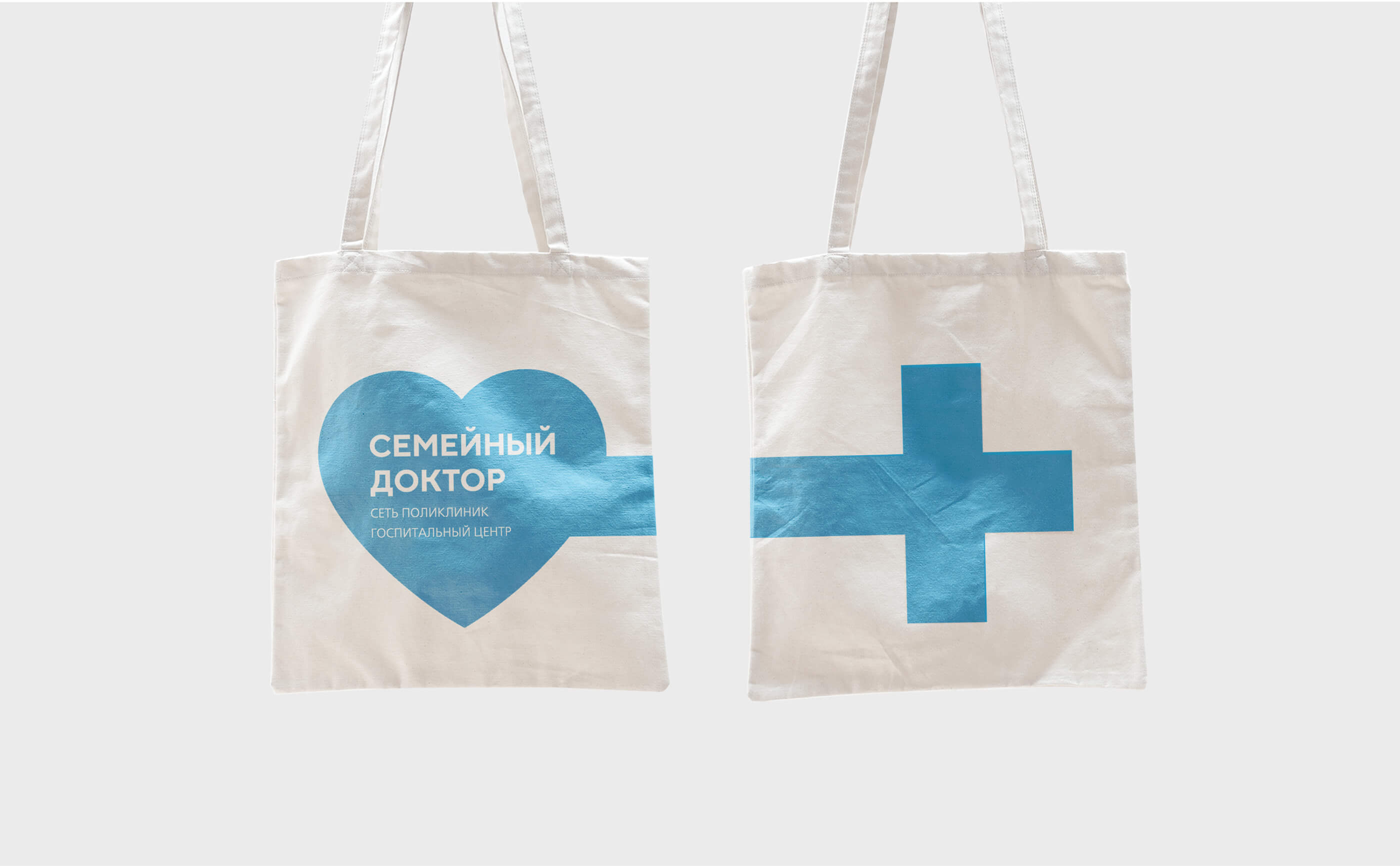
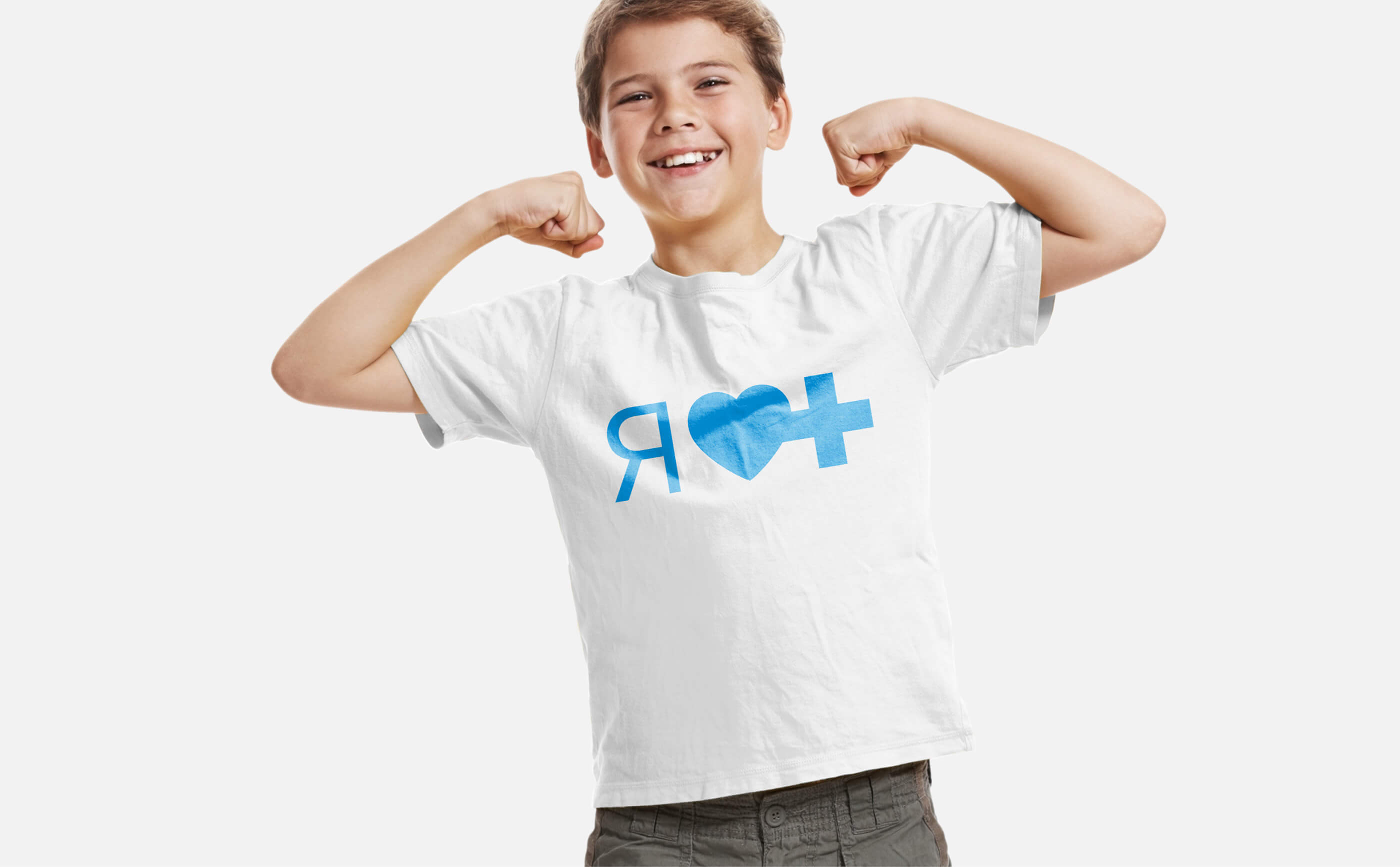
It was necessary to highlight basic principles of work: combination of family and professional approach, creation of trustful relationships between physician and patient. We created visual identification brand, corporate identity and detailed guide-book.
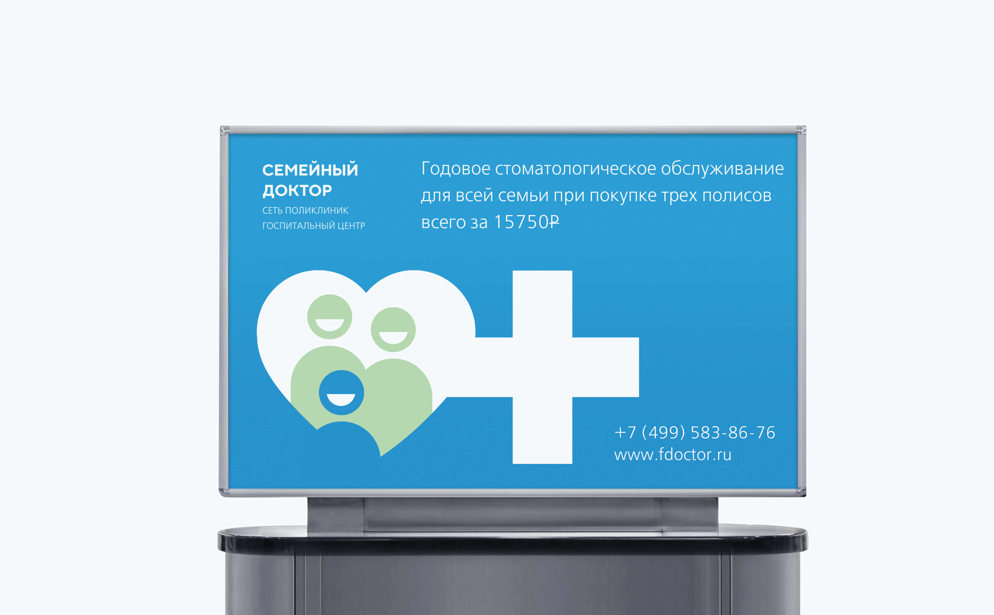
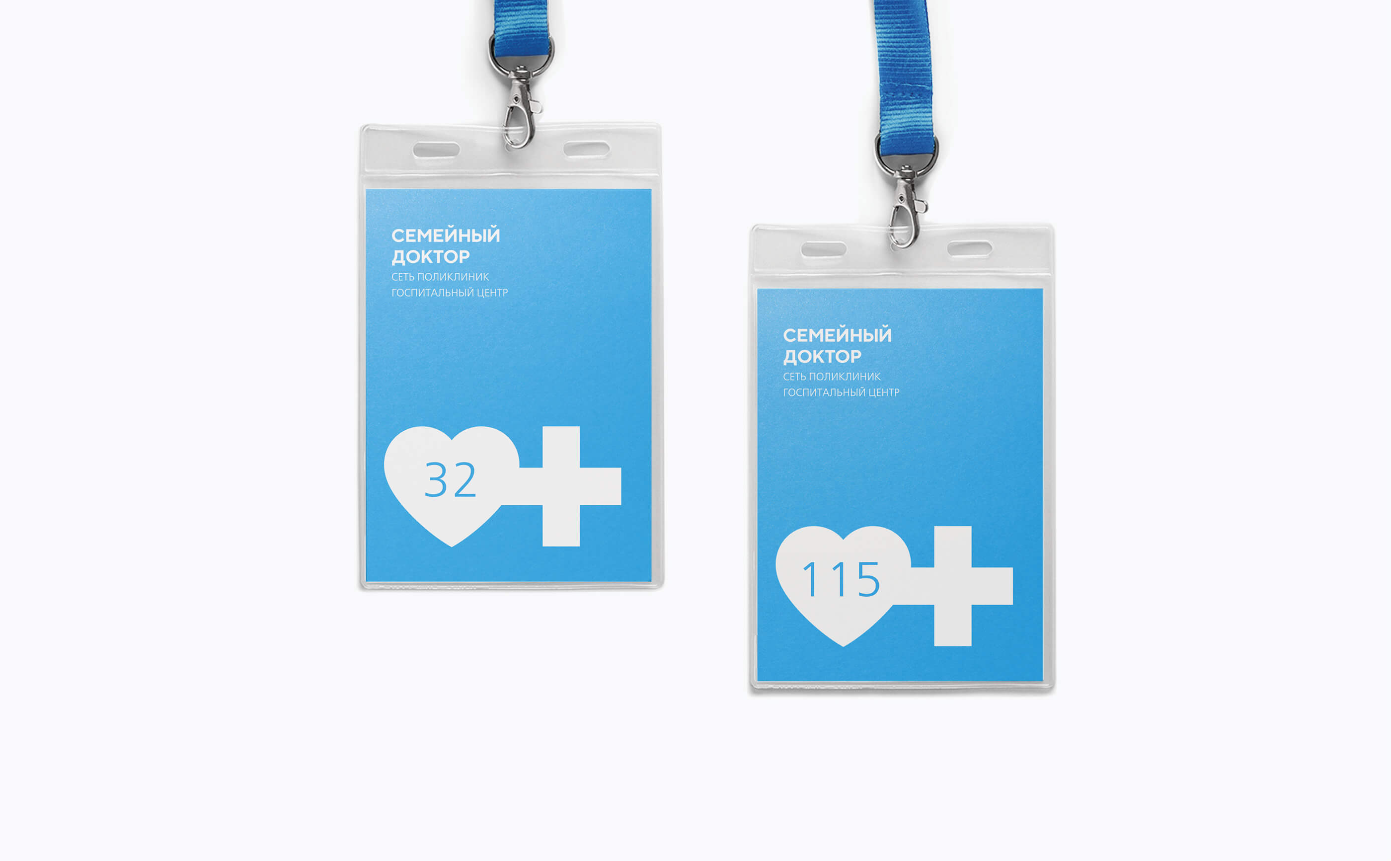
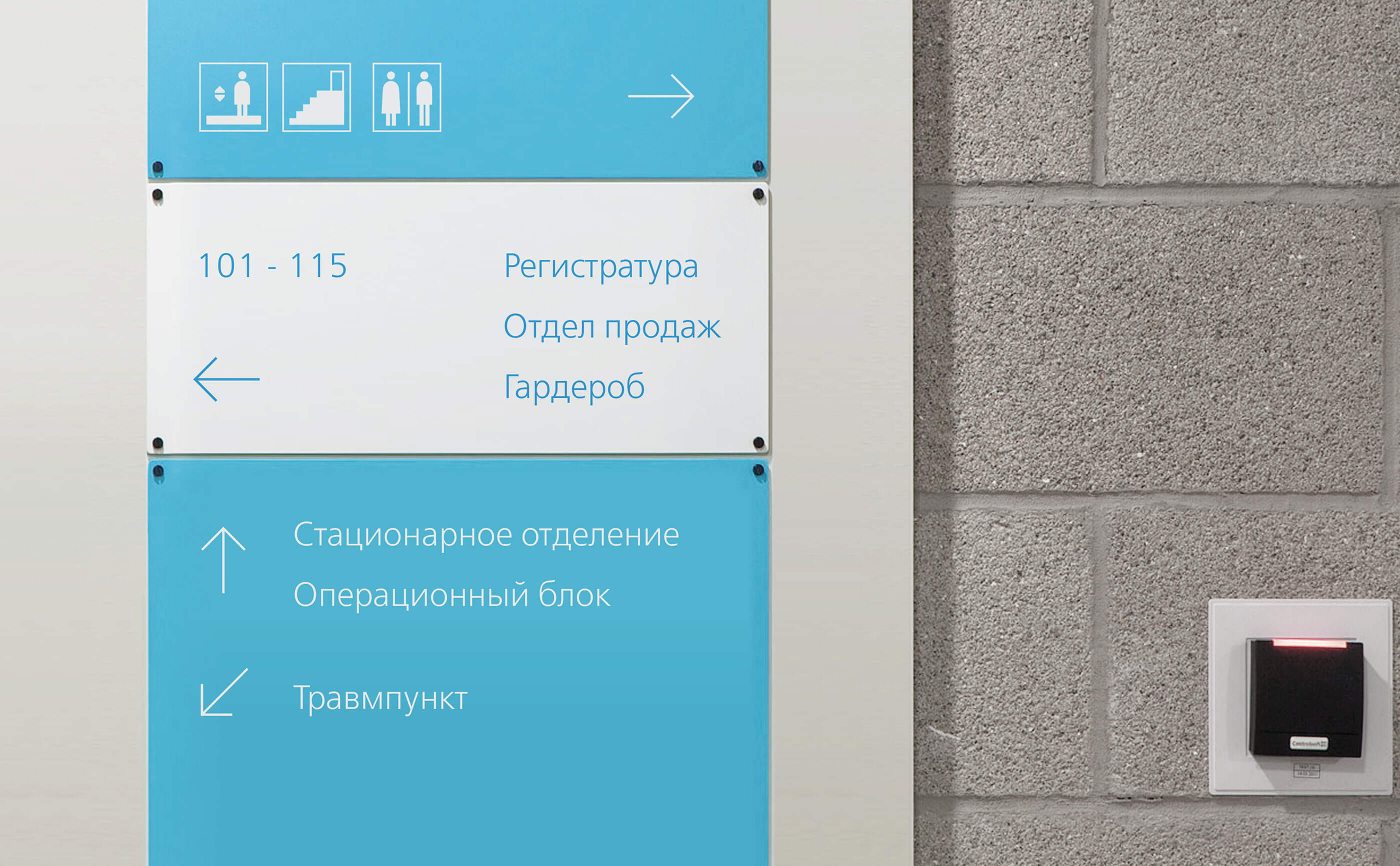
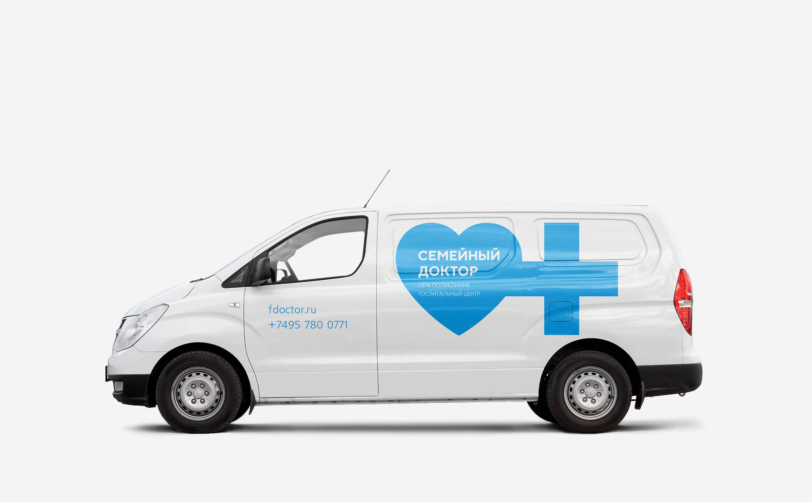
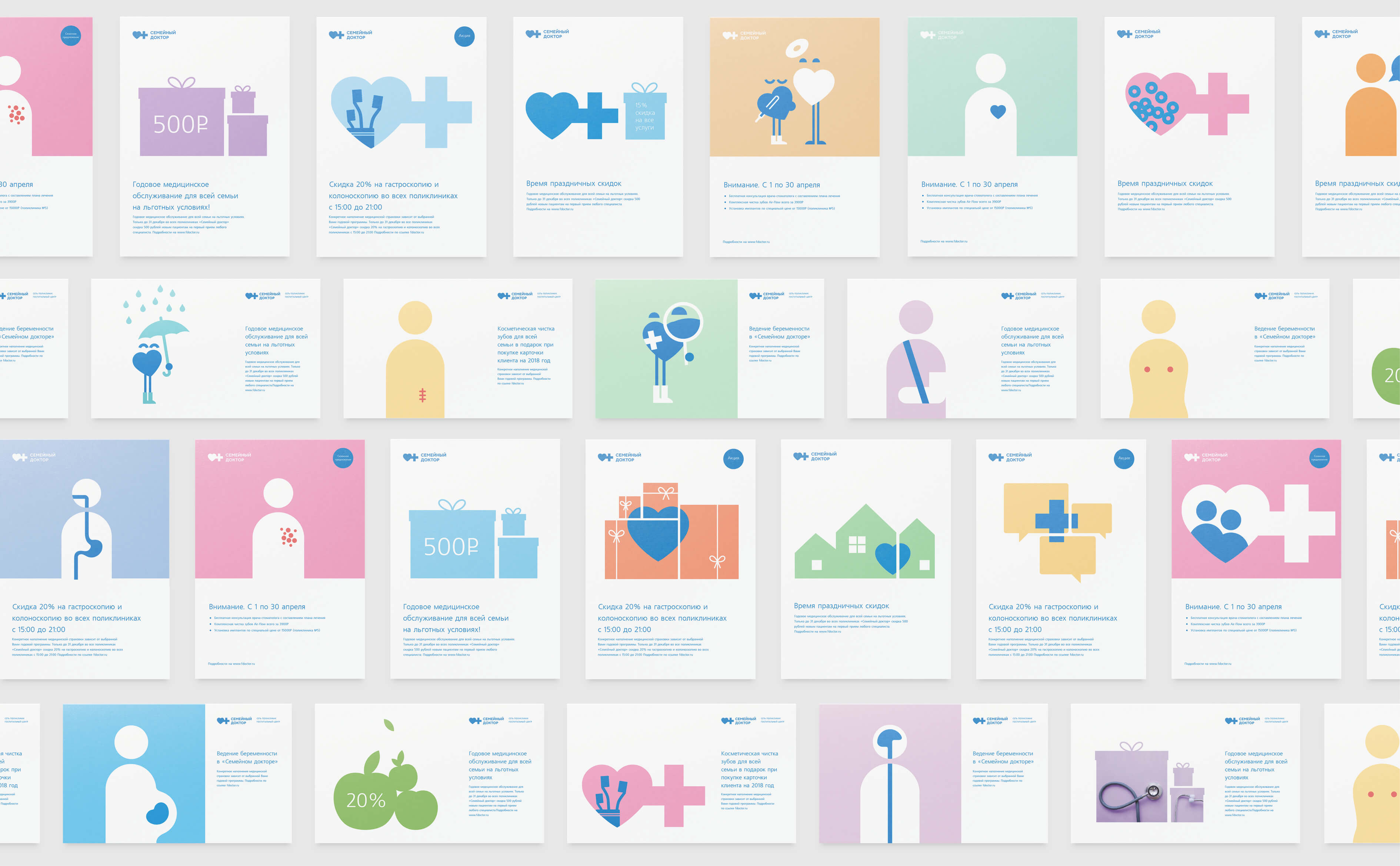
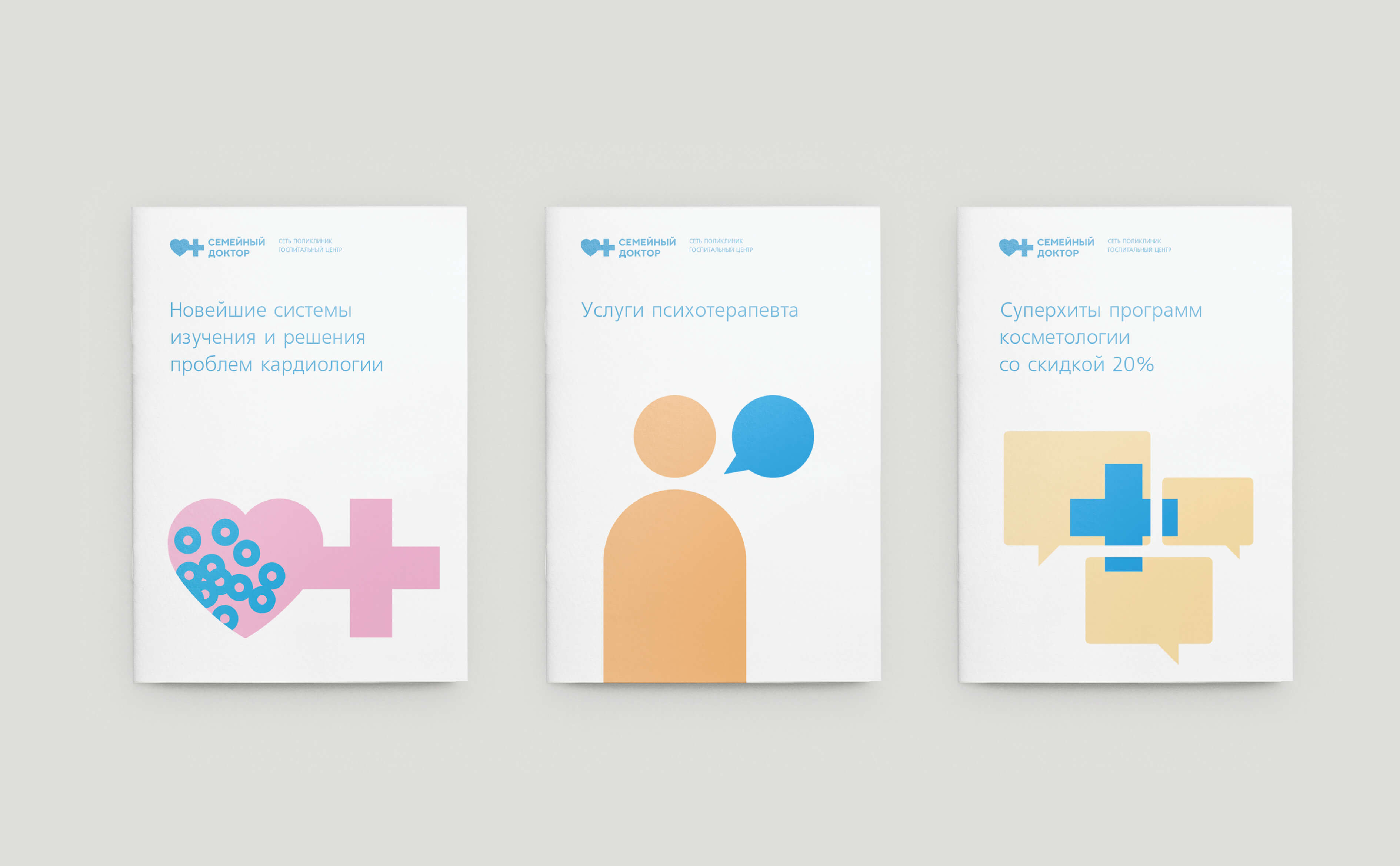
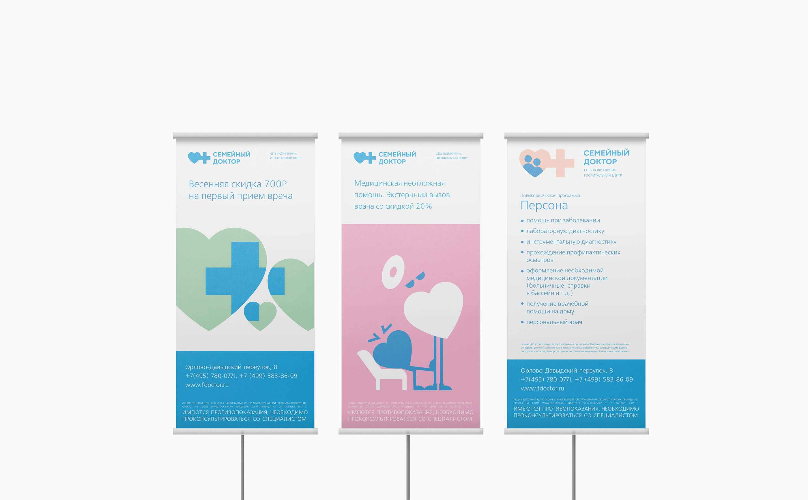
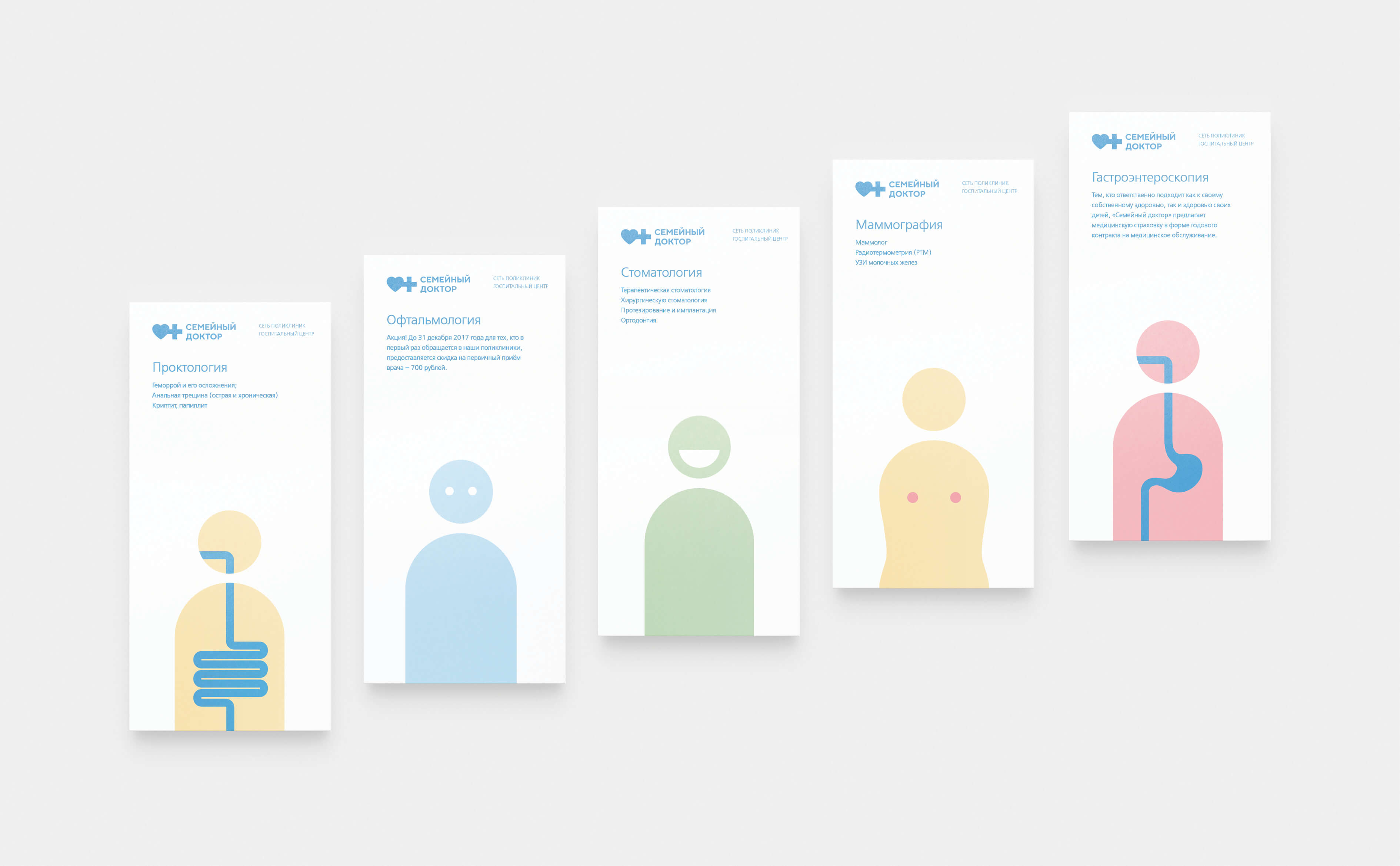
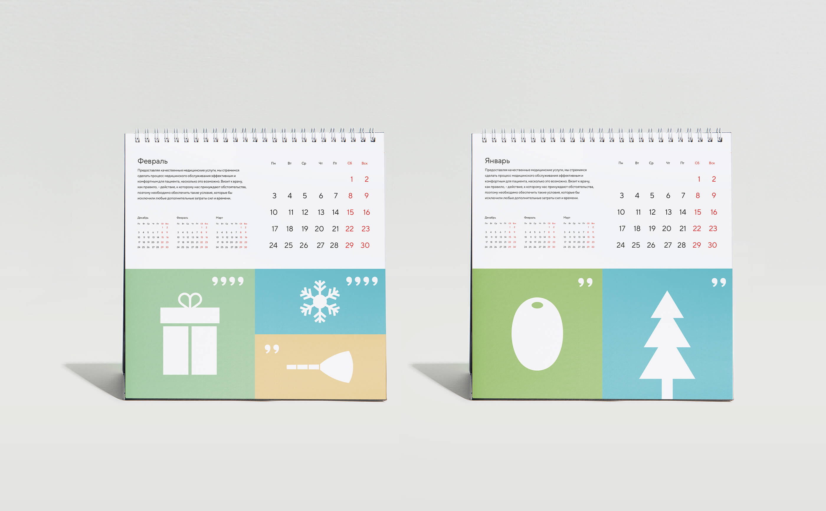
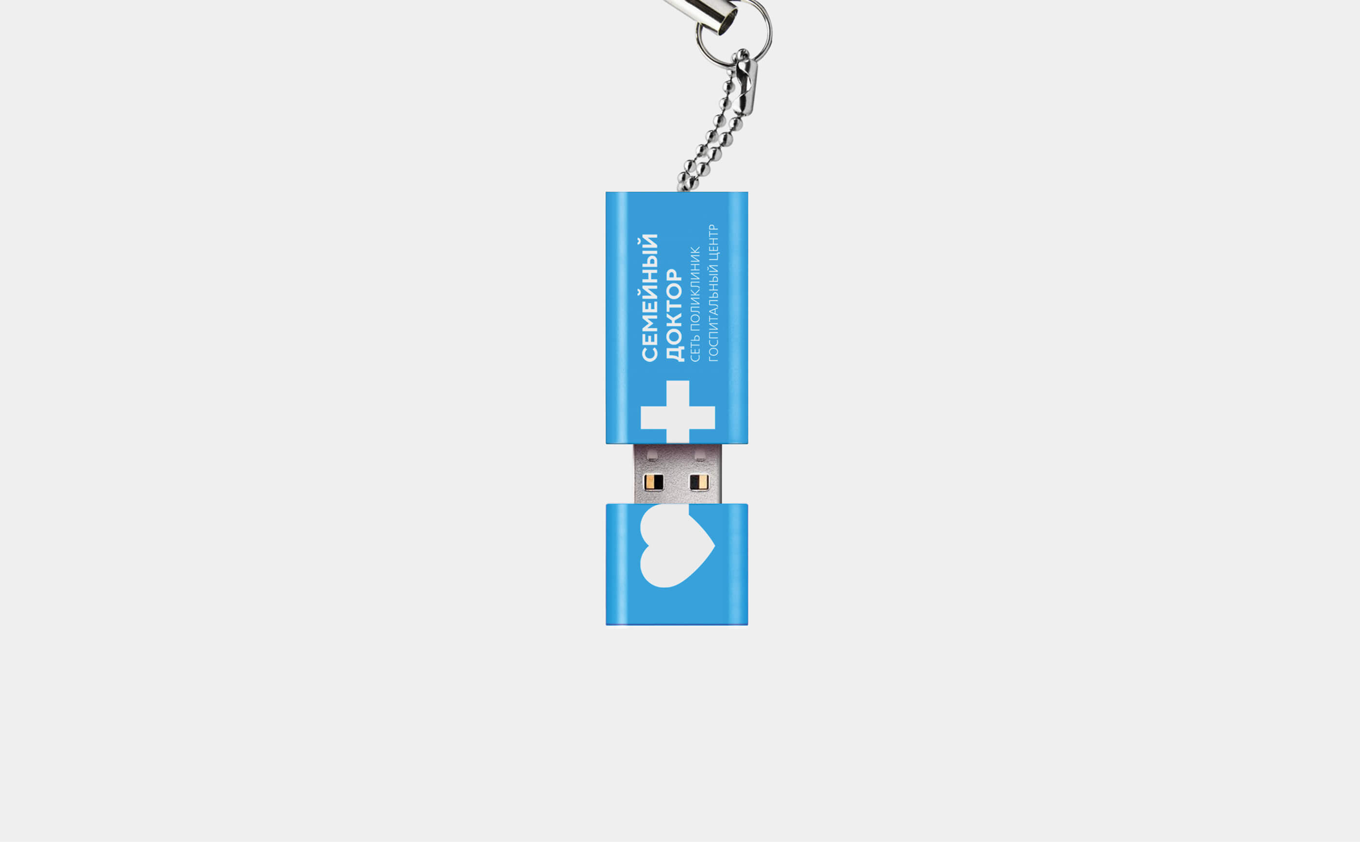
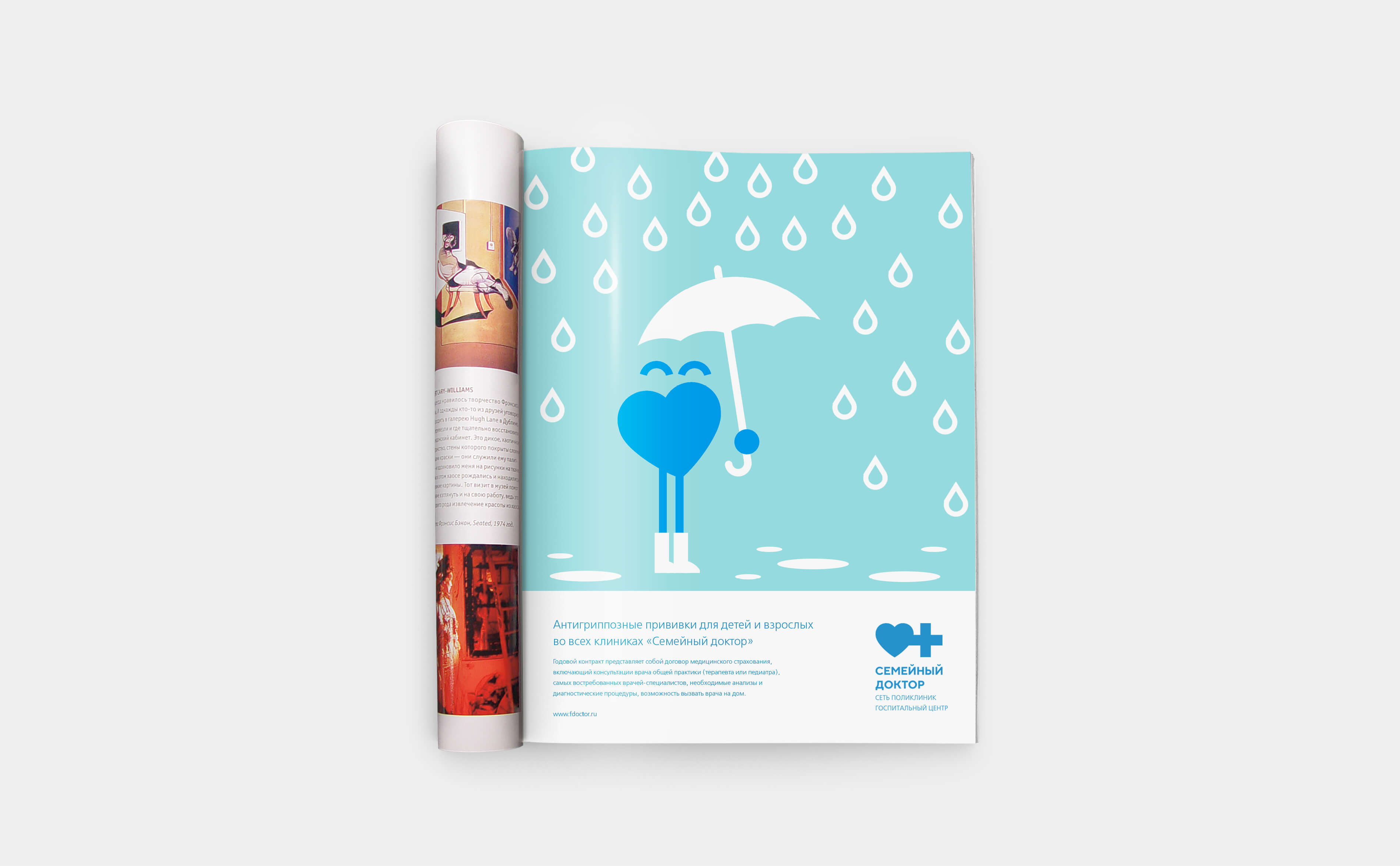
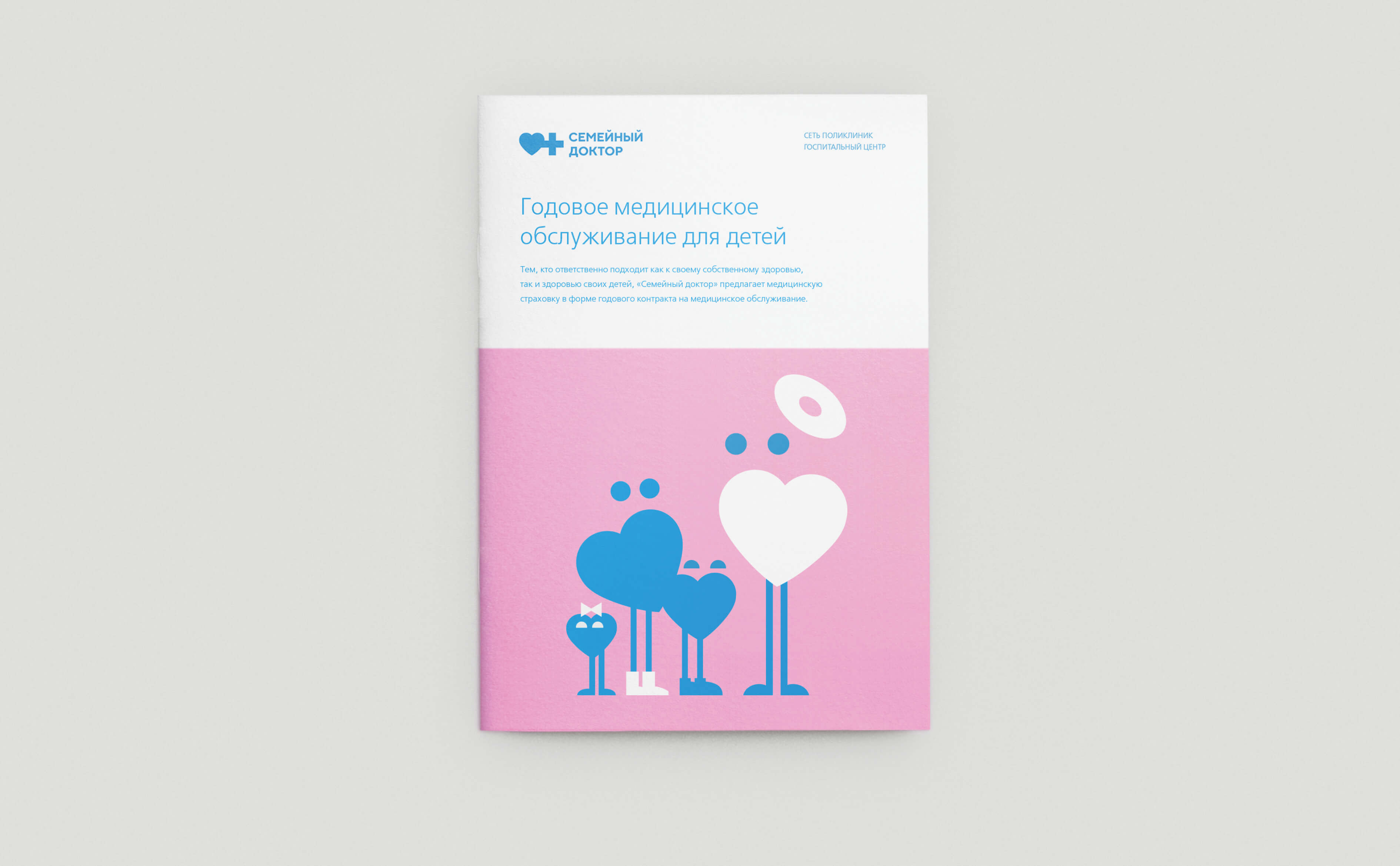
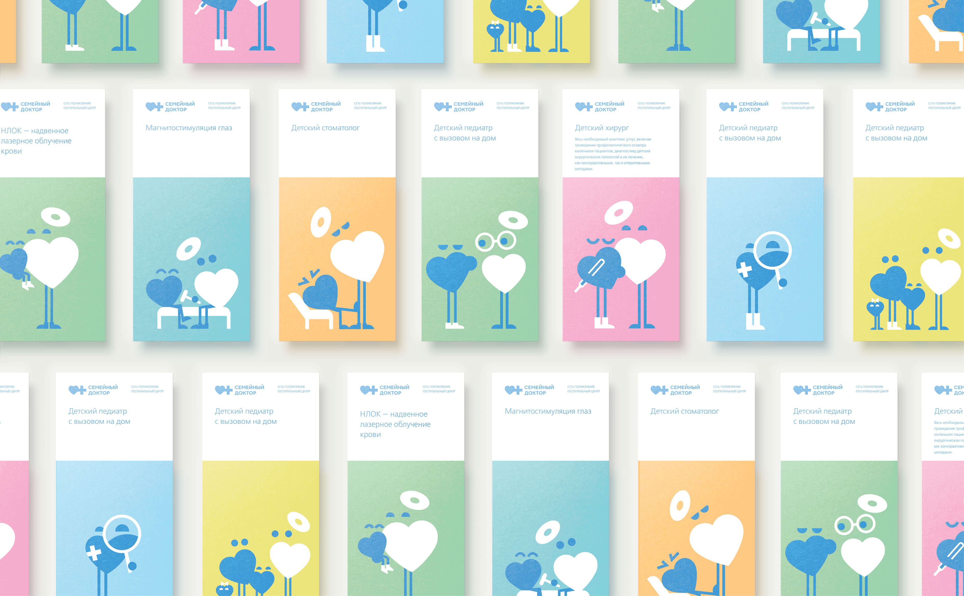
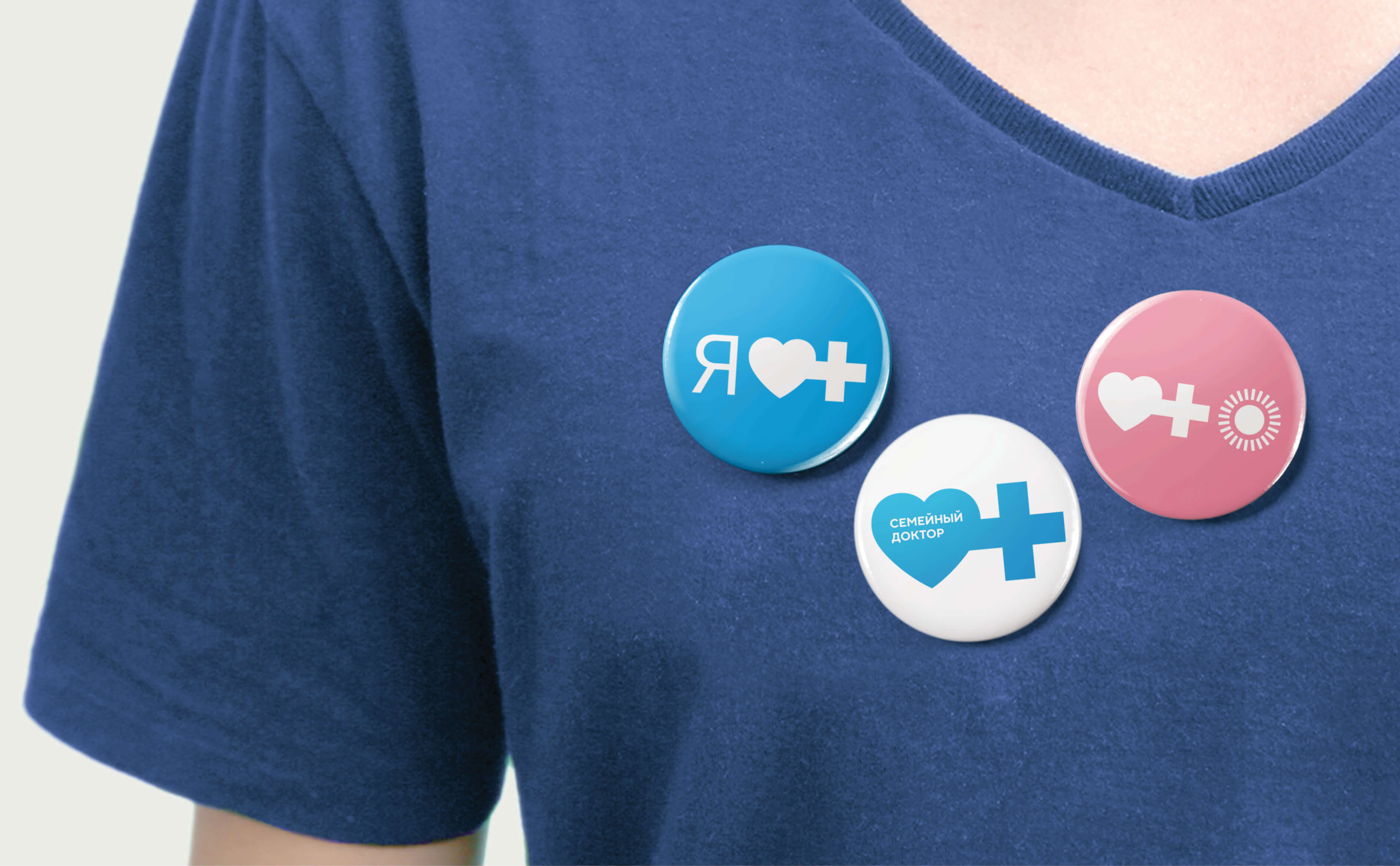
Conception was based on on the idea “Something that unites us”. Every media of style translates the idea of unity. Illustrations for advertising booklets, brochures, leaflets and info posters were generated on the base of laconic geometric objects, graphically combined with extra images. New font and broad set of graphic materials were also created within rebranding – from illustrations to pictograms, navigation for all network clinics, new advertising forms and facade decisions, animation for electronic devices. Extant logo got new meaning and signification. Now it performs as the bases of illustrating medical services.
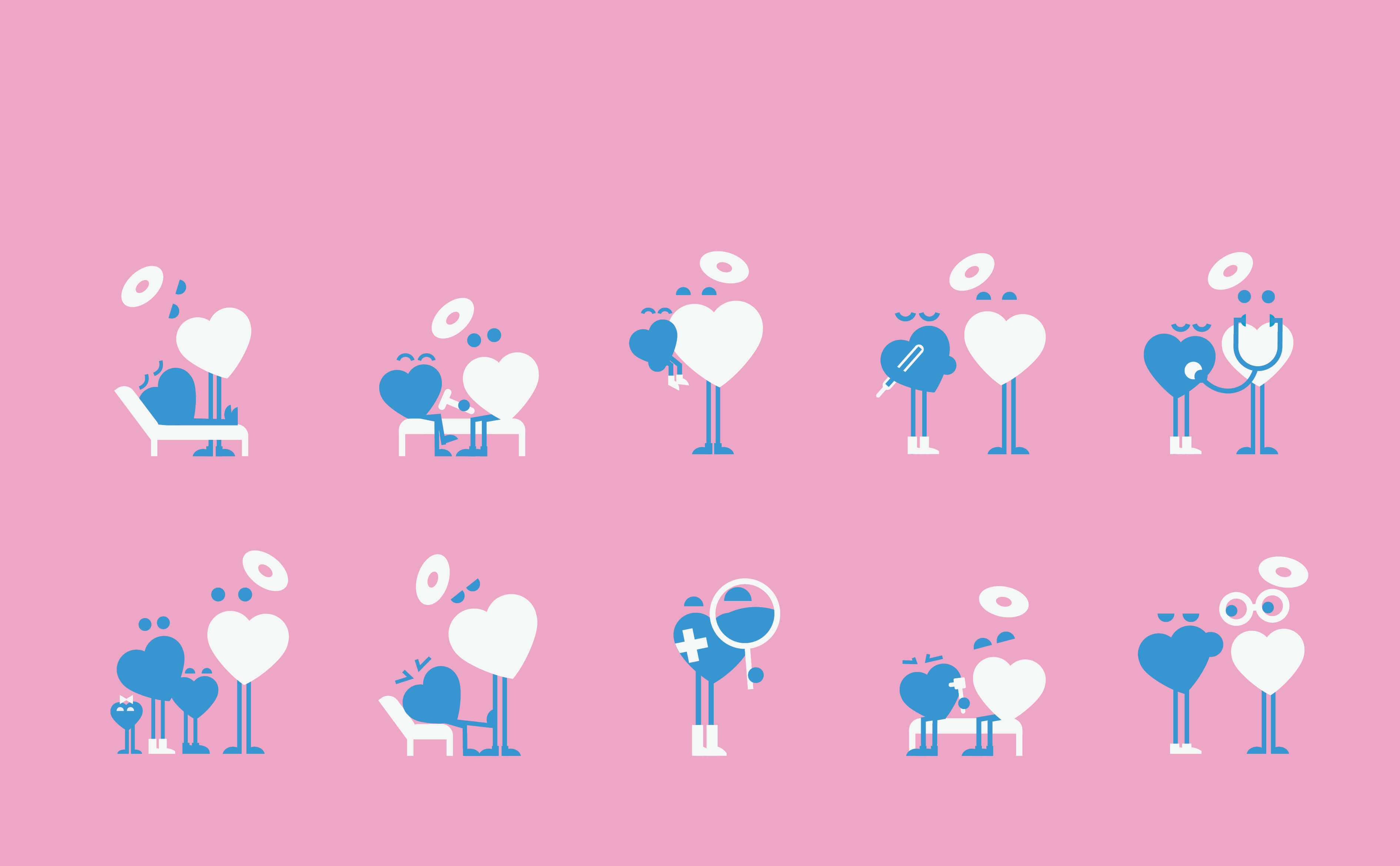
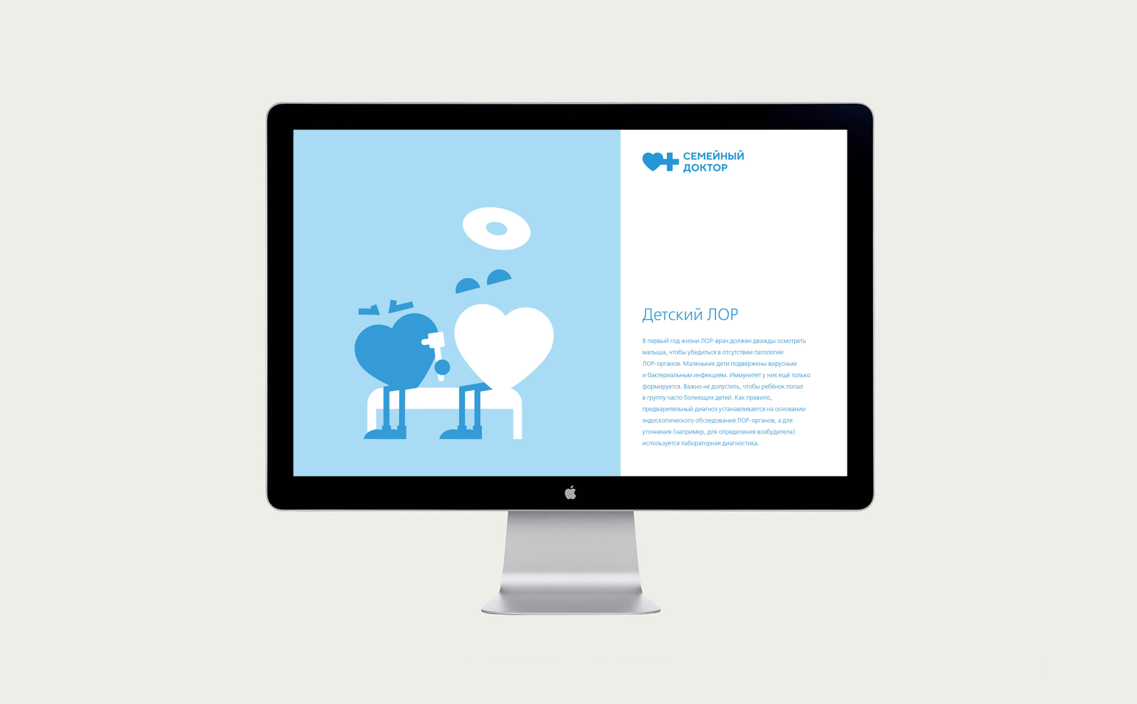
A widespread series of amusing doodles for child polyclinics became a separate illustrative section. Every doodle shows an example of typical scene from child polyclinics with such characters as doctor – white heart, and little patient – small blue heart.
Владимир Лифанов, креативный директор
Евгения Максимова, дизайнер
Марина Локтеева, аккаунт-директор
ADCR Awards, bronze
Sreda, shortlist