


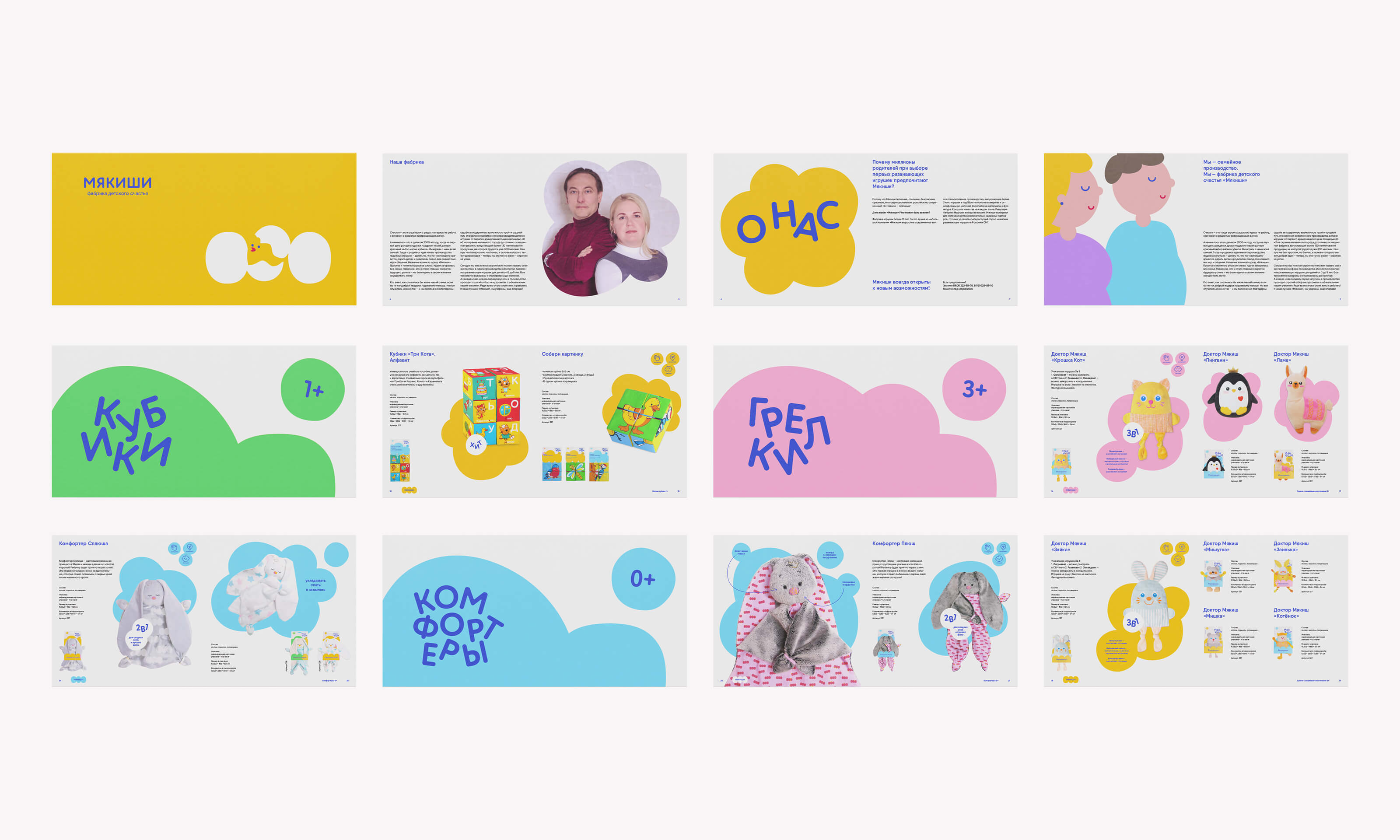


Myakishi
Manufacture “Myakishi” [translates as crumbs] works since 2000. Started with the production of soft cubes for babies, the manufacture grows from a small rented workshop of 30 square meters on the outskirts of Borovichi to an equipped factory producing a lot of types of soft toys with three hundred employers.
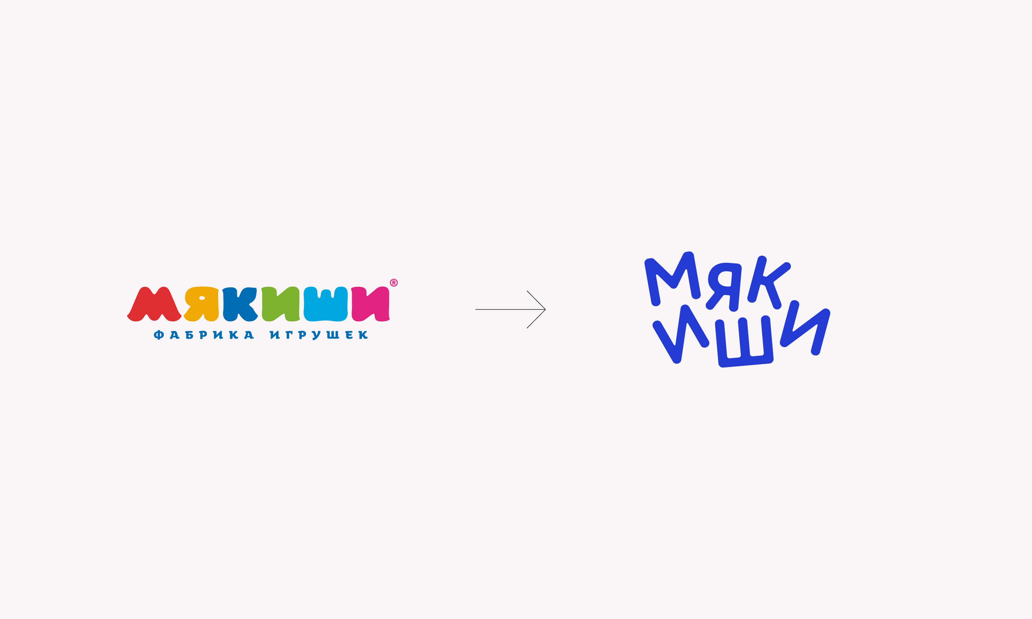
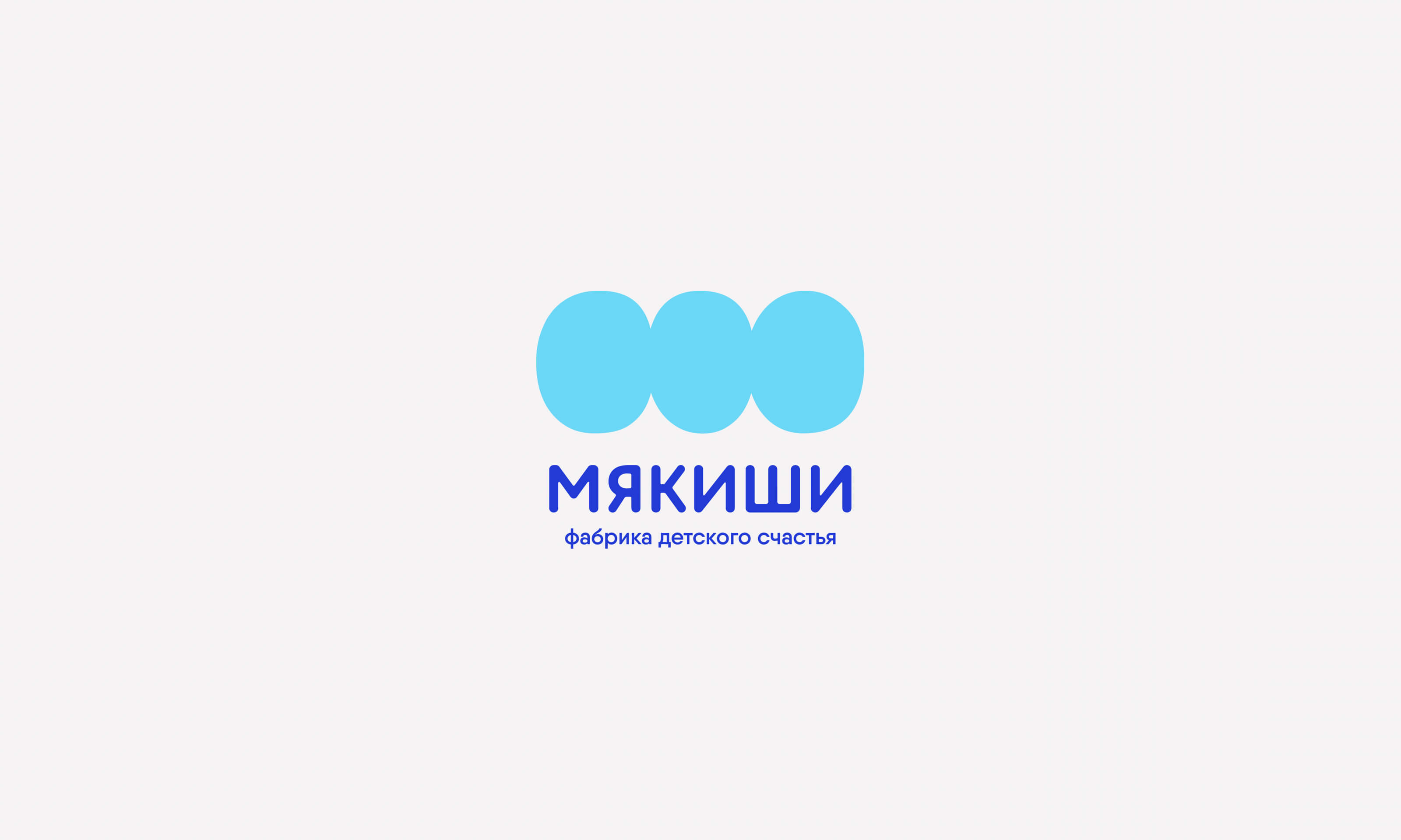
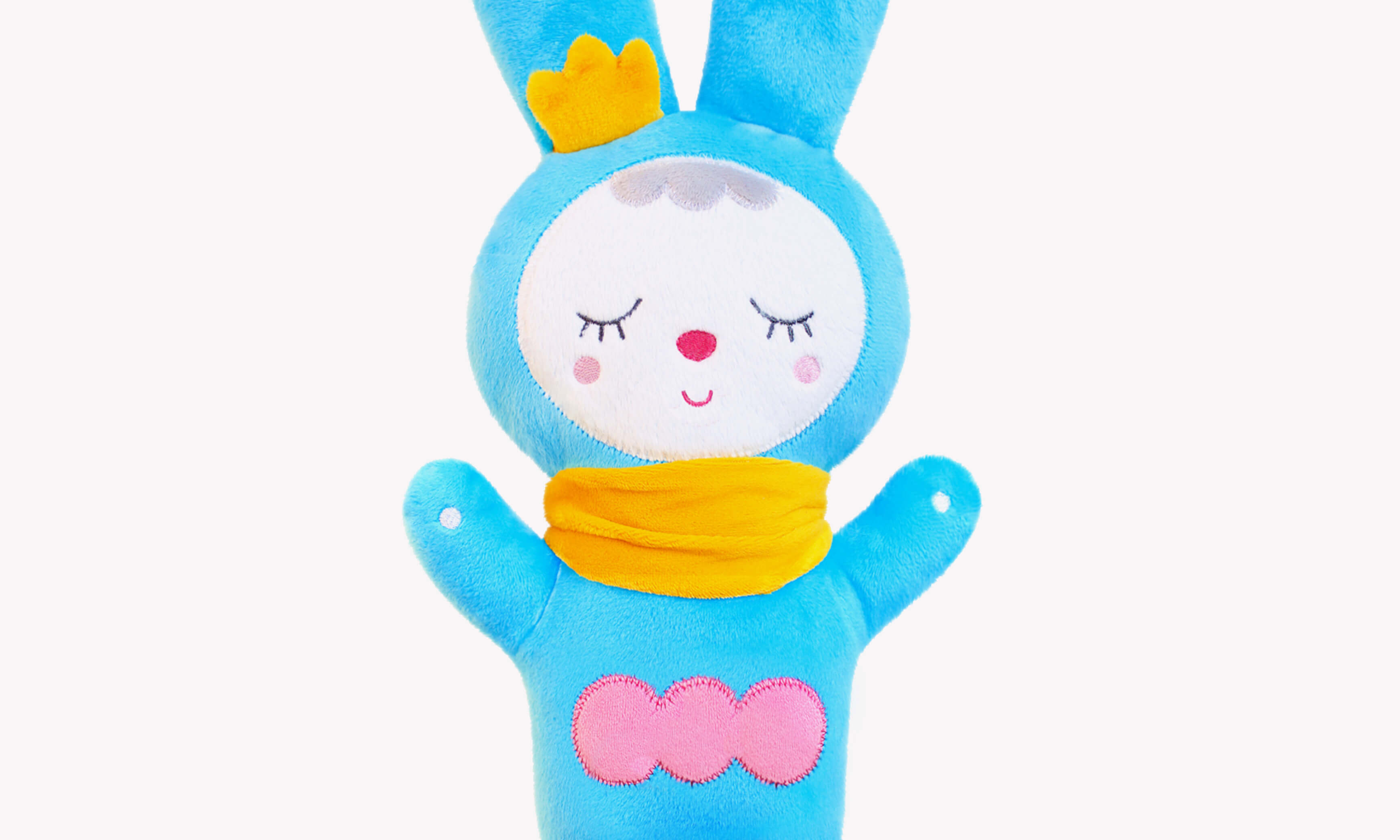
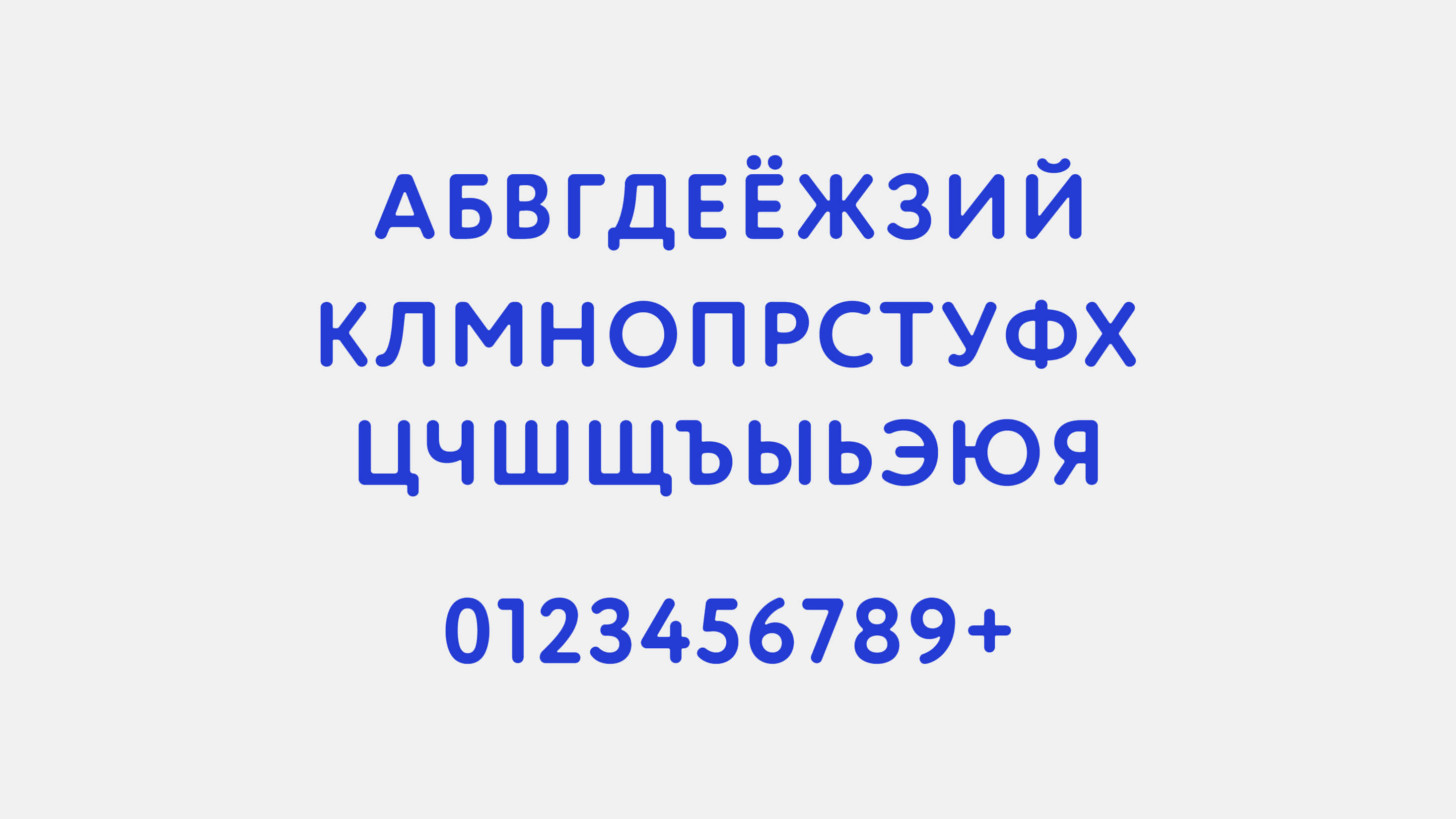
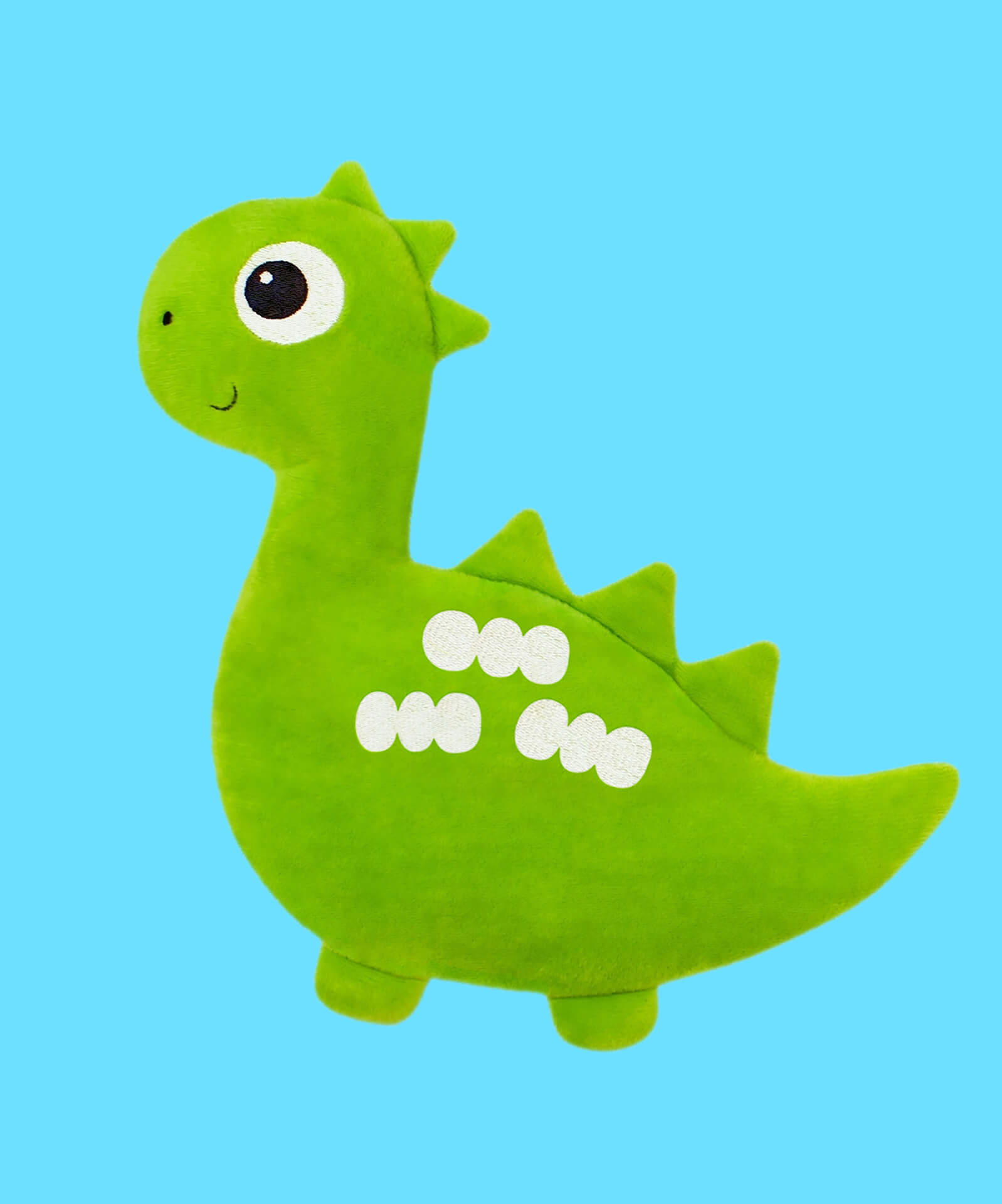
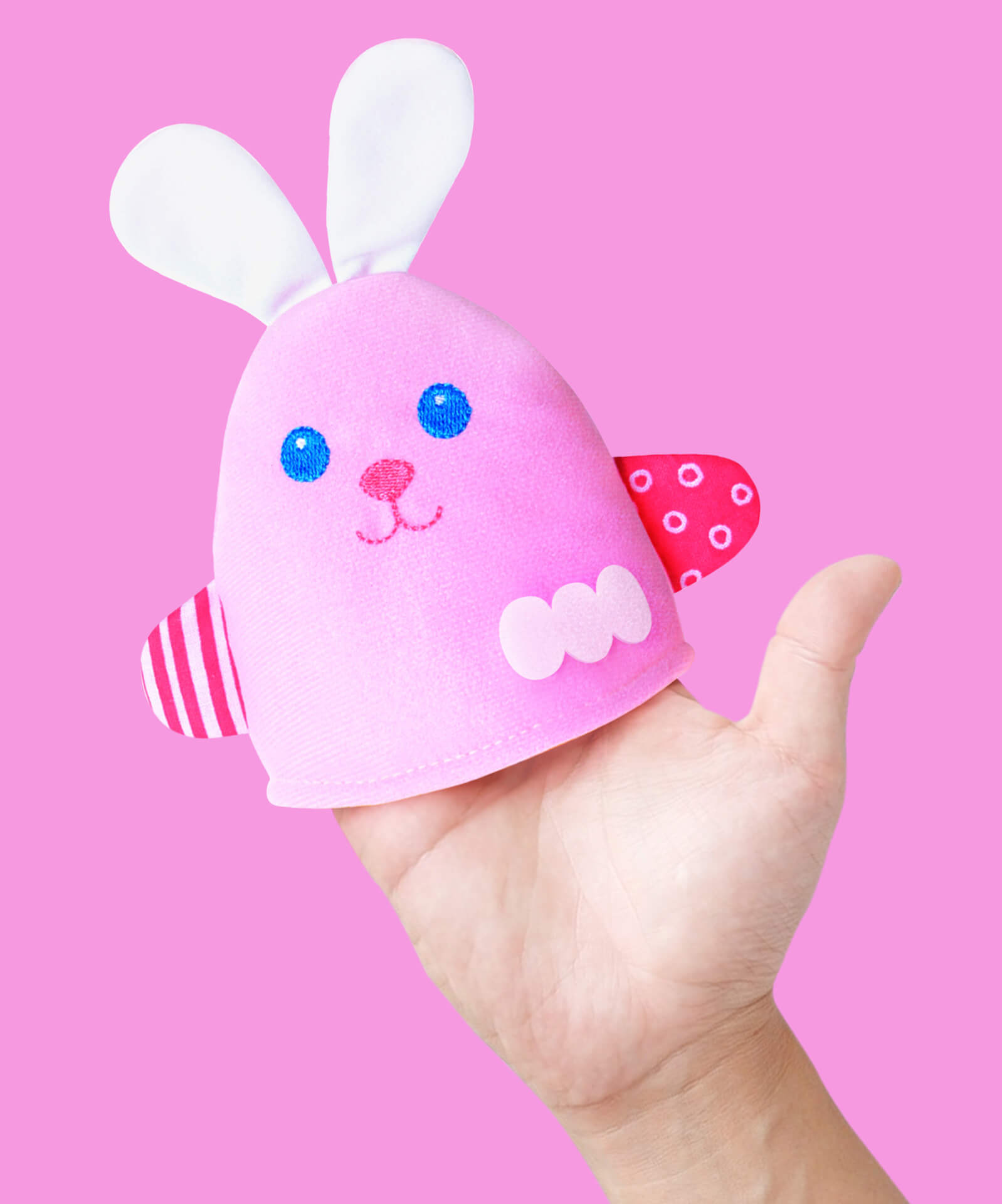
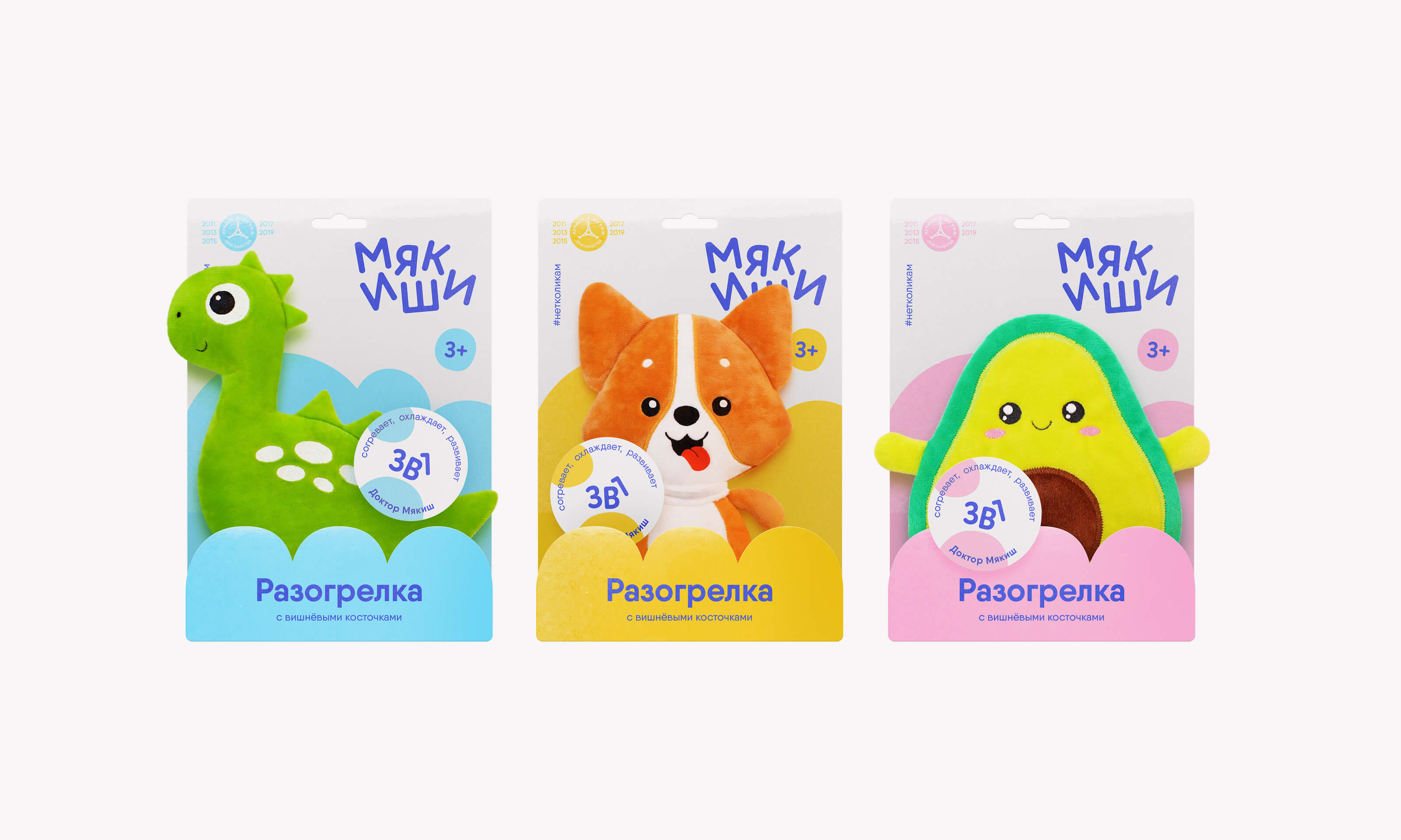
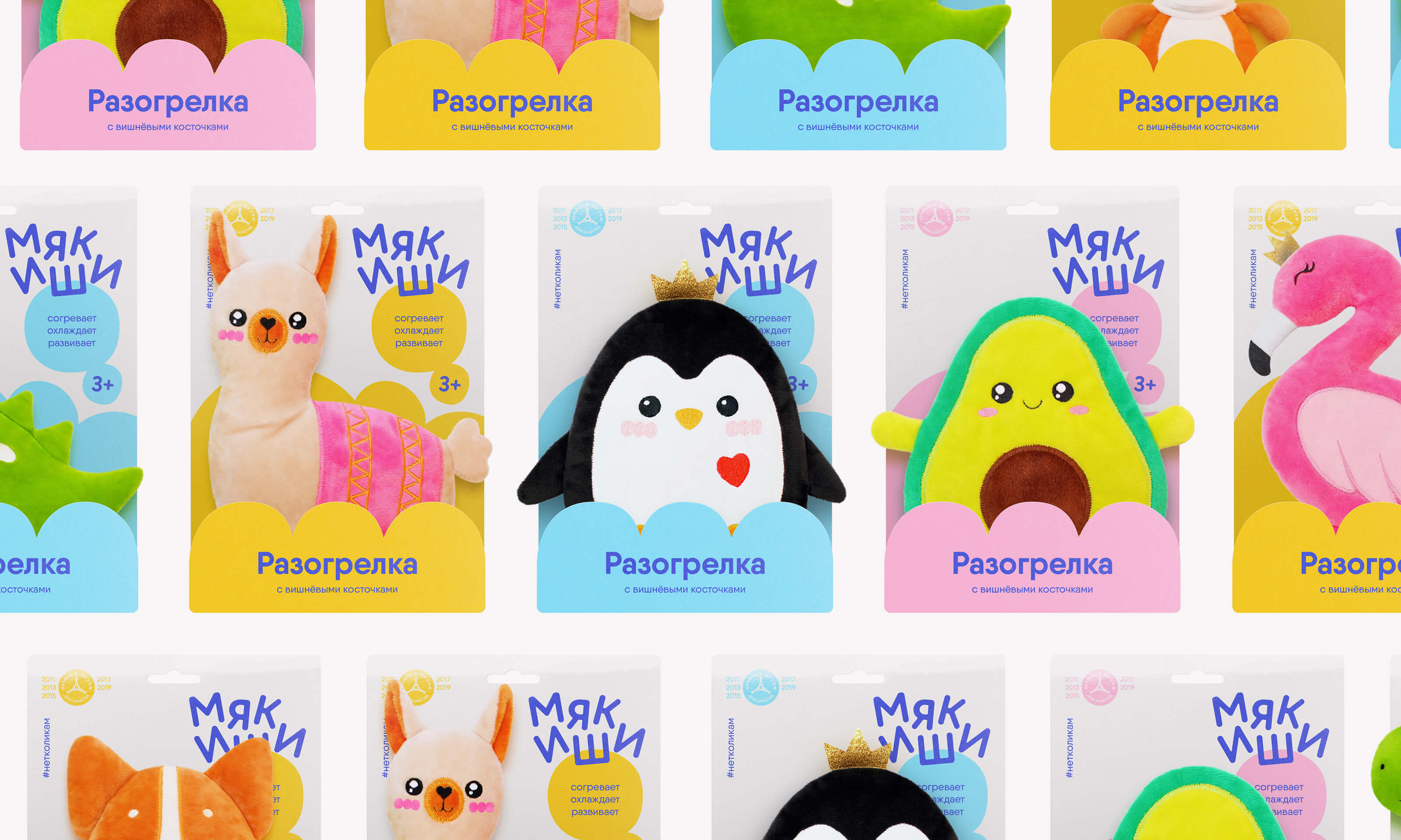
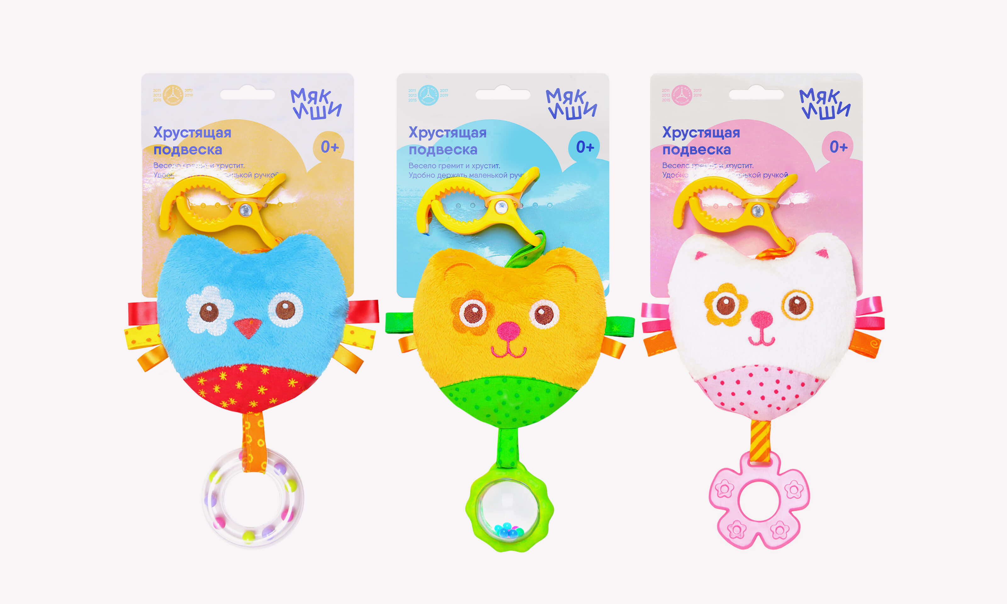
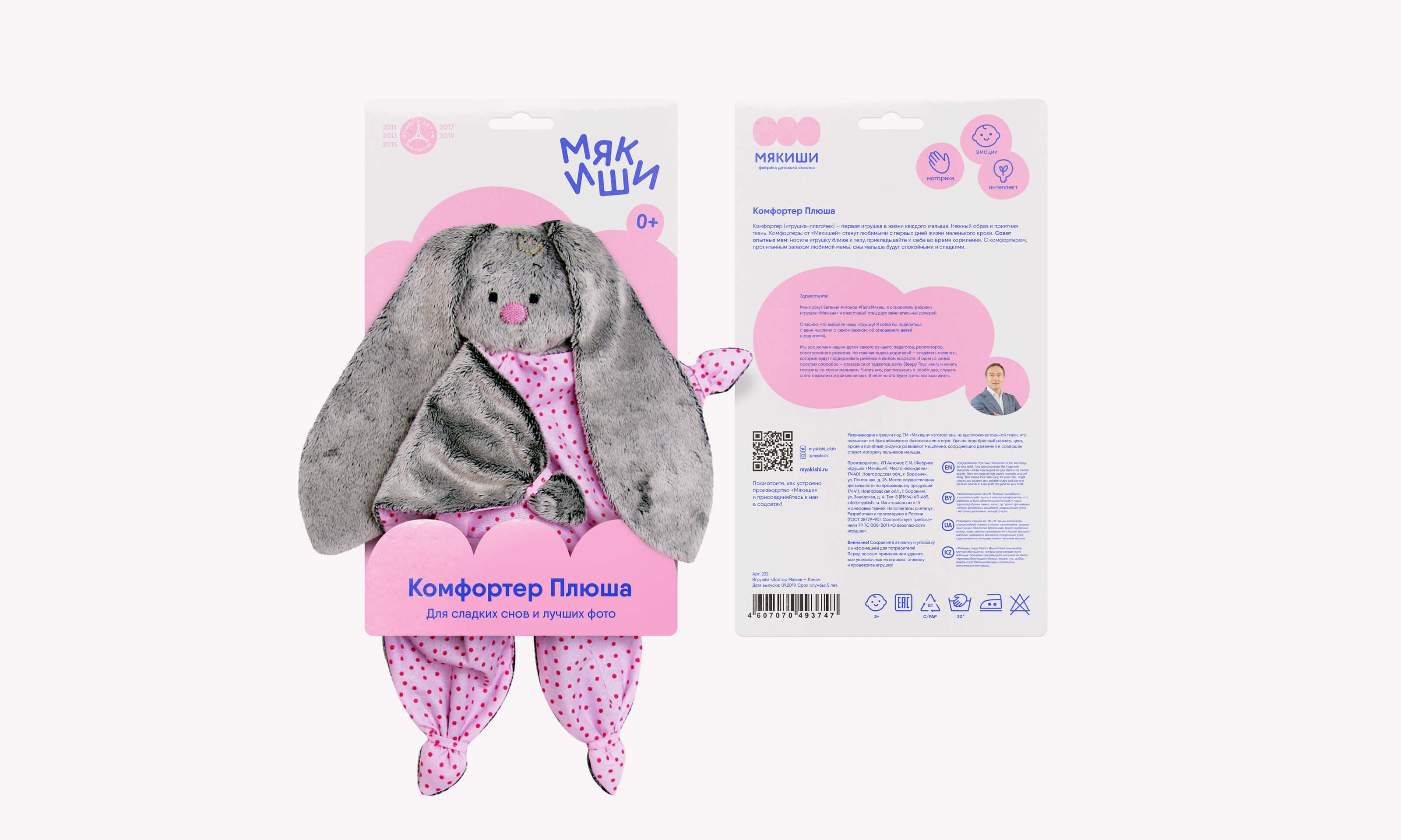
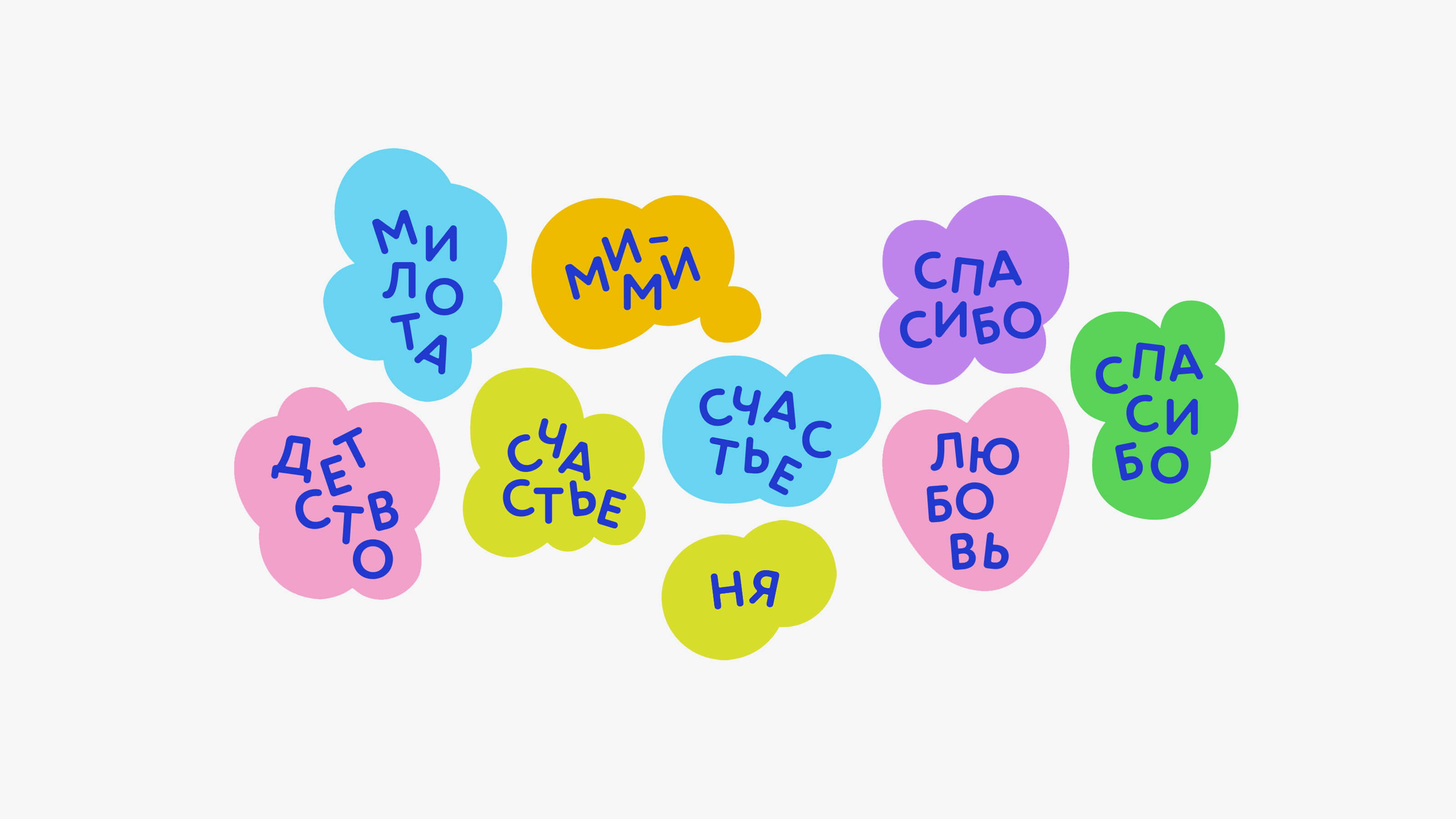
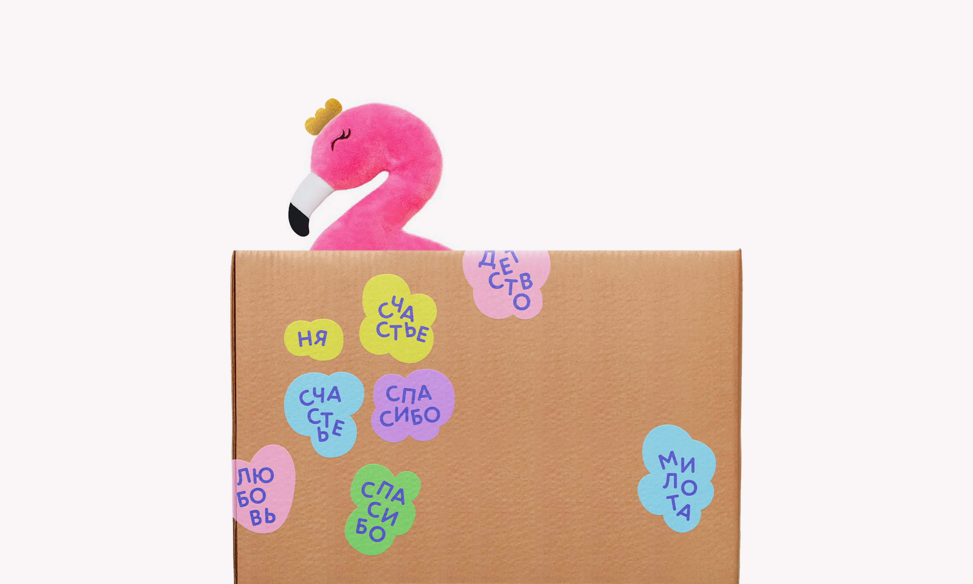
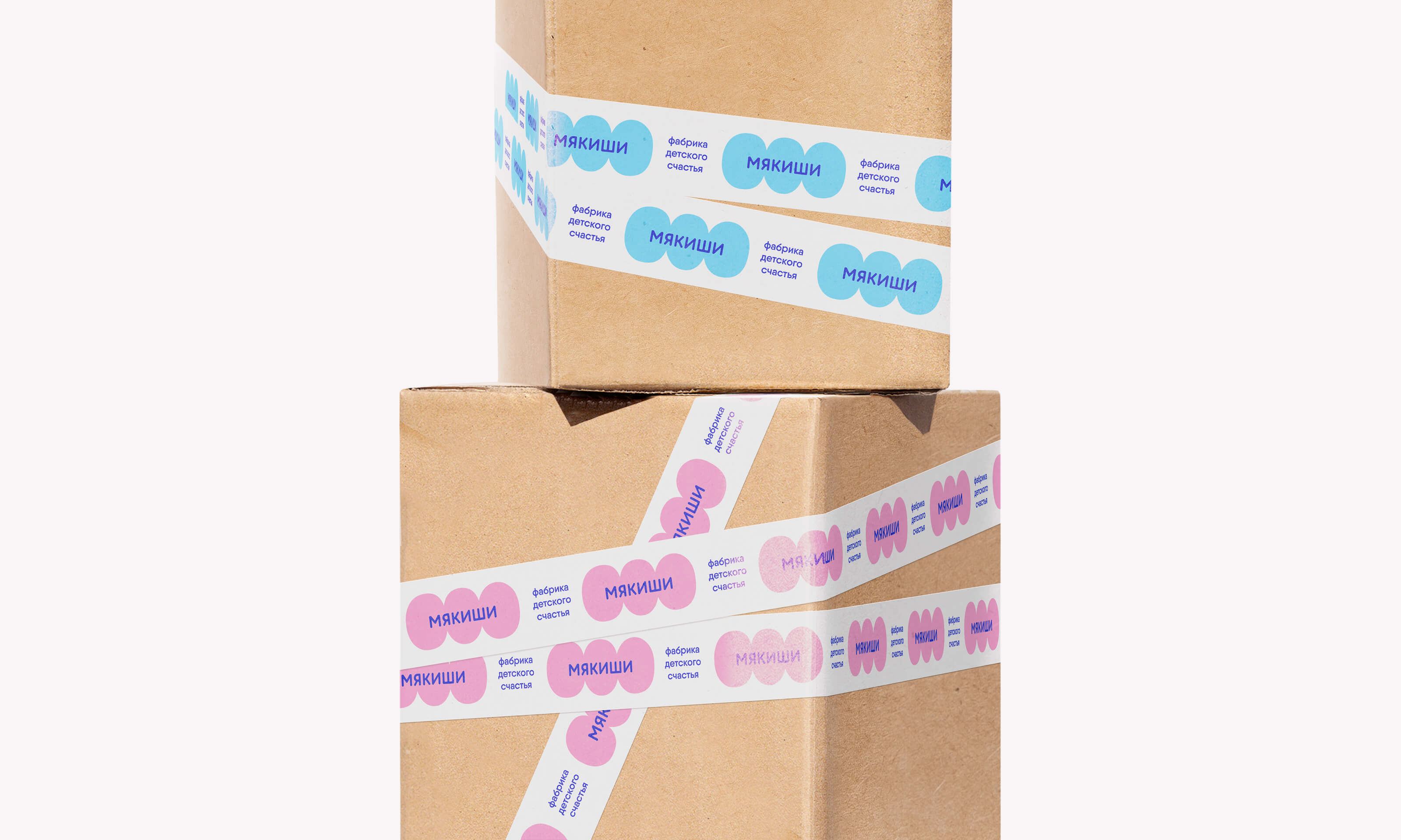
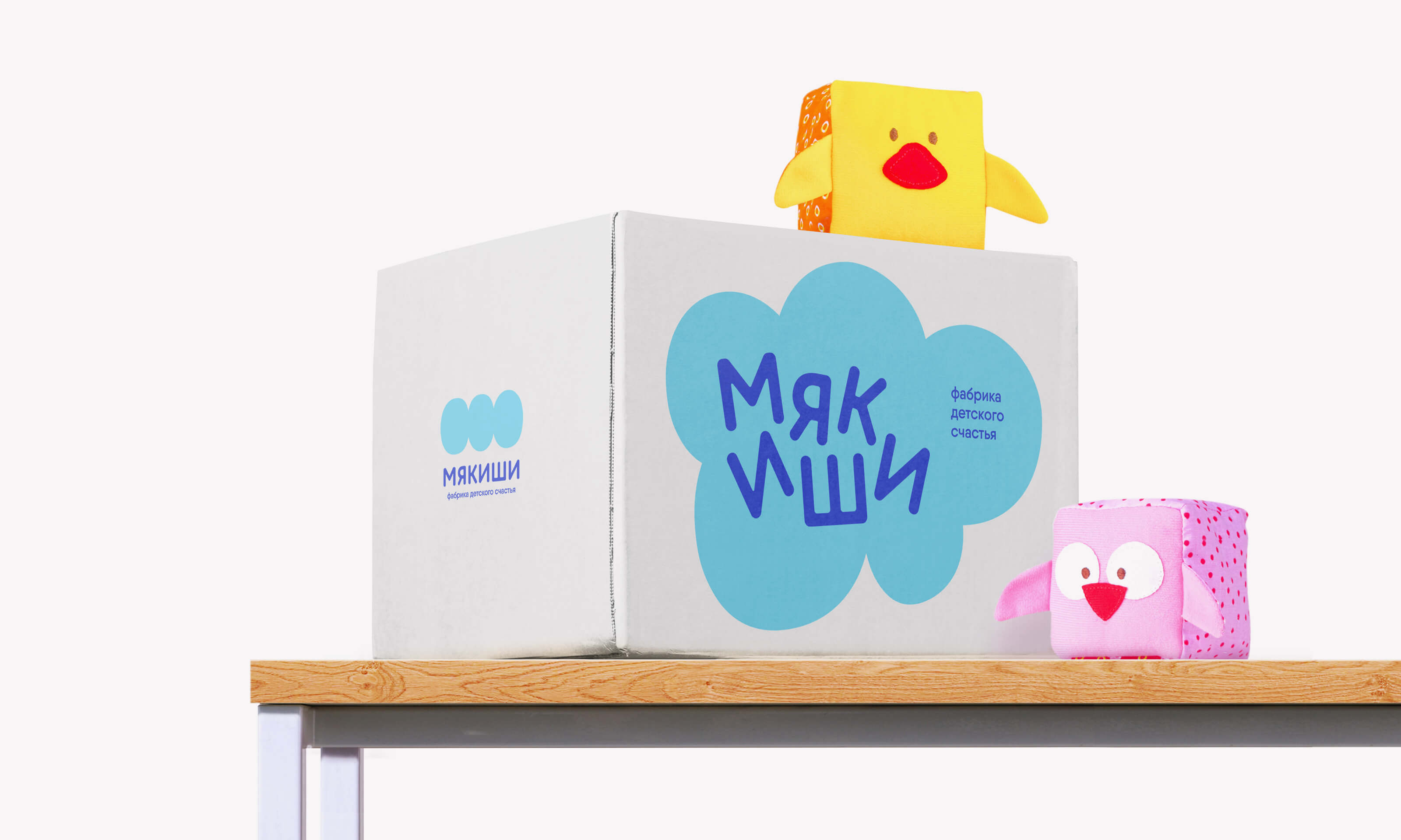
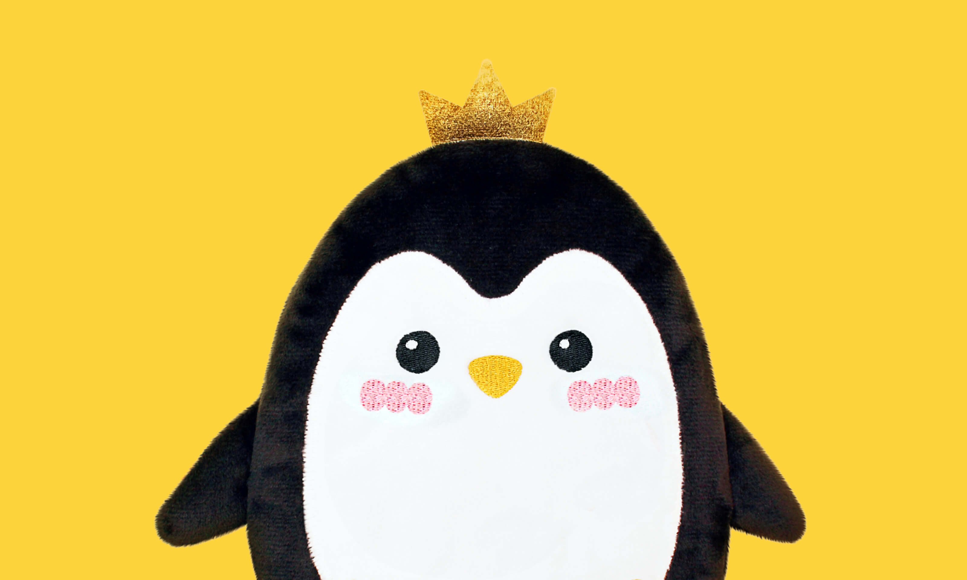
The factory now has a soft monogram symbol and a playful font logo. Round crumbs sticking together into simple cloud-like shapes. And the toys themselves are now seated on a soft cloud in each package. And all this is supported by a soft, rounded font that directly supports the factory’s slogan – “Childhood without sharp corners.”
Теперь у фабрики мягкий символ-монограмма и играючий шрифтовой лого. Мякиши-кругляши, слипающиеся в простые облакообразные формы, стали основным генератором графики. А сами игрушки теперь усажены на мягкое облачко в каждой упаковке. И все это поддерживается мягким округлым шрифтом, буквально транслирующим слоган фабрики — «Детство без острых углов».
Владимир Лифанов, креативный директор
Евгения Максимова, дизайнер
Алёна Шульга, дизайнер
Валерия Вайцеховская, дизайнер
Анастасия Хорошилова, дизайнер
Яна Попович, аккаунт