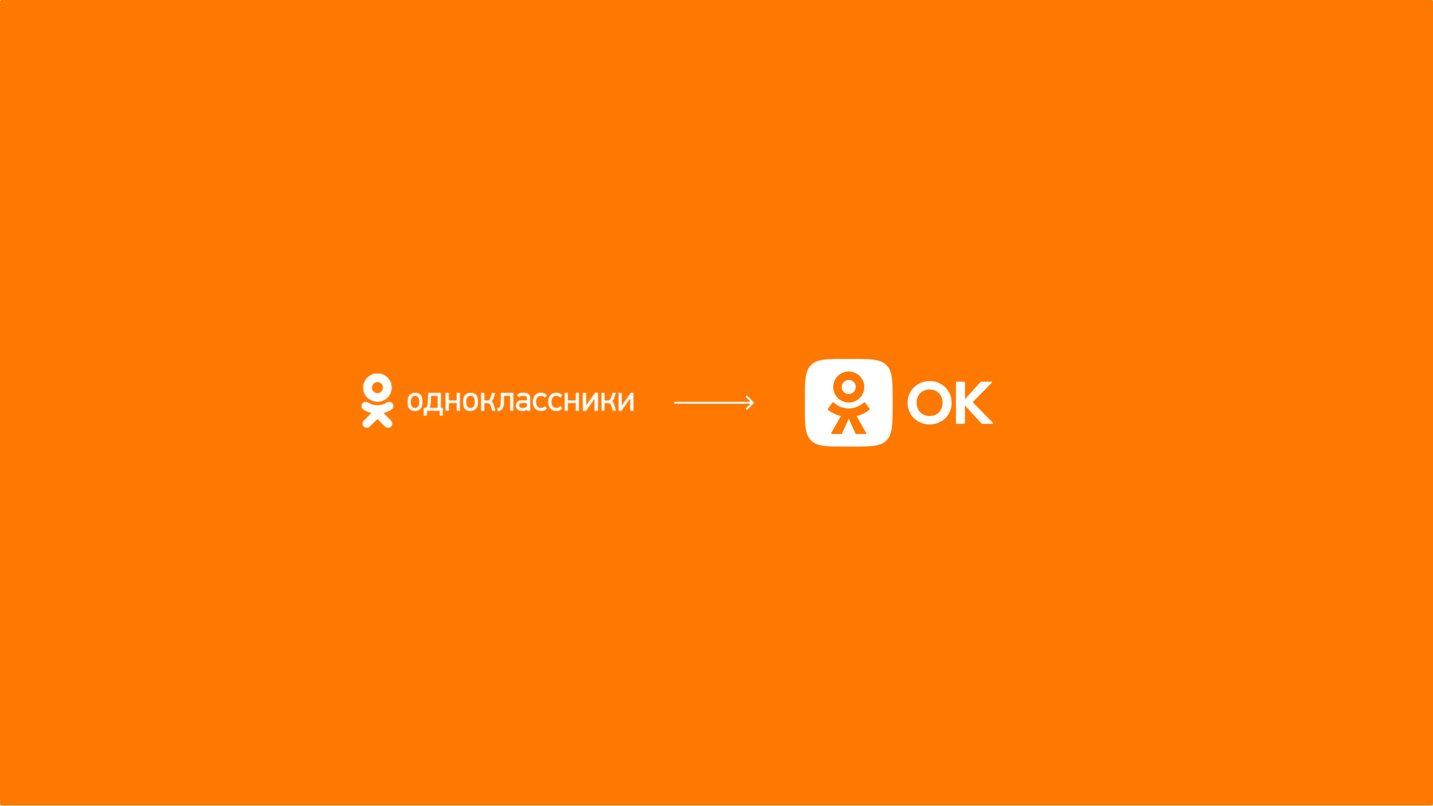
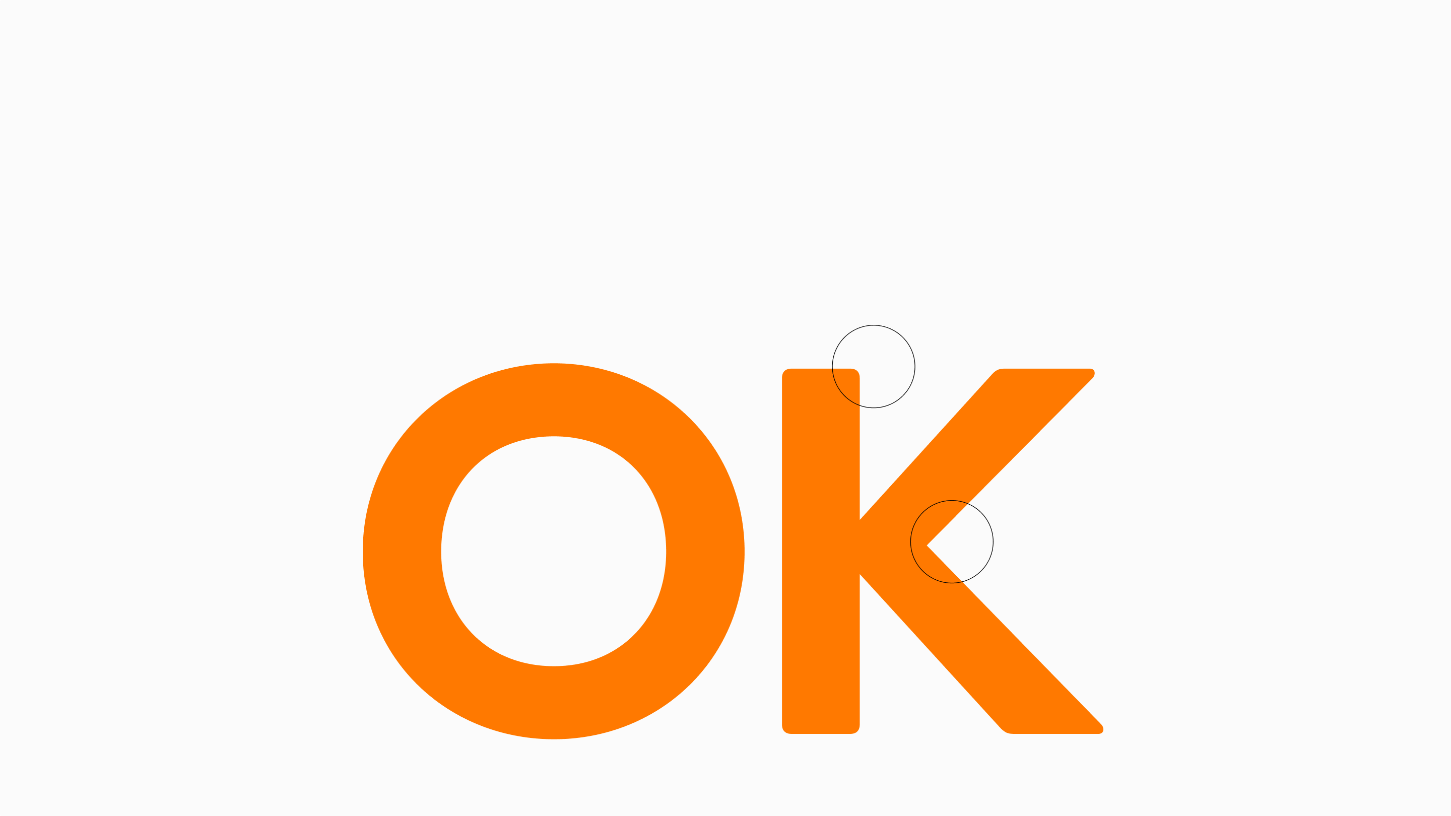
Обновлённый символ стал более устойчивым, чистым и лаконичным. А название от длинных «одноклассников» перешло к короткому и ёмкому «ок».

Ok.ru
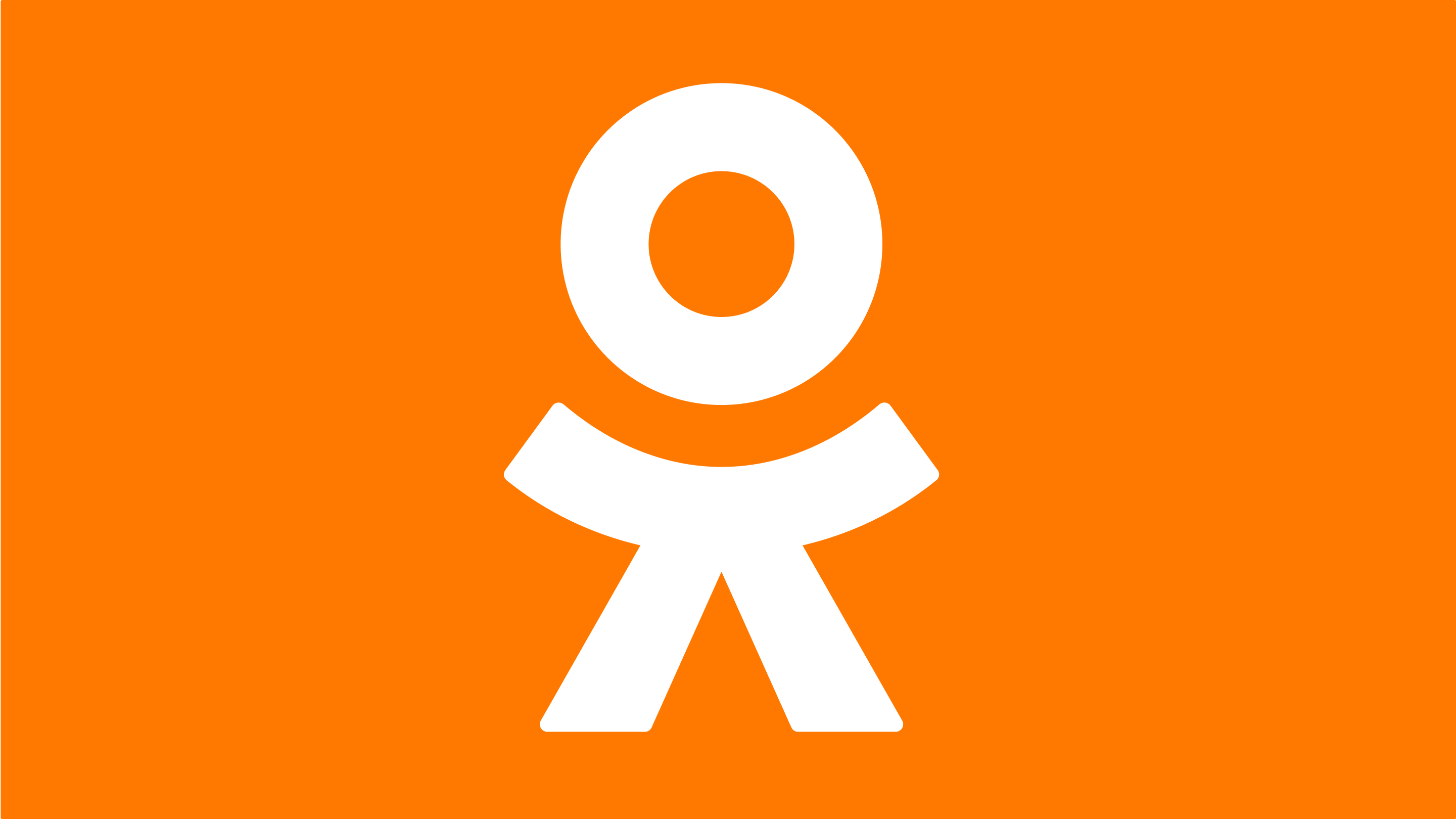
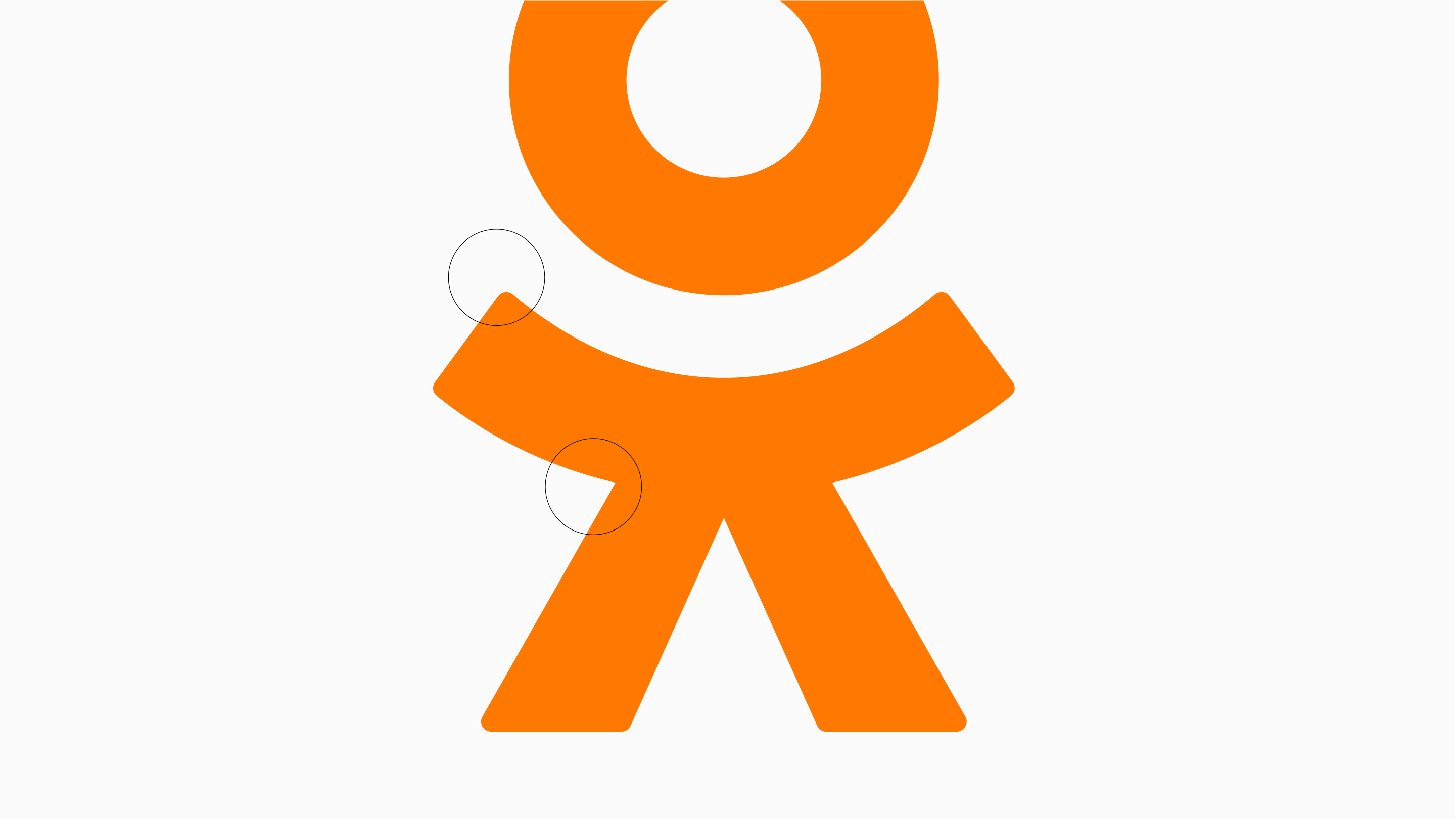
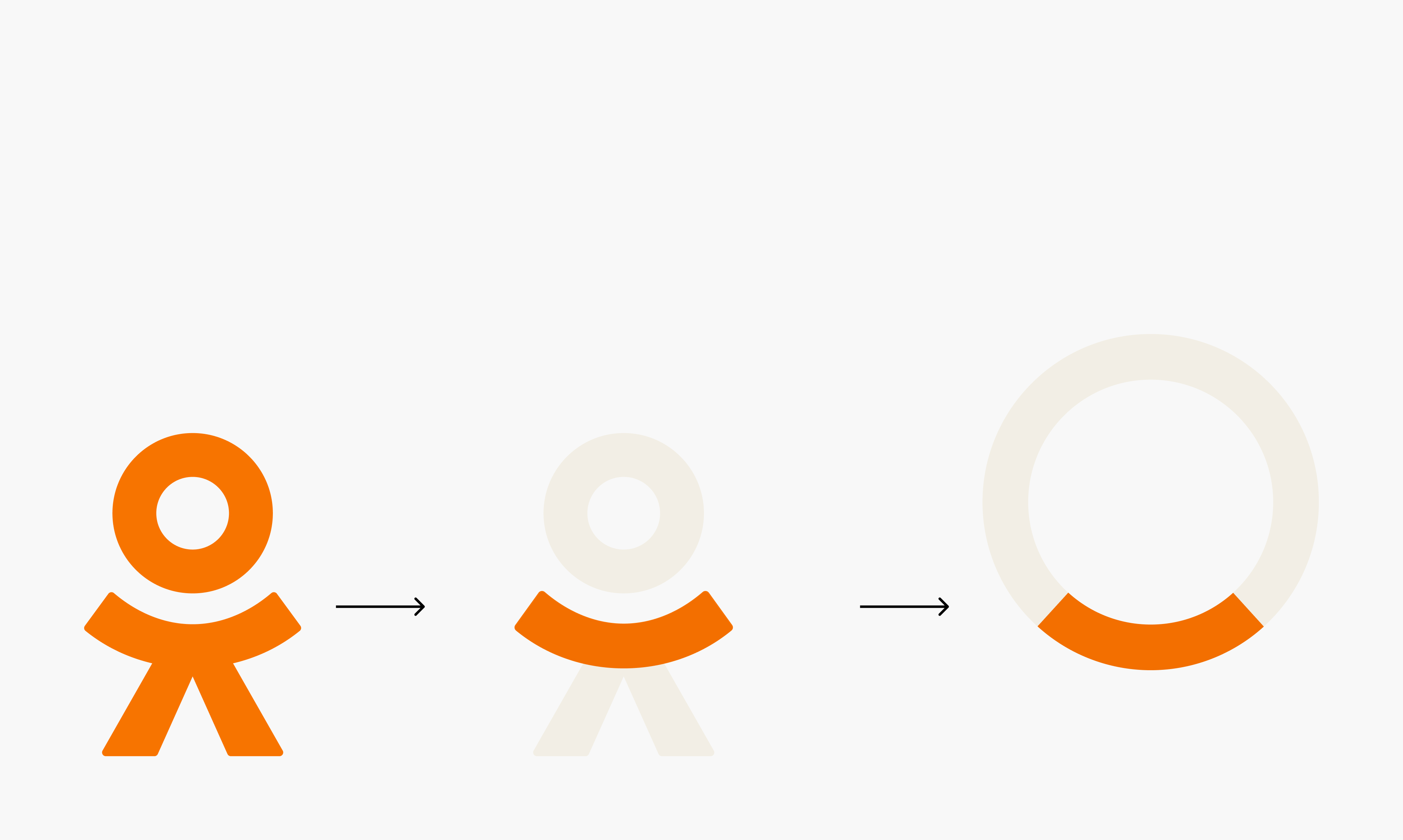
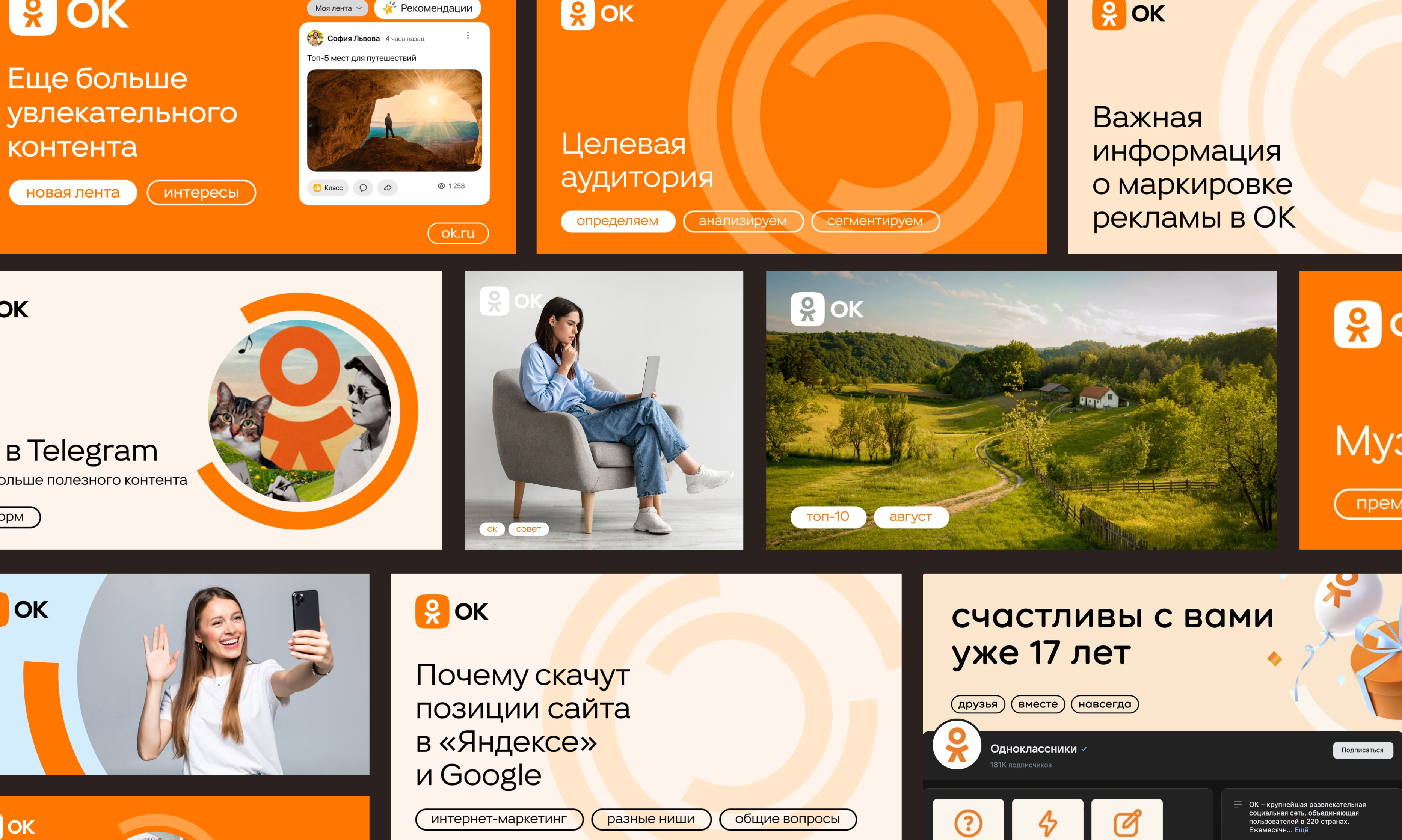
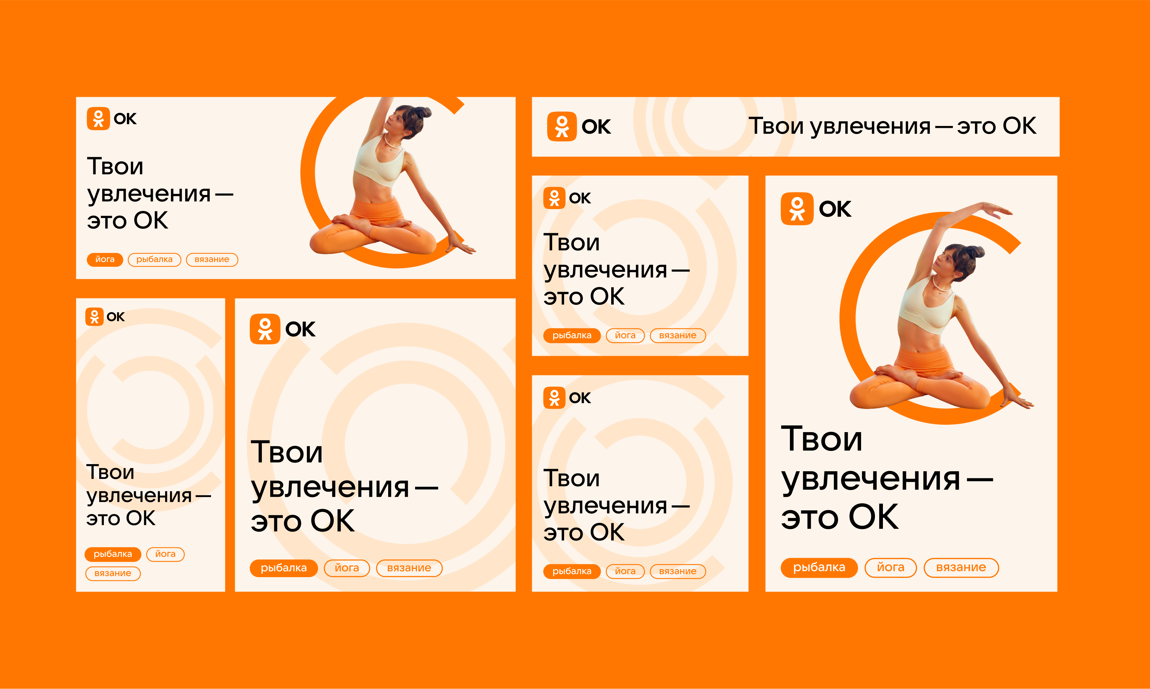
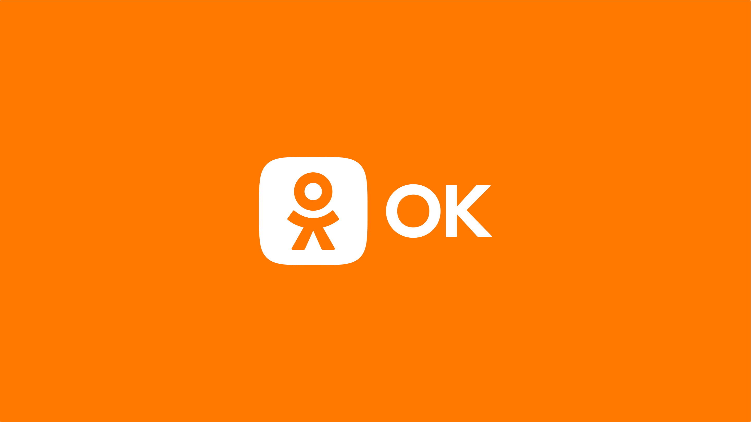
Название продукта сократилось до простой и понятной аббревиатуры ОК. А знак стал строже, увереннее, но сохранил свой дружелюбный характер. Теперь фирменный персонаж твердо стоит на ногах внутри иконки приложения. Радиус скруглений стал меньше как у знака, так и у написания, что избавило логотип от излишней мягкости и инфантильности.
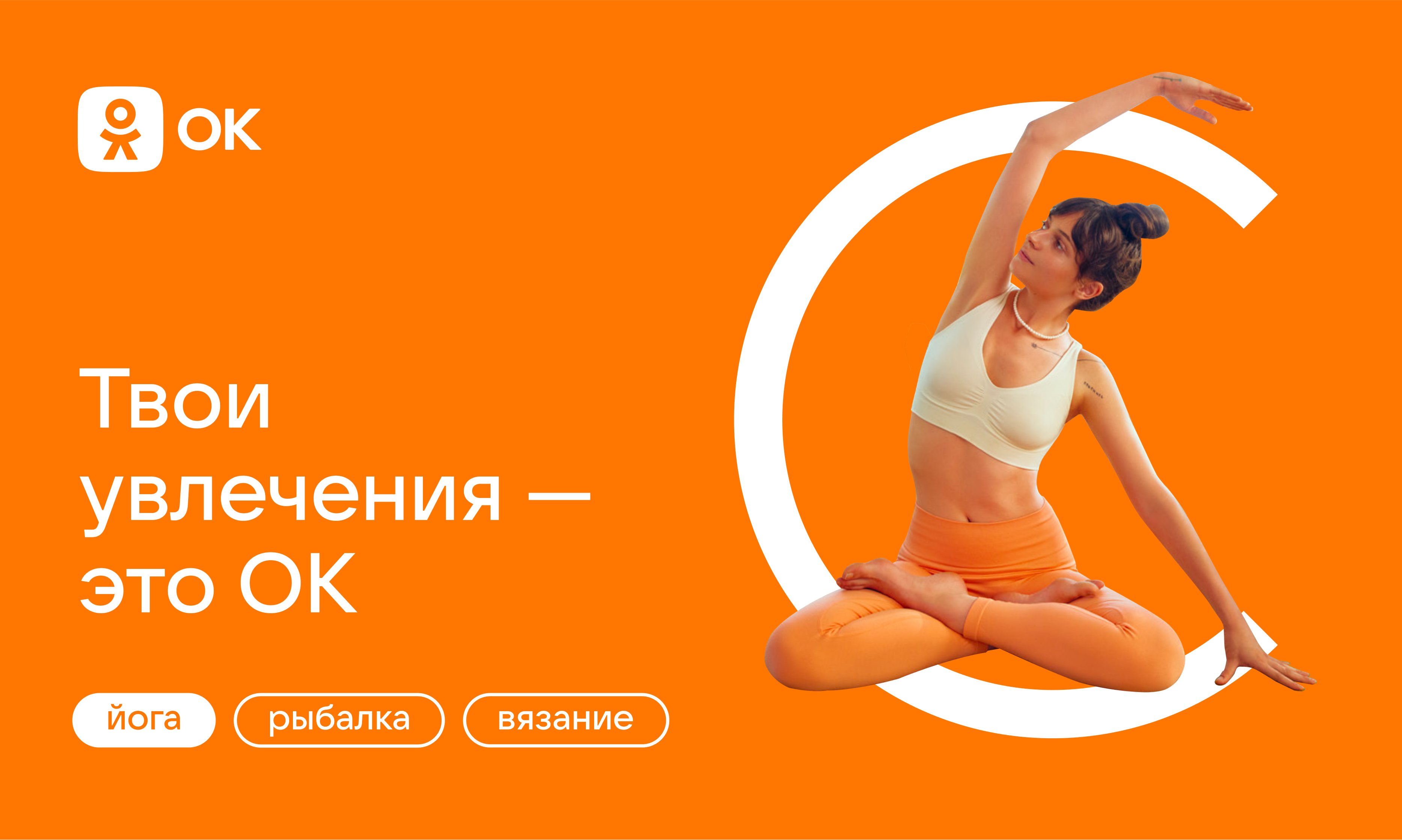
Фирменный оранжевый стал более насыщенным и ярким. В целом логотип стал технологичнее, он хорошо воспринимается в цифровом пространстве, вызывает положительные эмоции, запоминается и соответствует новому позиционированию. В поддержку ему создается фирменный шрифт и айдентика, в основе которой лежит идея человекоцентричности.
Обновлённый символ стал более устойчивым, чистым и лаконичным. А название от длинных «одноклассников» перешло к короткому и ёмкому «ок».
Владимир Лифанов, креативный директор
Ирина Сахарова, арт-директор
Даша Грекова, дизайнер
Лена Рязанцева, дизайнер
Анна Семёнова, аккаунт
Мария Казакевич, аккаунт