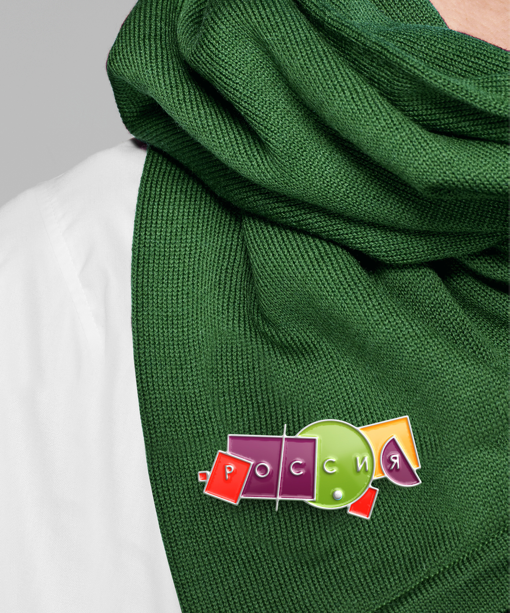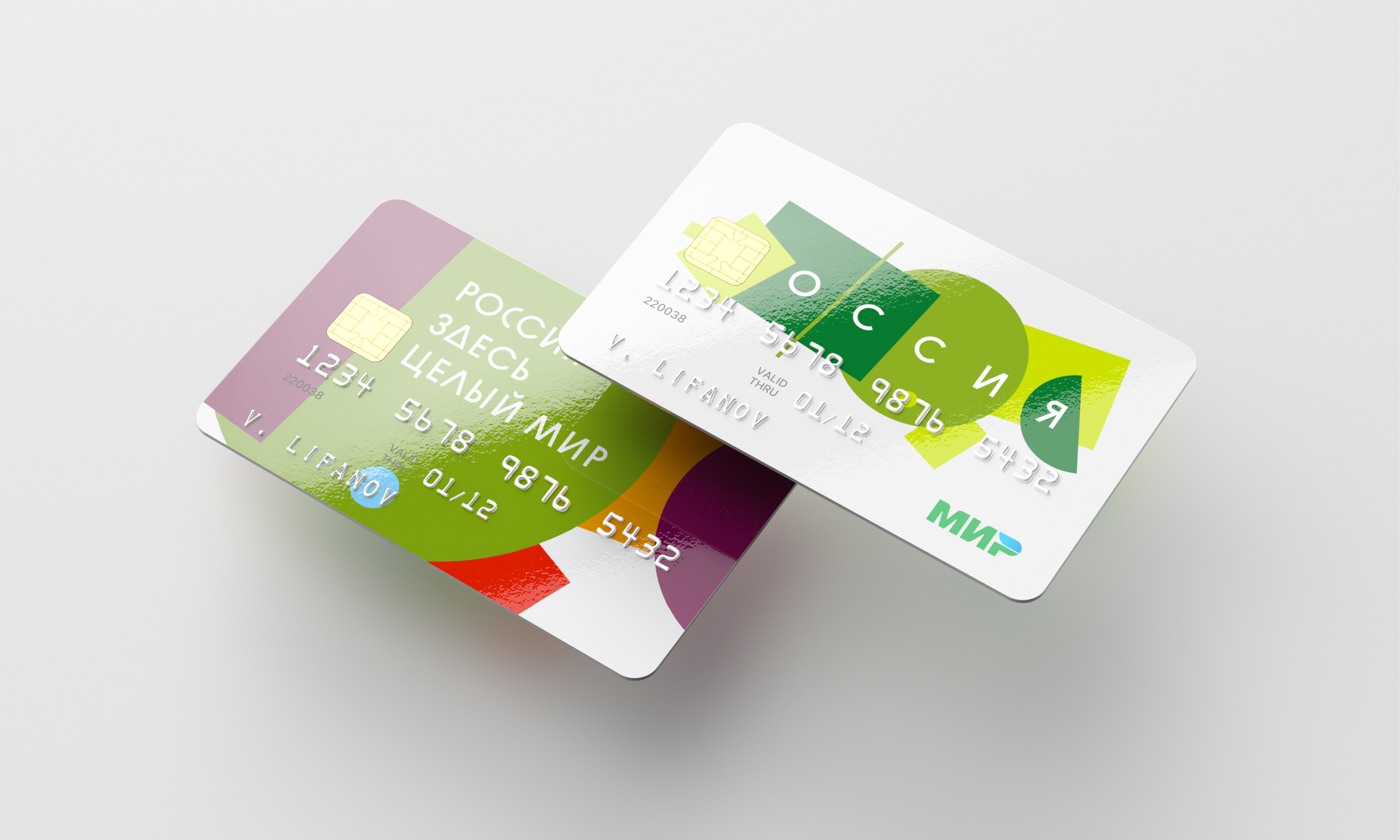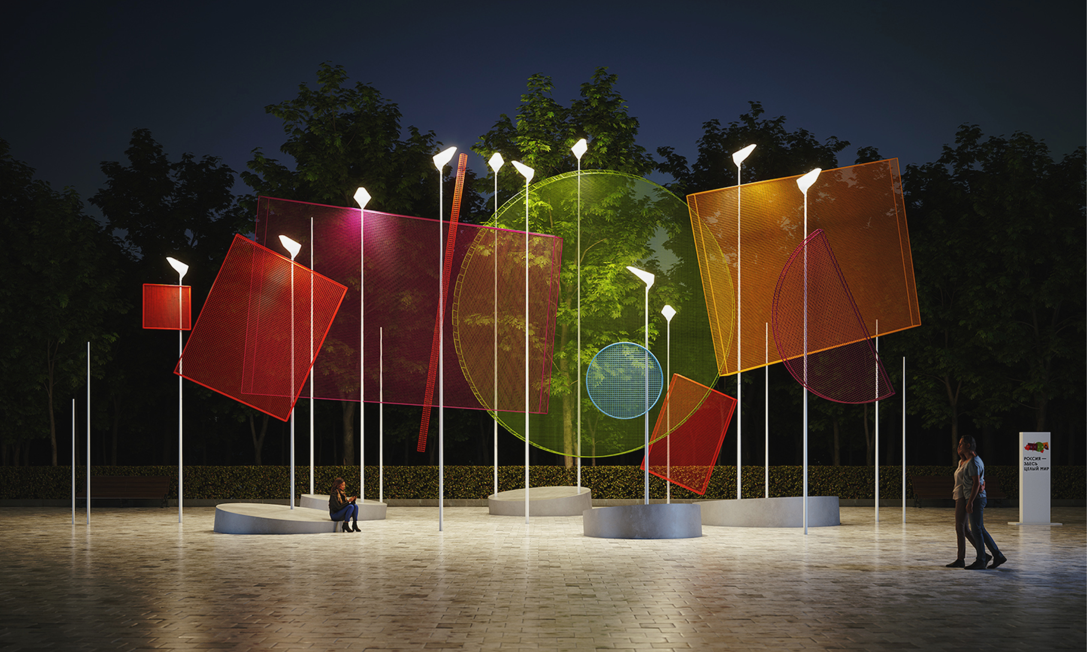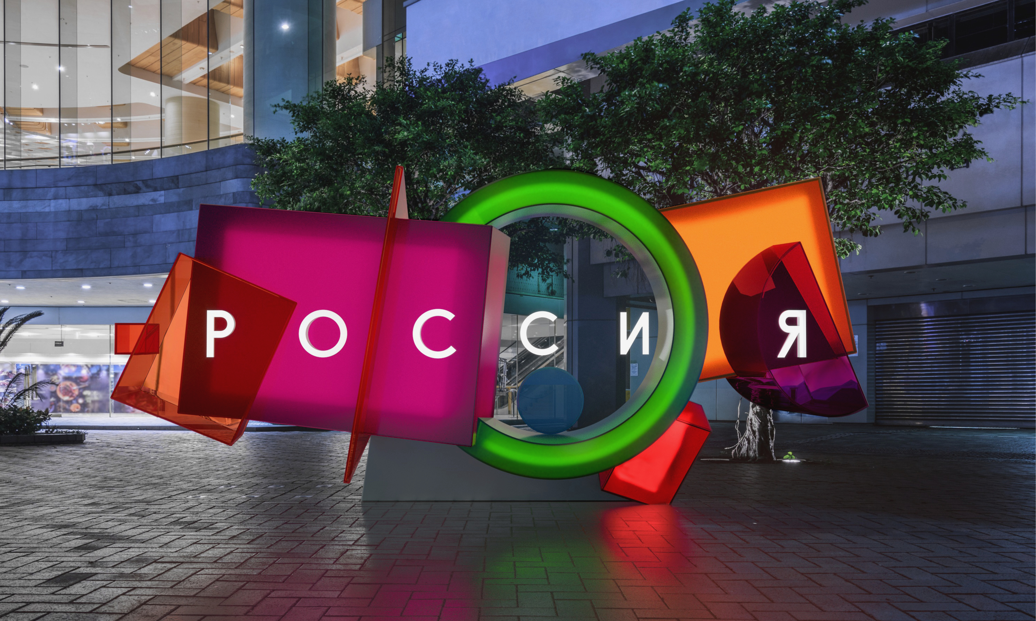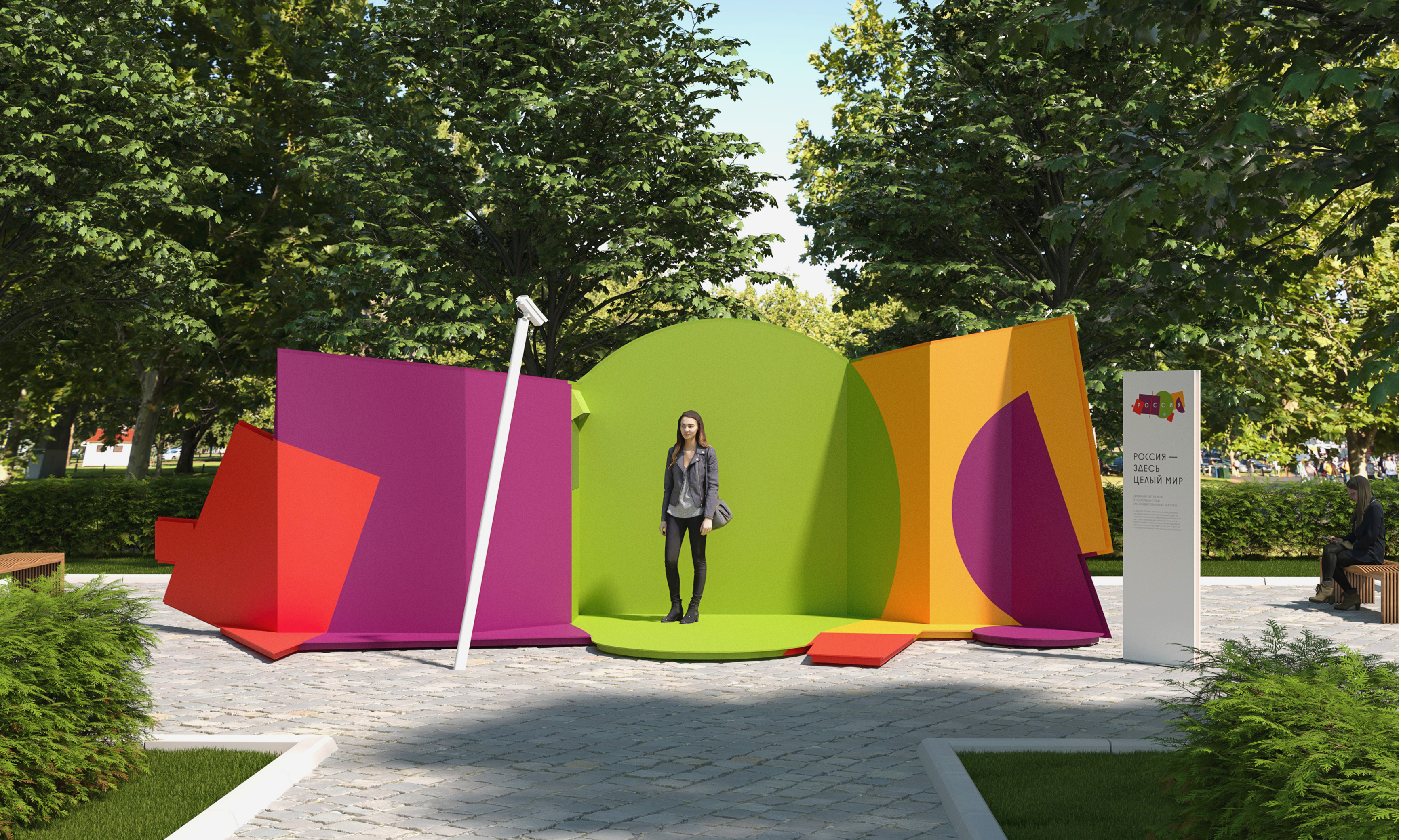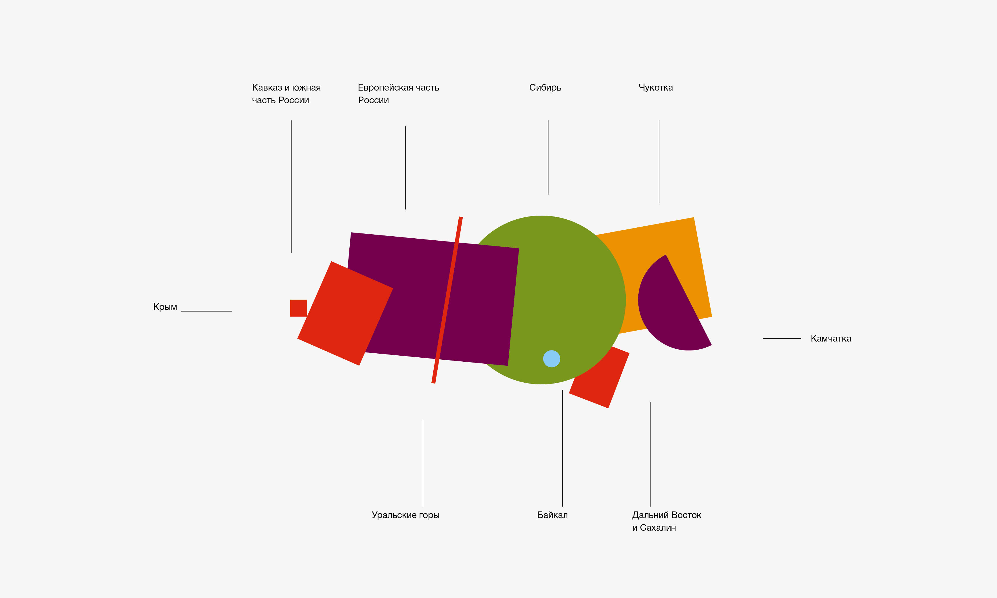
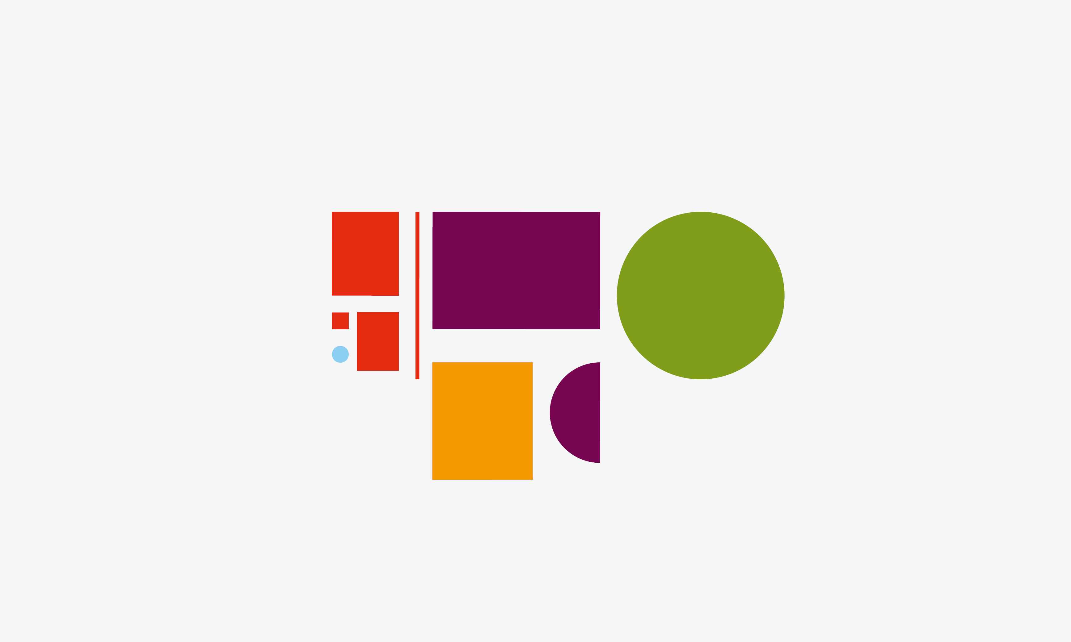
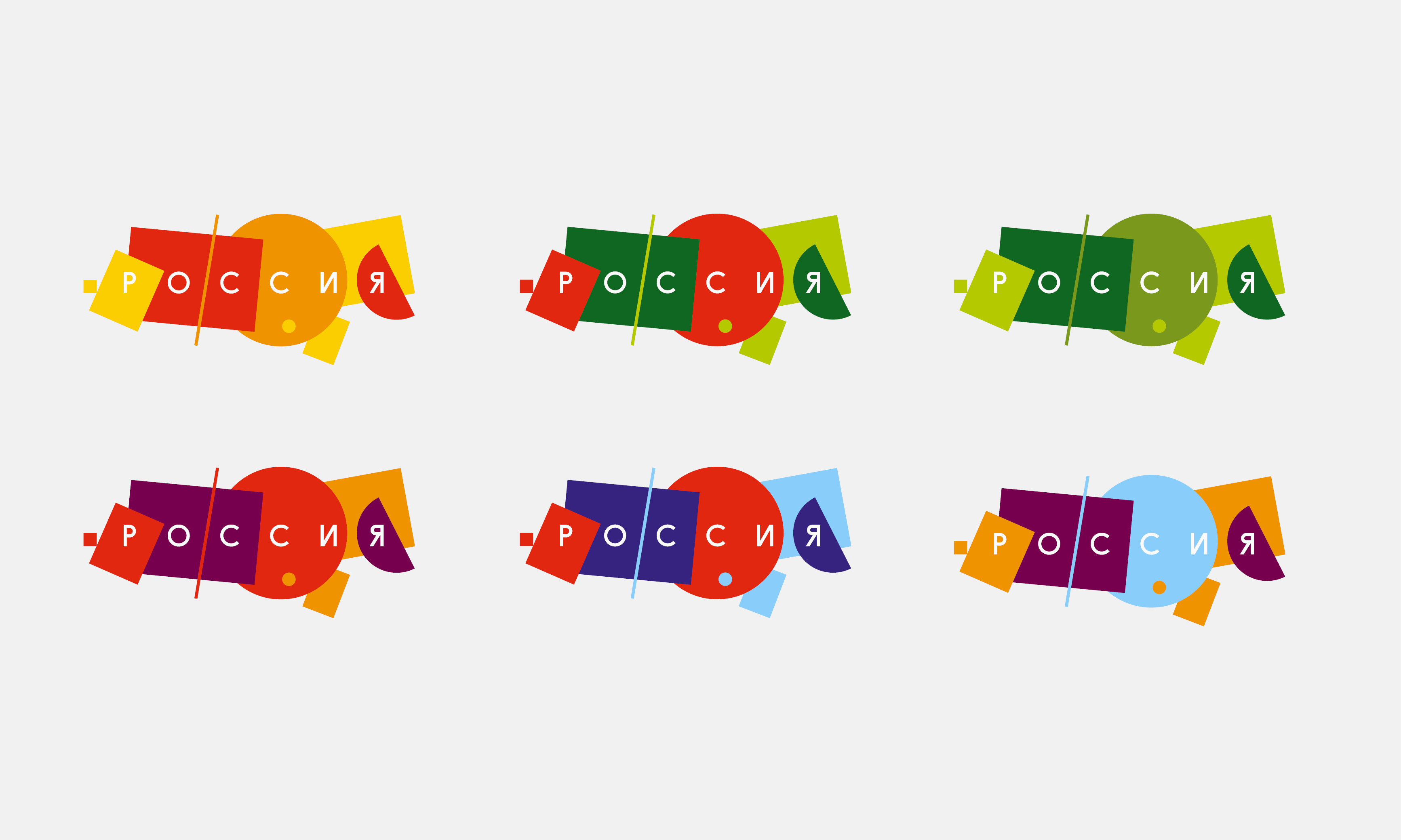
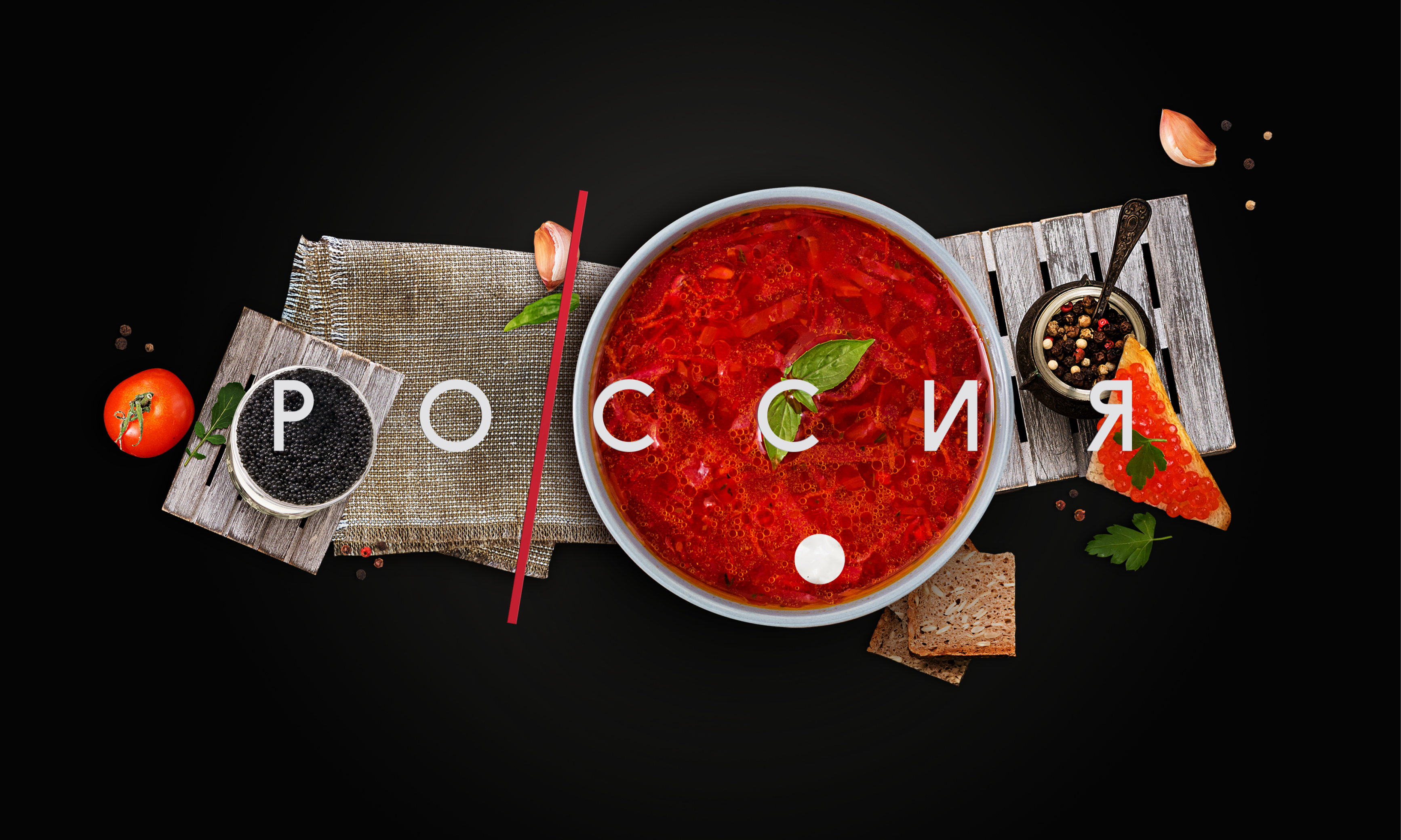
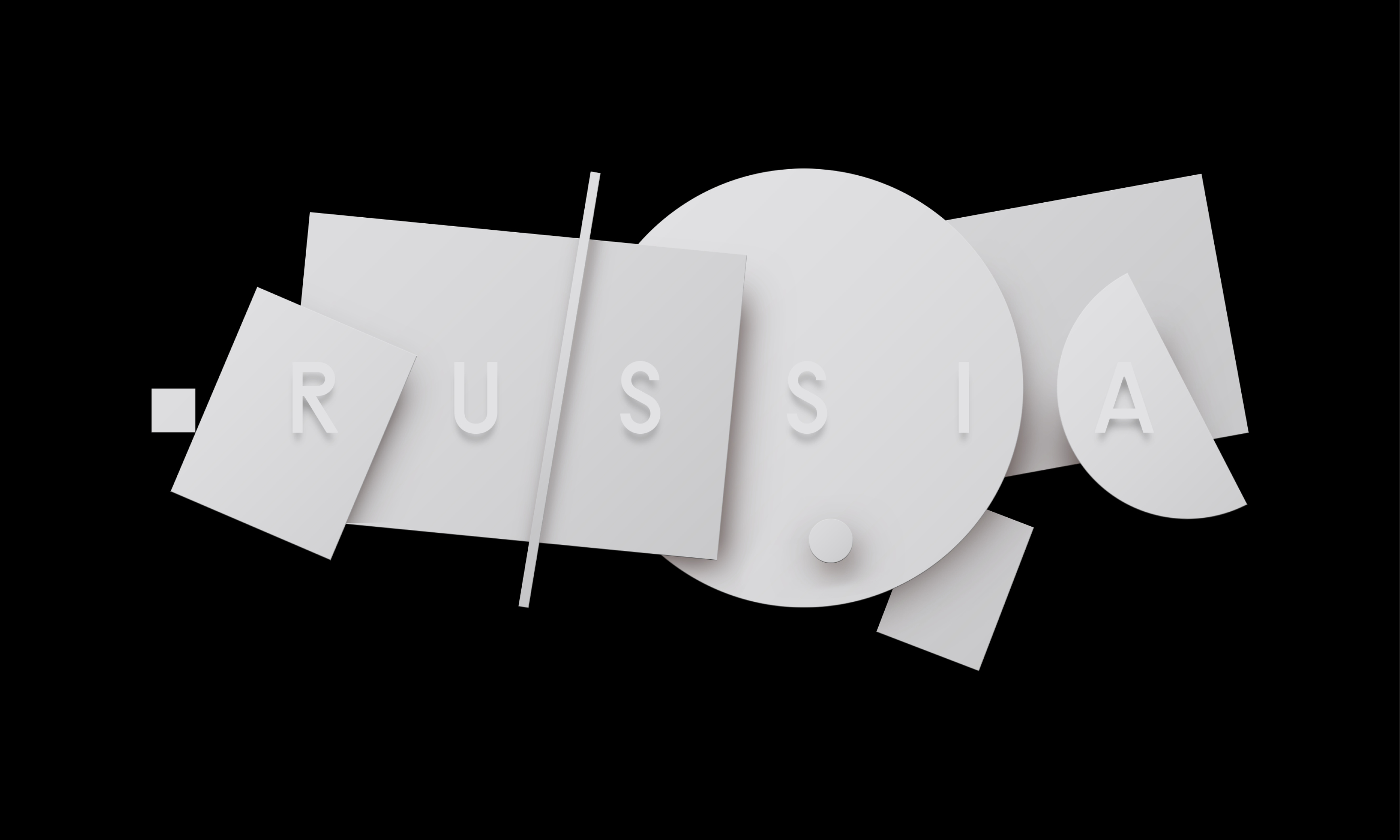
Знак — это стилизованная под супрематическую картину карта России, где показаны основные и наиболее характерные для туризма направления.
Крым, Кавказ и южная часть России, Европейская равнина, Уральские горы, Сибирь, Чукотка, Камчатка, Дальний Восток и Сахалин, Байкал.
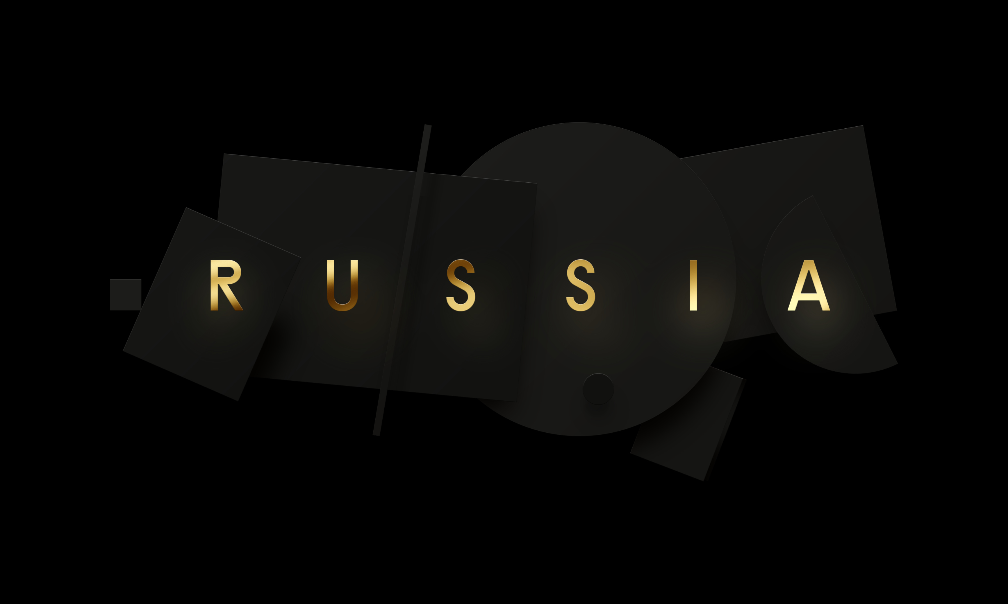
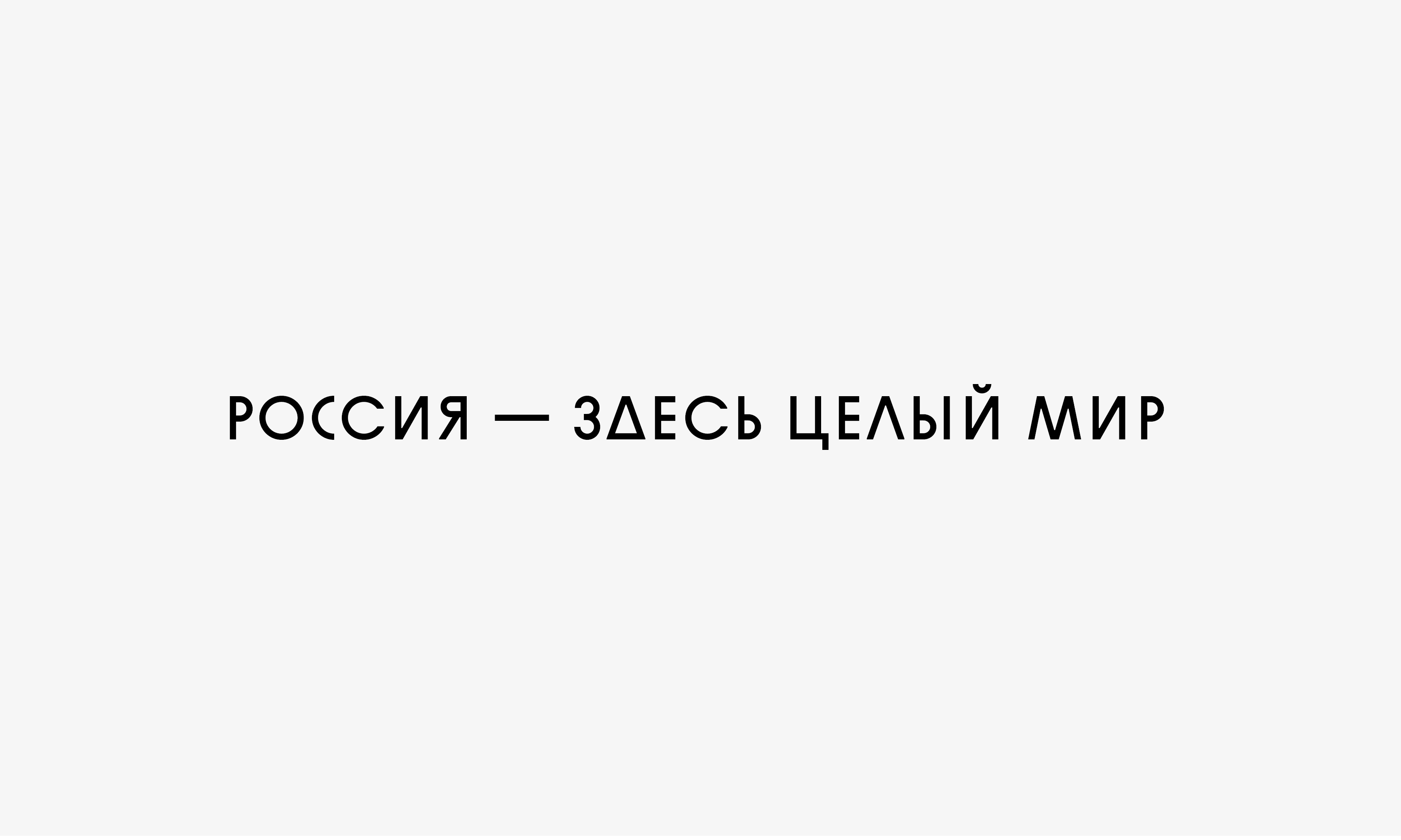
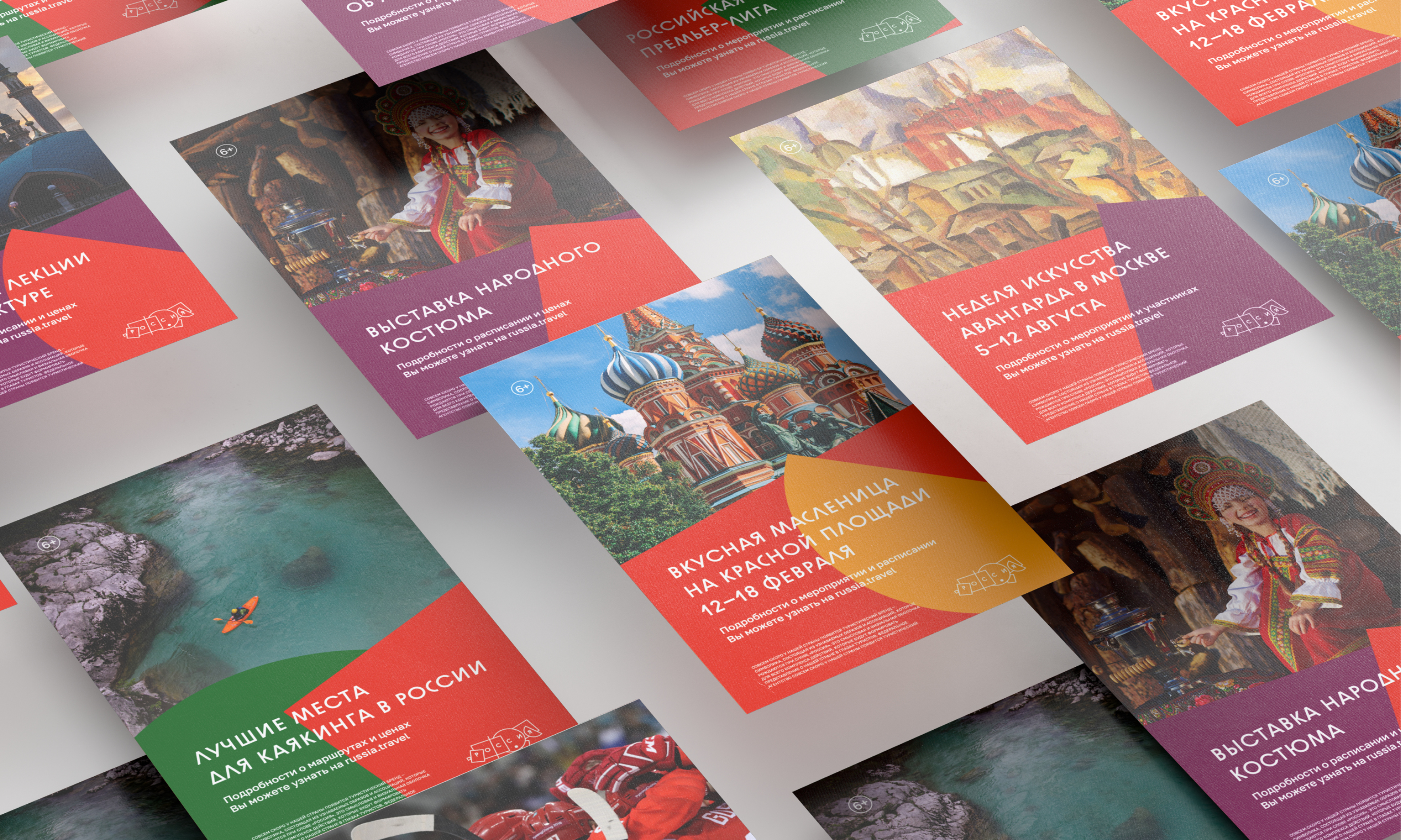
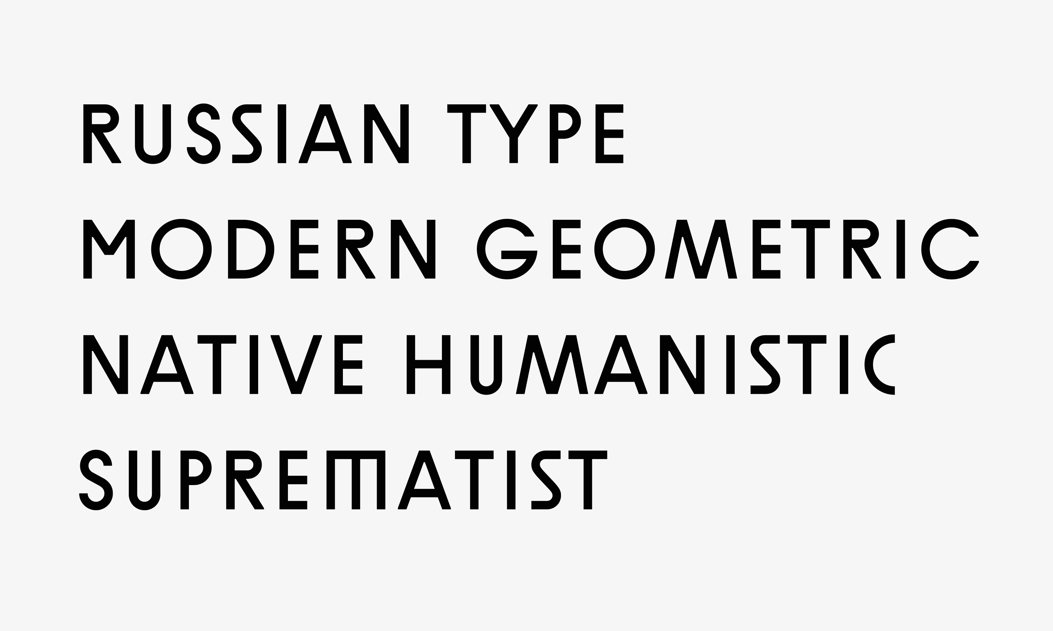
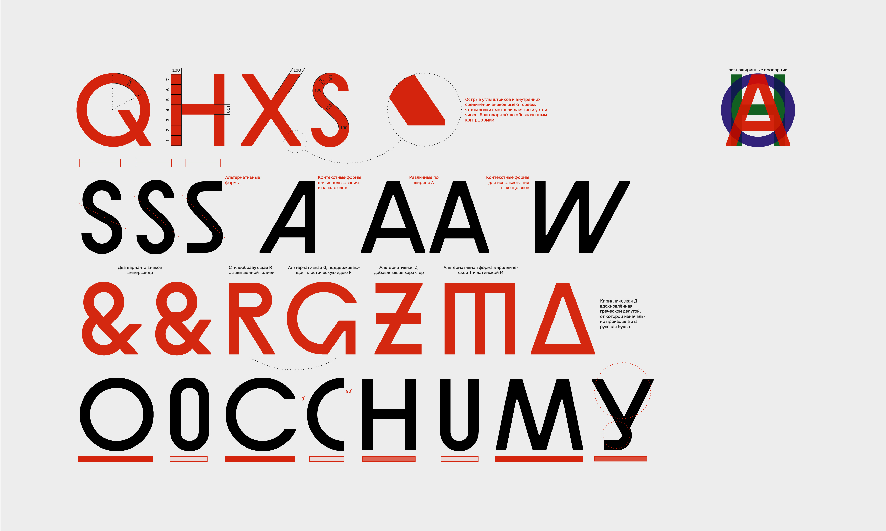
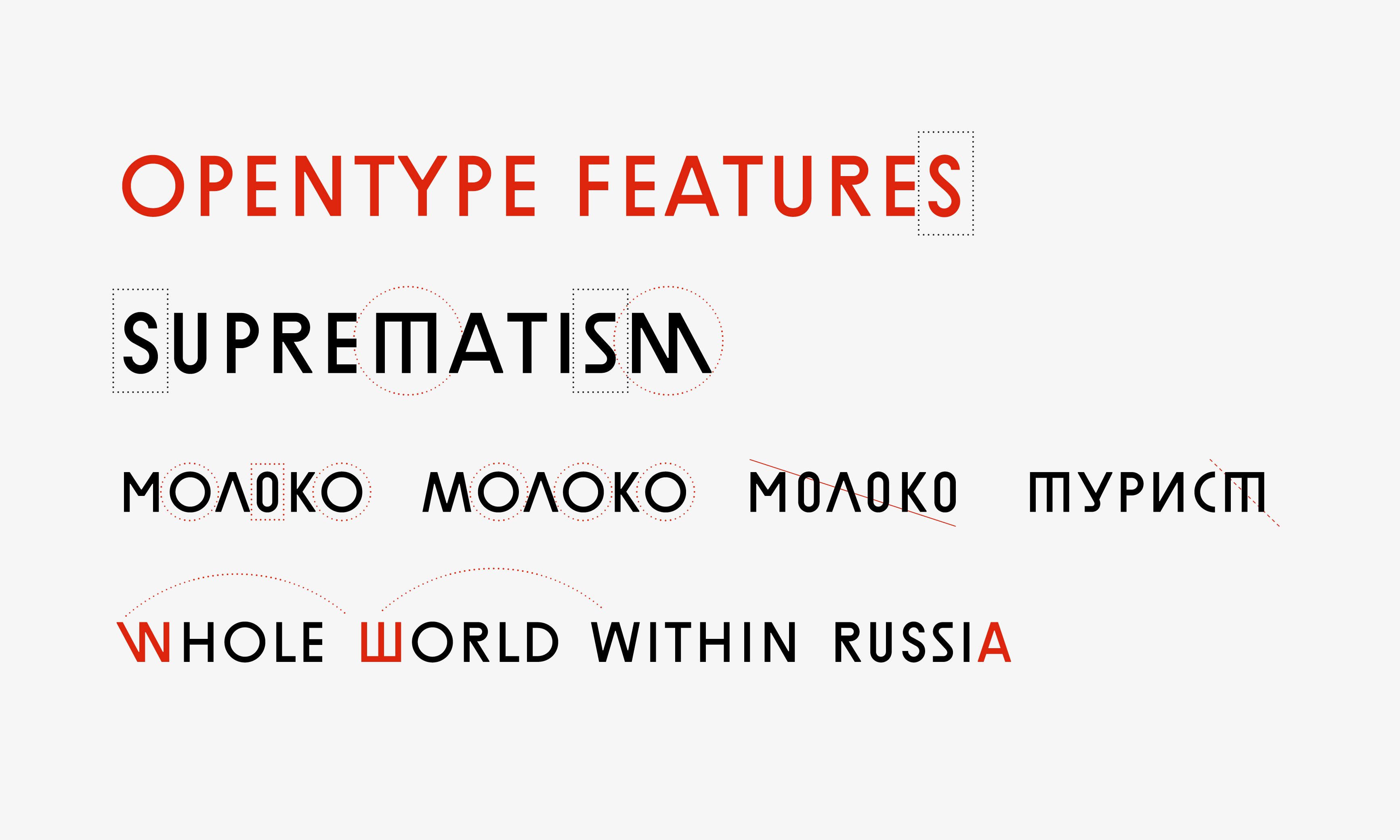
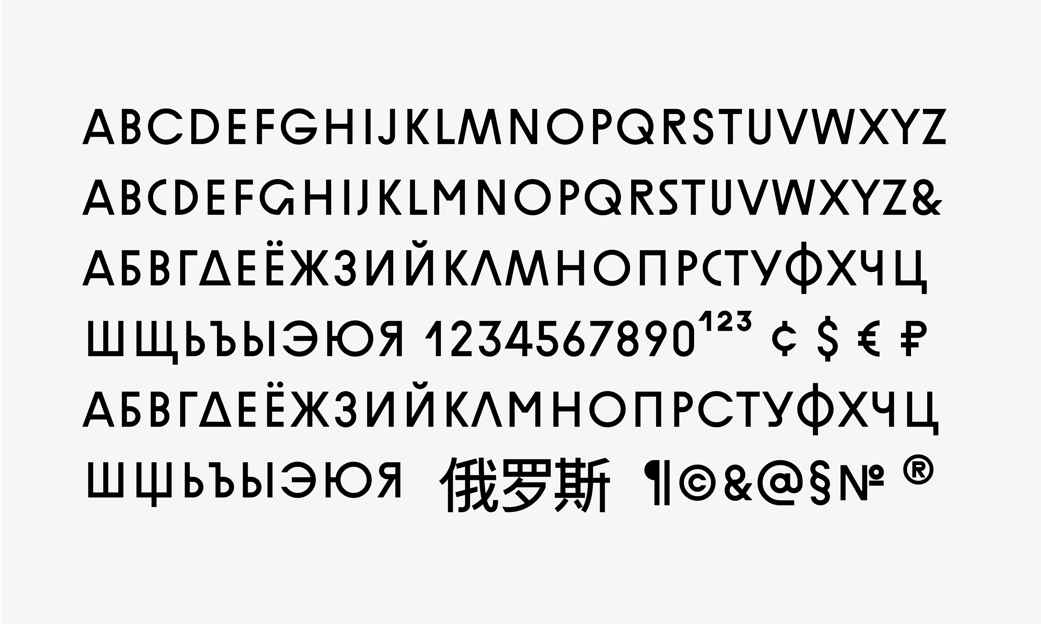
Слоган набирается специально разработанным уникальным шрифтом «Russian» для заголовков и подзаголовков на русском (кириллица) и английском (латиница) языках. Концепция шрифта вдохновлена шрифтовым работами русских конструктивистов ХХ века, в частности работами Эля Лисицкого и Петра Галаджева. Алфавит создан в преемственности со шрифтовой частью логотипа и развивает идеи, заложенные в туристический бренд России.
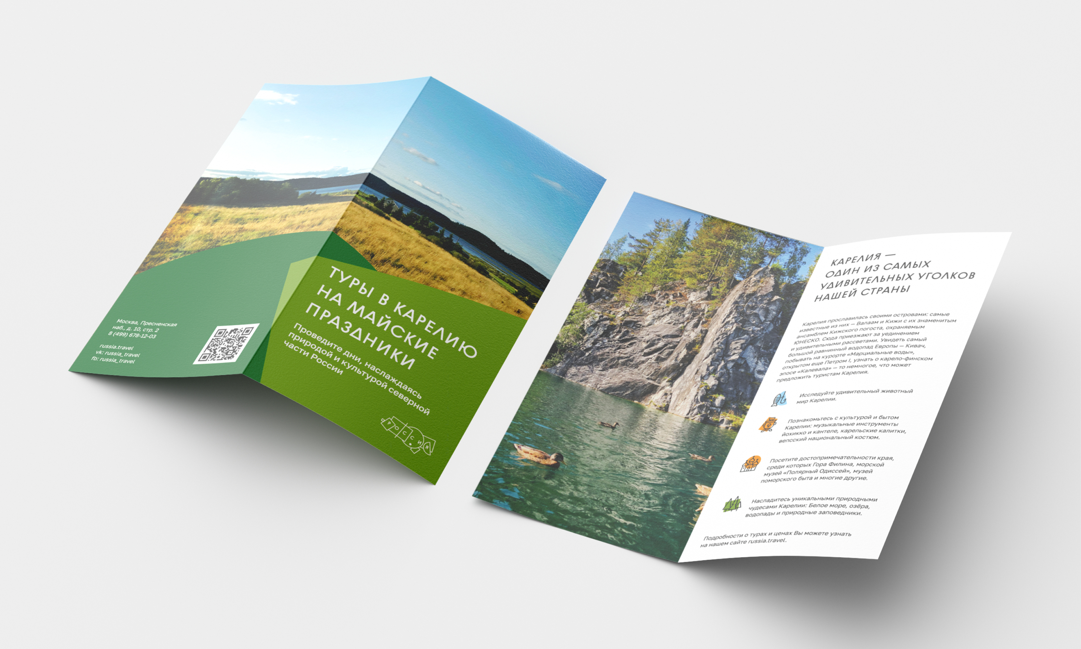
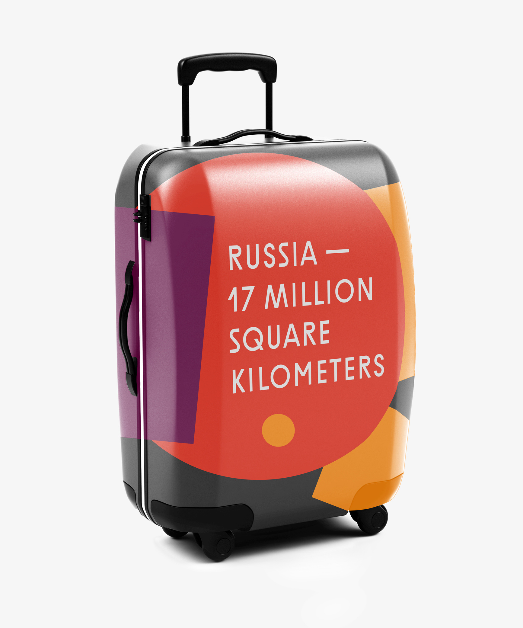
Туристический бренд отражает природу России — такого разнообразия климатических зон, растений и животных нет нигде в мире. Арктика, пустыни, ледяные вершины гор и жаркие морские побережья, тайга, вулканы и глубокие пещеры — есть не один повод отправиться в путешествие. В нашей стране можно увидеть белых и бурых медведей, Амурского тигра, китов, моржей и тысячи птиц. Здесь сохранилась первозданная природа, нетронутая человеком.